
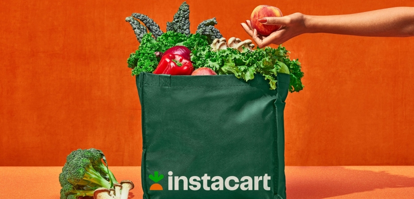

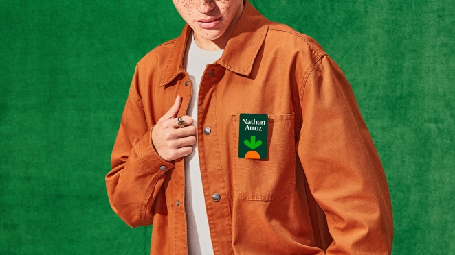
Wolff Olins partnered with Instacart to create a new identity system for the brand, as part of the grocery technology company’s ambition to serve more retail categories beyond food. Rooted in a new positioning and iconic logo, Instacart’s new identity system is now fully rolled out and features a proprietary type family, fresh color palette, vibrant photography direction, and delightful illustration system. The roll out of the refreshed brand follows the unveiling of its new logo in April.
Instacart started in 2012 as a consumer marketplace with the goal of bringing the grocery industry online. Since then, the service has expanded to deliver a wide range of goods, such as Sephora beauty products and home improvement essentials from Lowe’s. The new brand identity has seen Instacart through their continued growth, to a moment where the brand now partners with more than 900 retail banners across 75,000+ stores in North America and more than 5,500 CPG brands.
We spoke to Wolff Olins creative lead on Instacart, Senior Creative Director Daniel Renda, to discuss the Shop+Savor ethos of the branding and how it underlines the emotional value Instacart aims to add to people’s lives.
What was the brief for the rebrand?
To create a new brand identity to support the company’s new business ambitions to go beyond grocery.
How did the initial pitch/brainstorming phase go?
We worked very closely with Instacart to generate a ton of ideas. We shared a Figma space where anyone from our teams could add sketches, words, and inspiration at any time. This led to a really comfortable relationship and broke down the silos between the different departments.
Describe the purpose of the brand and its target audience
Instacart delivers groceries and products to people across North America. The convenience their service provides gives back time to busy achievers to savor life, often with their loved ones. This insight led to our Shop+Savor ethos which informs all of our branding decisions.
What was your thinking behind the rebranding solution?

We grounded our work in our Shop+Savor brand ethos: Instacart powers your shopping so you can savor all of life. This tension informed all of our creative decisions from the streamlined arrow that represents the ease of the product – to planting the carrot to symbolize the moments you grow with the time you get back.
Our type of family is also inspired by this recipe. It has both a sans serif optimized for the digital product and a tasty display cut that reflects the enjoyment made possible by the service.
Did you learn anything new during the project?
Full-on remote collaboration!
What was the biggest challenge? How did you overcome it?
Changing the logo the company had grown with. We believe the best way to create change is through empathy and understanding of what a business and its people need from design. We were very sensitive to the emotions in the company and grounded our decisions in what we feel is best for the success of the business rather than just cool design. Magic happens when both align.
What kit/tools/software were used to create it?
Figma, Adobe Suite, good old pen and paper.
What details are you most proud of and why?
We strive to make brands with something for people to discover because it engages and creates a dialogue between people and brands. We love that we were able to transform something so dear to the company's heritage into a symbol for their audience to discover.
The motion behaviors bring our idea to life and equip the brand to delight people throughout the experience. As a type lover, I really enjoy how the custom typeface brings our strategy to life and strays away from the trendy Cooper Black influenced serifs we see lately in the food space.
What visual influences fueled your solution?
So many, but one that comes to mind is the delightfully tasty typography in Gastrotypographicalassemblage by Lou Dorfsman and Herb Lubalin for the CBS cafeteria.
What do you hope it achieves for the brand?
We hope the rebrand will help Instacart become a beloved and iconic brand!
What would you do differently if you could do it over again?
Because of the pandemic, most of our collaboration was remote. I wish we could have had more time together in real life with this lovely team.
Credit list for the work?
Wolff Olins
—
Daniel Renda
Jess Yan
Colin Kinsley
Vanessa Hopkins
Nicholas Samendinger
Draeger Gillespie
Jason Chen
Michele Kim
Marina Ammirato
Ian Carroll
Chloe Rinaldi
Instacart
—
Kevin Byrd
Laura Jones
Adam Cote
Rogelio Magana
Andrew Chen
Angela Ko
Genesis Silva
Aldo Crusher
Anabelle Roeser
Bert Paige
Typographer – Ryan Bugden
Illustrator – Aldo Crusher
Composer – Ian Jolin-Rasmussen
Photographer – Stephanie Gonot