
No matter how you put it, a library's a library. Right? Well, not to Silk Pearce, it isn't. The Colchester-based branding agency has a special interest in creating beautiful and colourful identities, so why not make Suffolk Libraries as colourful and unique as it could be?
The independent charity runs the library service for the local council and was in need of a logo simple enough to stand out from the visual noise. And stand out is what this logo below does – poking out of the green background and any other element in the visual branding like a neat bookmark.
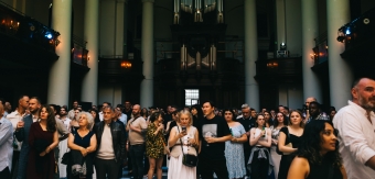
Today we are getting Behind the Idea to learn more about the process that led to the marvellous visual identity you can see below, and why it was so effective in targeting young commuters in the local area.
![]()
What was the brief?
We were approached by Suffolk Libraries - an independent charity who runs the library service for Suffolk County Council - to create a new logo and brand that would appeal primarily to young professionals. The library had high engagement with the elderly and families with young children, but were struggling to tap into young commuters who regularly use download and streaming services, as opposed to physical books. Where these services cost money, Suffolk Library offers its own digital services for free. The rebrand was aimed at raising awareness around its eLibrary offer, such as downloadable books, music and films, and attract the younger demographic to sign up.
![]()
How did the initial pitch/brainstorming phase go?
The first presentation went very well. Before presenting our concepts we showed the client some research we did of typical library logos – which primarily consisted of open books, trees or a combination of both! We countered this with research of what other arts and culture organisations look like such as the Barbican, whose approach is more contemporary and confident. At the same time, many of the activities at the Barbican are similar to those of a community library – artist events, exhibitions, it even has its own library – so we thought we could take our cue from them instead. This is where our concept of a bold, simple rectangle that echoed the library’s heritage originated from – a marriage of the contemporary and the traditional. The client understood this approach and thankfully went with what was the bravest of routes we presented – which is certainly not always the case!
Tell us more about the concept. How did it come to life, and why was it the right choice?
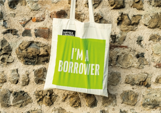
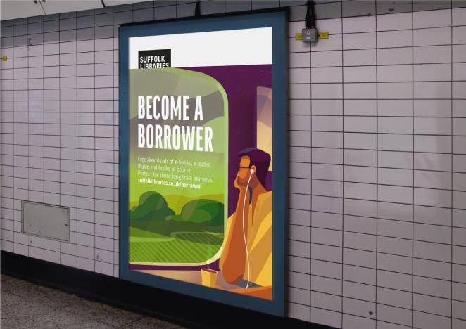
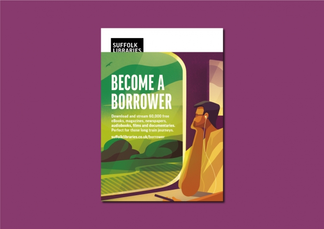
As Suffolk Libraries wanted to target younger commuters to use their services, we created the 'Become a Borrower' campaign. Chiming into the zeitgeist of buying less and re-using more, the campaign struck a chord with younger, more conscious consumers. We also wanted people to feel part of a collective, so developed a series of bags and library cards which said ‘I’m a Borrower’, to give a sense of pride in using the library’s services.
We then took our design inspiration from the idea of a bookmark. We felt that no matter how libraries evolve and become more focused around online services (particularly during the pandemic), books will always be what people visually associate with a library.
What was also immediately noticeable from their previous branding was the proliferation of logo variations – different logos were used on different collateral by different people. Part of our solution was to design a singular strong logo that could be used consistently, whilst also strengthening the Suffolk Libraries brand wherever it appears. It does everything a good logo should do – be visible and memorable, while simultaneously creating a coherent brand identity across all touchpoints.
What was the production process like? What was the biggest challenge?
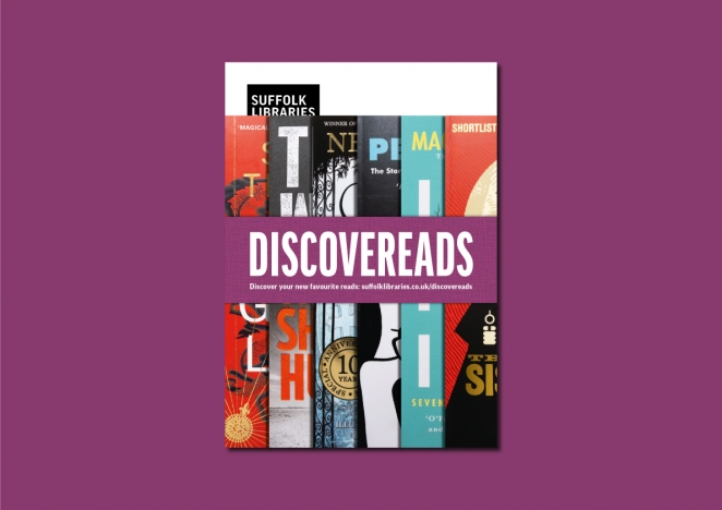
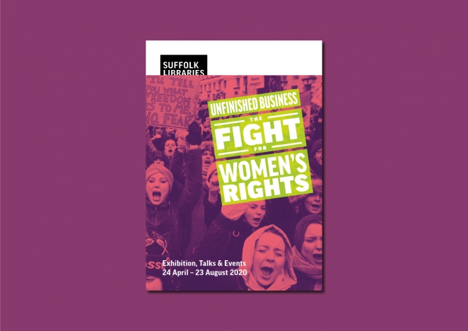
The biggest challenge was creating a brand that non-designers with rudimentary computer skills could use – which is no easy task. Our solution was to create a series of Microsoft Office templates, so that the user - often a library volunteer - could put together a simple poster or social media post to create something ‘on brand’. The logo always appears top left, so even if the typography isn’t perfect or the imagery isn’t beautiful, the Suffolk Libraries logo stands proud, as a bookmark would. We also produced a set of simple brand guidelines that people could follow if any questions arose.
What is one funny or notable thing that happened during the production of the campaign?
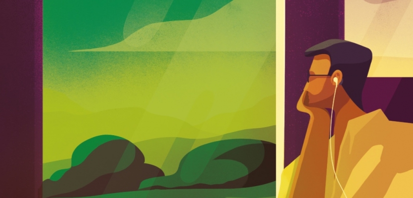
The first lockdown happened just as our ‘Become a Borrower’ advertising campaign launched. So the strategically-placed, lovely (and big!) posters, using an excellent illustration by Charlie Davis, were barely laid eyes upon in the train stations across Suffolk as travel understandably stopped. Thankfully, it was still viewed across social media, but there’s still nothing like a nice big poster!

What’s the main message of the campaign and why does it matter?
The main message was one of simplicity. Suffolk Libraries produce a huge amount of promotional collateral for a variety of different events, so what we designed needed to be easy to implement and also stand out from the visual noise you often see in libraries.
But Suffolk Libraries aren’t just about physical libraries anymore – their services can be accessed 24/7 online and outreach into the community. I think in the current climate libraries matter as much as they ever have, whatever shape they take. So it matters that what we’ve done for Suffolk Libraries plays its part in the continuation of their services for the community – young and old.
What is one unique aspect of the campaign?
One standout aspect is that the brand appears in 47 libraries across Suffolk. I don’t think we’ve ever had our work appear in that many different locations at one time. It’s pleasing to think of your work being seen by so many people in the local community.
How long did it take from inception to delivery?
The initial brief to the launch campaign took around 4 months. This included the creation of the core logo and brand plus the ‘Become a Borrower’ advertising campaign.
What do you hope it achieves for the brand?
We believe the minimal freshness of the visual language helps bring Suffolk Libraries into the 21st century and gives them the confidence to achieve their aims of attracting a younger audience. We also hope that the simplicity of the design will enable it to stand the test of time.
Credit list for the campaign?
Creative Director: Rob Steer
Senior Designer: Anthony Blease
Copywriter: Rob Steer
Illustration: Charlie Davis