


Retail e-commerce sales are set to hit an eye-popping $5.4 trillion by the end of this year; even so, many would be surprised to realise that the average conversion rate ranges between 1% and 4% for many industries. These statistics make it clear that a company that can boost its conversion rate by even a single percentage point would be able to significantly boost sales and profits.
There are many reasons why site visitors may fail to convert. Some may click on your site by mistake and then realise you don't offer the products/services they are looking for. Others may find your product too expensive or balk at the cost of shipping. Still others may decide they don't really need or want what you have to offer.
However, one important aspect of a site's conversion rate that should be given ample attention is site design. A business site is, essentially, your virtual storefront, and it needs to be appealing to your target audience if you want to bring in customers and make sales.
What goes into the creation of an engaging site design? Following are six of the most important aspects for your consideration. These pointers apply to companies of all industries, sizes, and geographic locations but can be adapted as needed to suit a business' exact needs.
1. Logo and Consistent Colour Palette
Consumers expect legitimate businesses to have a consistent brand design and logo. Without these branding assets, your company could easily be confused for another firm or even disregarded entirely.
Your colour palette should match your industry, products/services, and core values. For instance, companies that put a premium on offering sustainable products and/or services will likely want to use green and possibly brown as part of their branding colours, as these shades denote nature and have an eco-friendly vibe. Companies offering financial services do well to use red and/or blue, as these colours convey trustworthiness and reliability.
Your logo should match your company's products while allowing room for you to expand your product line and/or services in the near future. It should be scalable and easy to use not just on your website but also on social media platforms, email newsletters, business cards, letterheads, banners, etc.
2. Lead Capture Form
Your lead capture form does not need to be fancy in order to stand out. In fact, simplicity is best as a simple form with few options is easy to scan and fill out, thus encouraging customers who are sitting on the fence to give your firm a try.
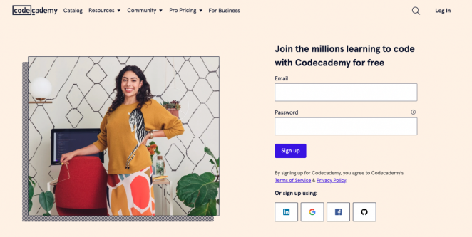
Codeacademy has done a fantastic job with its lead capture form. Different background colors are used for each segment of the sign-up page to separate information on various themes for easy browsing. The large text makes it easy for interested customers to skim sections and find the information they are looking for without undue delay.
The page provides internal links to important information on the site, so interested site visitors can learn more about a particular topic; however, only the most important information is offered on the sign-up page to avoid distracting site visitors.
3. Original Images
If you want your site to stand out from the rest, it's best to use original images rather than stock images. Original, high-quality images showcase your products/services in the best possible light. They set you apart from the competition because there is no other site on the internet that has the same images your website does.
Business branding platform Tailor Brands uses images in a powerful way on its site homepage. Images accompanying descriptions of each service show great results from these services, so clients can see the business delivers on what it promises, and then some.
The segment on web design, for instance, features a winning website; the segment on its logo creation services shows a range of enticing products with a company logo printed on them. At the bottom of the web page are photos of happy customers sharing their great experiences with the firm. Additionally, the light background colour draws attention to the images, so prospective customers can clearly see what Tailor Brands can do for their businesses.
4. Enticing Video
Statistics show that well over 80% of consumers prefer watching a video to reading informational text. While a video can't take the place of all the text content on your site, video content can be used successfully on many landing pages to explain a site's purpose, showcase a product or service, help potential customers get to know the business owner, and more.
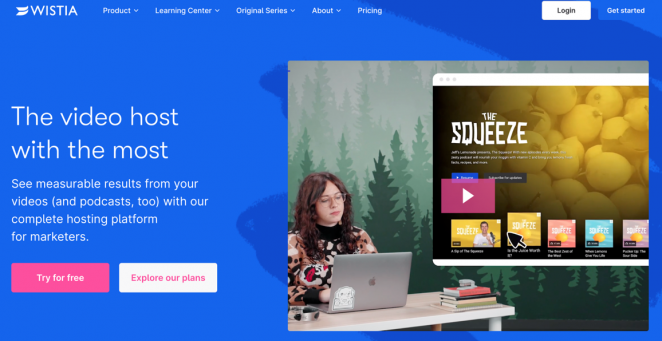
Hosting service Wistia uses an engaging video on its homepage to showcase its services at a glance. The video grabs attention and makes it easy for new site visitors to see what Wistia has to offer at a glance. Those who are interested in finding more information can scroll down to read product descriptions and business reviews or click on links to Wistia's blog posts.
5. Trust Indicators
Potential customers who have never done business with you in the past may be leery of working with a new company they don't know much about. That's why it's important to have trust indicators on your page to assure new clients that they can trust you with their hard-earned cash and financial information.
These indicators include your contact information, positive reviews from happy customers, links to reputable companies that you work with or that have done business with you in the past, and/or links to positive news articles about your business. If you have won awards or badges, these should be displayed prominently on the homepage of your site.
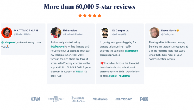
Talkspace, which offers various forms of individual and group therapy, features several noteworthy trust indicators to assure new users that it can be trusted with the confidential, personal information users would need to provide in order to access Talkspace's services.
There are positive reviews, a list of leading news outlets that have covered Talkspace in the past, photos and credentials of therapists offering services via the site, and statistics showing how Talkspace has made a positive difference in the lives of the people it works with.
6. Standout Call to Action
What do you want site visitors to do when they come to your landing page? Are you encouraging them to sign up for a free trial, trying to get them to buy your products, or asking for their contact information, so you can stay in touch via email or social media?
If you aren't sure what the end goal is, take some time to think about what you want people to do and then create a standout call to action that makes it easy for people to know what to do if they decide they want to do business with you.
It's smart to use a call-to-action background that is a different colour than the rest of your landing page. This sets the call-to-action button apart, so users can find it quickly and easily. Once a person clicks on this button, he or she should be able to complete the purchase or sign-up process in a matter of minutes.
There should be no glitches, undue delays, or a host of questions that must be answered before the process is complete. Make it easy for people to find what you want them to do and then do it, and the odds are your conversion rate will increase.
There are anywhere from 12 to 24 million e-commerce sites on the internet. If you want yours to stand out from the rest, you'll need to pay attention to your site design. Your site should be appealing to your target audience, using colours and images that will catch their interest and make them want to do business with you.
People should be able to see at a glance who you are, what you offer, and what benefits they can gain from buying your goods and/or services. A site that is engaging, clear, and easy to use will prove to be an invaluable asset that will generate sales and profits for years to come.


Chris Bicourt May 11th, 2022, in the morning
Very good take. Enjoyed. There's definitely a priority list for landing page design, and this is a solid proposition for top 5.