
With design critique, especially within the passionate world of sports, it’s easy to jump in two footed to disparage any new identity. However, the North American World Cup 2026 logo has the potential to become as memorable as Mexico 1968 or London 2012. Those brands were both derided at launch, but are now be viewed as iconic identities with the benefit of hindsight.
Behind any new brand launch, it is valuable to hesitate and consider the wider context and possible challenges each project may have faced. Anyone who has ever gone through a large organizational branding process like this will understand the gargantuan effort required to get to a solution that all will be aligned and happy with (let alone good!).
As this is the first time FIFA have awarded a joint bid to three hosts (Japan and Korea co-hosted in 2002), it’s easy to imagine the complexity being taken to new heights, with new challenges never faced before.
Historically, brands for large sporting events like the Olympics or the FIFA World Cup have been created to reflect the country hosting. A mix of history, traditions, motifs, colours and cultural cues created over hundreds of years all add to the nuance of a one-off event that captures global imagination.
But, this well-trodden approach has been given the red card in 2026, as this is the first time the FIFA World Cup brand has to reflect three countries (USA, Canada and Mexico) across 16 cities. Distance creates a real issue in reflecting three incredible – but unique – countries. The boarders are both physical and ideological. This means, the classic topes of leaning into historical national cues are knocked out in the qualifying rounds. So, how do you solve for this unique event?
Well, before looking for the answer, it’s worth reviewing the last decade of World Cup logos from Qatar (2022), Russia (2018) and Brazil (2014). They all used tactics from the same playbook. Each logo centrally uses the FIFA World Cup Trophy in a stylized way, in keeping with visual traditions of the host.
This approach is an understandable, but also feels like a predictable solution that is bereft of imagination in favour of a cookie cutter solution that enhances a broader sense of increasing commercialization of the world’s second most watched sporting event. The world’s most watched event? it turns out, people really like cycling.
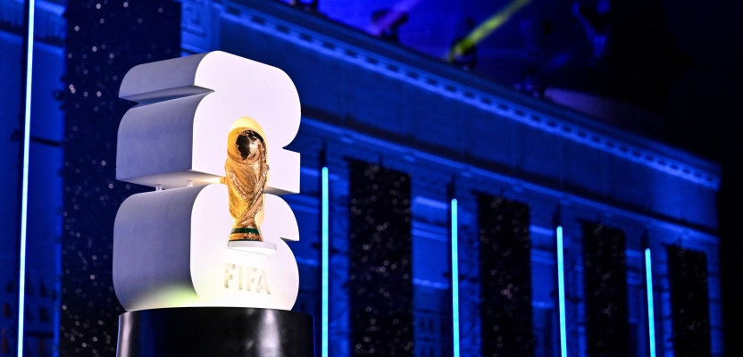
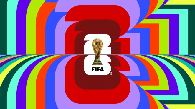
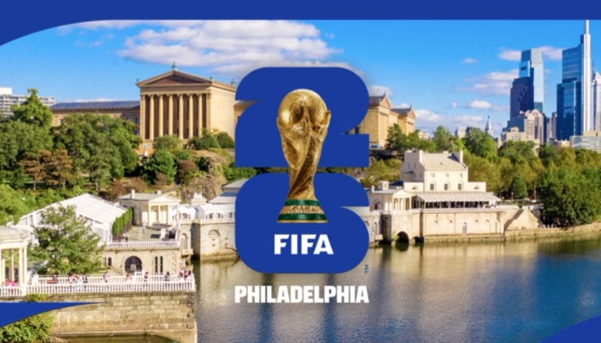
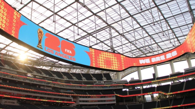
The new 2026 logo carries on the tradition of elevating the trophy to the centre of the logo, but there is no connection to a nation (because and as discussed, there are three). Instead, the year of twenty-six has been elevated as the connective glue of the tournament.
At first thoughts, this may appear underwhelming or overly simple given past expectations. This may be why it has met widespread criticism at launch along with the usual host of smart tweets and memes that now accompany any significant branding moment.
This visceral reaction has a history. Anyone remember the hysteria around the Olympics London 2012 logo? At launch in 2007 there was confusion and anger towards the sharp blocky styling. The designers were hunted down by news reporters for an explanation. Even Stephen Bayley, founder of the Design Museum, described it as feeble, a “puerile mess, an artistic flop and a commercial scandal”.
But, by the time of the event took place, there was widespread admiration for how the logo turned into an infinitely expressive symbol of all that is great and unique about the city it represented. And, 2026 will be the same.
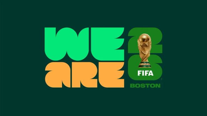
The 2026 logo is not the answer, just part of a wider solution that will build between now and the event to represent the 16 cities individually and collectively. Each will use the wider system which contains both a bold display face (where the ‘26’ numerals come from) as well as a repetitive graphic language to create more localized versions of the event that will also contribute to the unification of the three countries.
By making the solution less about the World Cup logo and more about the system as a form of expression, focused on a simple holding shape that can adapt with colour and content as required, FIFA has taken a sophisticated approach that builds on learnings from successful destination brands such as the City of Melbourne and New York City, which have both been heralded as world class examples of place branding.
All we have to do now is wait. Have confidence in the execution being as good as the promise of what the system can offer. If it’s realized well, we are all in for a World Cup like no other. The execution has set the stage for a strong, flexible and exciting event that we can all look forward to. I – for one – cannot wait!

By Oliver Maltby, Executive Creative Director at Interbrand, New York