

It is never too late to include design into your marketing plan, especially in the context of a new season. Here are five of the most promising design ideas for summer 2022 (with examples) to assist your organisation in meeting and crushing its marketing objectives over the rest of the year.
1) Data visualisations that are visually appealing
Let's face it: data given in a spreadsheet, a list, or even written out in plain text does not have the same effect as data provided in a visual format that can be scanned in a split second and understood entirely. Using data visualisation to communicate difficult information to your target audiences has become much easier.
Is there a perk to this sort of content? You will have something that sticks out from the crowd and something that is readily consumable in the 2-5 seconds that you have to capture your audience's attention on social media if it is easily sharable.
Instead of showing information in a simple bullet format, such as this:
- 2,137 Invitations Have Been Sent – This total includes all of the emails that have been sent out in conjunction with the campaign.
- Click-Through Rate: 13.6 percent – The overall click-through rate for the current campaign is 13.6 percent.
- 19 Customer Reviews – This is the total amount of customer reviews that have been submitted.
- Response Rate: 7.1 percent – The overall proportion of customers that replied to the survey.
Consider using a graphical element to assist improve the information:
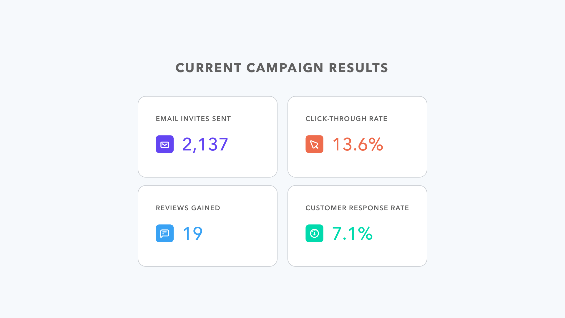
Data Visualization in Graphical Form
2) Quotes that have been visualised
The inspiring quotations that your grandmother might post on her Facebook page are not what we're talking about here. Here, we are talking about using quotations that have an immediate impact on your audience, whether from a live or pre-recorded webinar, podcast, video, or even a blog post.
This gives you a brief taste of what this medium is all about and what to expect when you use it. Once again, a common element running across all design trends is the potential to distribute content organically on social media, which allows you to reach a larger target audience.
In the majority of situations, content management systems have a default quotation module, which might be a little bland and uninteresting to look at. In this case, rather of saying anything like this:
What is it that actually distinguishes our brand? Our SmartAcres are a great resource. We are a community of intelligent individuals who are stronger when we work together to make a difference each and every day.
Lisa Zwikl, Chief Security Officer
In lieu of this, create a graphic that represents the quote together with the person (if applicable):
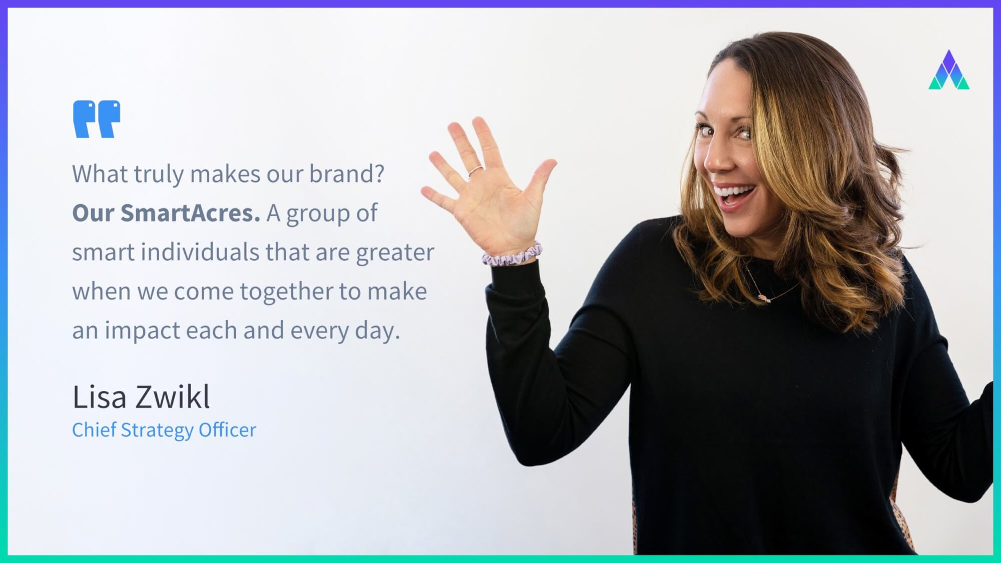
Graphic with a quote by Lisa Zwikl to provide visual appeal
3) Visuals that are inclusive
This has been a popular habit for quite some time, and it is always a good idea to keep up the excellent work. Including a varied variety of individuals in all types of business and commercial materials is made easier with the use of inclusive images.
The default for iconography and images is no longer merely white, male, and able-bodied humans, but rather a collection and representation of underrepresented groups in marketing graphics, which is becoming increasingly prevalent.

4) Simplicity and modernization are important considerations
You've probably heard the term K.I.S.S. (Keep It Simple, Stupid) a lot.
Starting with colours, gradients are a significant aspect of design, and they are ultimately transitioning into light, dreamy, and delicate minimalist hues, while vivid colours are gradually fading from fashion and becoming less fashionable.
Bold fonts are here to stay in the world of typography since they not only draw attention to themselves but also serve to distinguish a brand's style from the competition. And it's back (thanks in large part to virtual and augmented reality): neomorphism, which is effectively the creation of a 3D effect within a plane, has made a comeback.
But bear in mind that not everyone will be able to benefit from this strategy because it is not universally available. If someone has weak vision, they may be unable to distinguish between the shadows and the separation of individual blocks. The ideal method to use neomorphism is to use it to enhance the design rather than to use it to distinguish between significant aspects of the design.
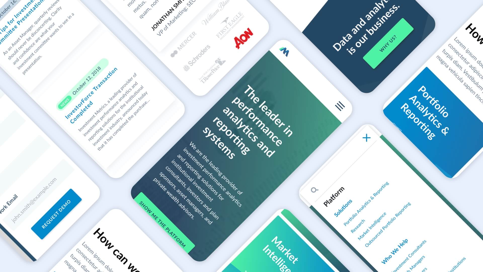
The image below is an example of how to properly use neomorphism shadows. The shadows enhance the picture, but they do not obscure the brand logos if the person seeing the graphic has bad vision or if the technology they are using is old and inefficient (i.e., a monitor that can not display high-quality imagery that showcases the shadow effects.)
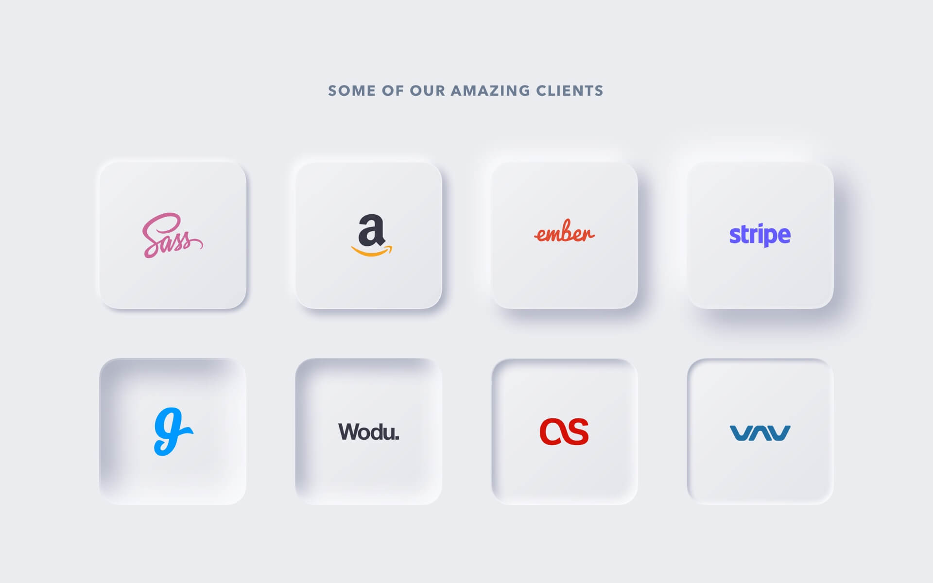
Exemplifications of Neumorphism Shadows
5) A mobile-first approach
More than ever, mobile phones have become a constant in both business and personal life, allowing people to keep in touch with coworkers, clients, and friends while still staying productive. As a result, more and more ux designers and website developers are considering mobile-first – rather than merely mobile-friendly – when creating their work.
However, what exactly is Mobile-First Design? It is a methodology in which web designers and developers build websites with mobile devices in mind from the beginning of the development process. To correctly accomplish this, begin by developing the mobile version (or the smallest screen size), then progress to bigger screen sizes, such as tablets and laptops, rather than monitors and desktop computers.
This, however, is dependent on the user experience trends in your industry and how they engage with your company. Using Google Analytics, you can determine if the bulk of your users are using mobile devices to access your website and content, or whether they are using bigger platforms to access your website and content.