
2016 is here. All the web designers and developers are already gearing up to test and embrace fresh ideas and innovations that the year will bring forth.
In the past year, one can take a look at our dynamic industry and pick the trends that were revolutions in a way: the bigger shift to user-centric and accessibility-friendly designs, the ever-growing popularity of WordPress (Dinah, Billie, and the most recent, Clifford were introduced in 2015), and we all learned to look at Internet of Things as something more well defined than a vague technological notion of the future, thanks to a larger focus on responsive design and performance.
1. Above the fold Innovations
Whether you are pro-fold or against it, there’s no denying that above the fold space is the most valuable page real estate. From Storytelling point-of-view, this space is ideally used to grab and hold attention.
In 2016, we will continue to see:
- Larger-than-life hero images, background videos, and animation above-the-fold
- Less auto-forwarding sliders, More Interaction: Automatic sliders are going out of style fast. These will be replaced by dynamic, interactive banners instead.
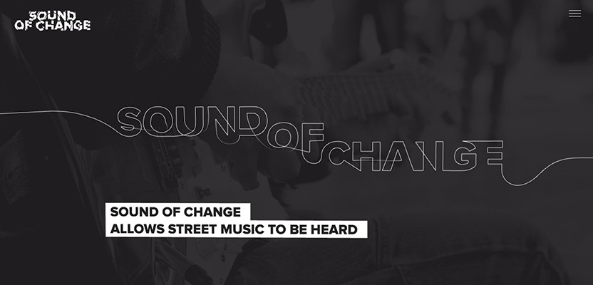
Check out the following examples from a design agency, an eCommerce store, and a digital marketing SaaS.
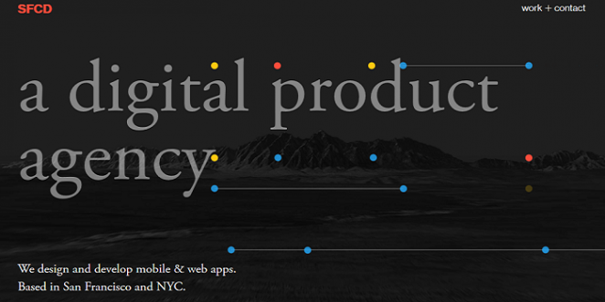
Source: SFCD
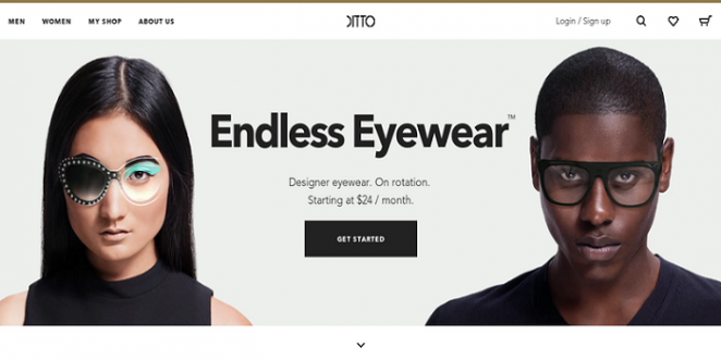
Source: Ditto
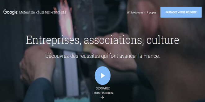
Source: Google Moteur Image
As long as it’s done right (without choppiness or adding too much bulk to page size), the trend itself isn’t harmful.
The designers will continue to experiment with above-the-fold in 2016.
2. Cards
Another design trend that will gain traction in upcoming year is the Pinterest style ‘card’ layout for showcasing content. The simplicity, cleanliness, and the way it just works with flat 2.0 makes card design an increasingly popular choice for e-commerce and websites with a lot of content.
Coca Cola’s ‘AHHH’ campaign, Sony, Blackberry, Flipboard etc. are already using card style to display their content without compromising on clarity and comprehension, especially for mobile users. From photography and portfolio sites, the trend for using cards has and will continue to spread out to blogs and e-commerce sites.

Source: Ahh
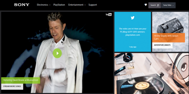
Source: Sony
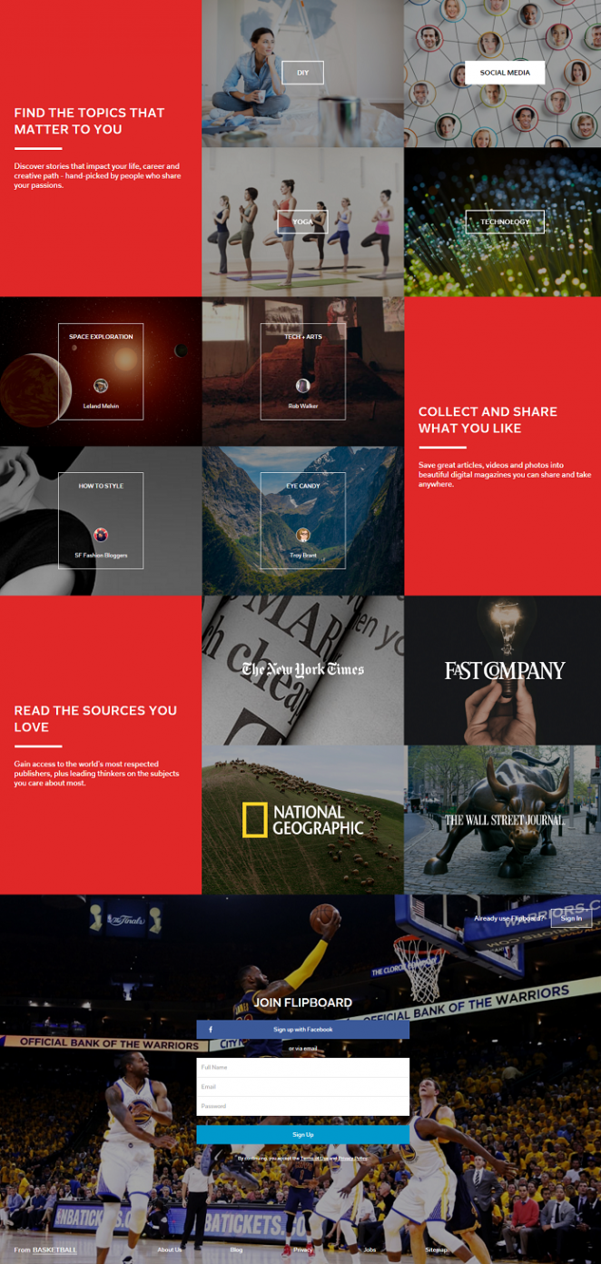
Source: FLIPBOARD
Designers’ job will be to come up with new and better ways to adopt this layout for the purposes of desktop (mouse) users.
3. ‘Infinite’ scrolling
You can thank Facebook and Twitter for this one.
Infinite scrolling came up as an excellent solution to display content to mobile users on responsive websites, and then took the shape of a trend.

Sure, it’s seemingly the perfect answer for large websites with too much content who needed to adapt to smaller bandwidths. Unfortunately, from all the data gathered so far in usability and eyetracking studies, the long length and continuous need to scroll increases fatigue.
The designers this year will have to come up with ways to only use Infinite Scroll where necessary so as to not bore or exhaust the visitors. Online stores can make great use of this scroll to display products, but the same applied to a blog post which just goes on and on will drive your visitors crazy.
4. The Hamburger
Whether you realize it or not, this one is a thorn in everyone's side.
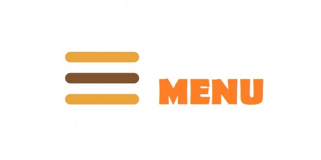
The hamburger menu came about as an ‘elegant’ way to hide the ‘unnecessary and clutter causing navigation’, which sounds to me the exact equivalent of stuffing all your furniture up in the attic to make your house minimalistic. Sure you’ll reduce clutter, but you are also causing your visitors discomfort.
Those who swear by this icon will call me a heretic, but I’ll stick to my old school methods of keeping things simple and accessible. When my grandma comes across a website I design, I want her to know, at one glance, which button will take her where she wants to go. Youtube, New York Times, etc. know it.
In 2016, this hamburger will continue to show up and confound the non tech-savvy people everywhere. It’ll be up to the designers to make this little icon more descriptive (with animations or effects) or give up using it altogether by switching to tabs or navigation-hub style pattern for mobile navigation.
5. Pop-ups Everywhere
Interruption marketing is the official term for this nightmare.
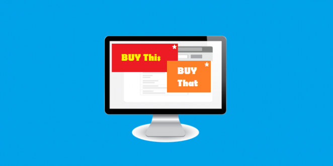
I can understand, from a marketer’s point of view, how important it is to remind visitors to share the content, or sign up, or download the free ebook, or like/follow the brand on social platforms. The trigger delayed pop-ups are the best shot at that. But trust me on this marketers, it’s really annoying.
I’ll explain it as a user and not a designer: When I have never even visited a site before in my life, I do not want to be ‘reminded’ of to sign up, or like, or follow, or share the content before I have a chance to even take a look at it (you know, because the pop-up asking me to sign-up to your website is blocking my view of your website!).
Unfortunately, despite everyone calling out ‘User experience’ at the top of their voices, 2016 will be a year when pop-ups will be used by everyone, everywhere.
It will be up to the designers and developers to make the transition smooth, to tie pop-ups neatly with the users’ journey, and to keep them relevant to the goals at the same time.
Here’s what 2016 holds in store for the web designers (create a to-do list now and start racking your brains to come up with new ways to work with these design trends):
- Above the fold focus: First Impressions matter a lot. Designers will continue to get creative with that first screen.
- Cards: Everyone is getting on it, and will continue to do so. E-commerce, photography, and portfolios aside, designers will have to create better ways to incorporate this comprehensible layout for other types of websites
- Infinite Scrolling: Again, finding the relevant context to use this on will be key.
- Hamburger navigation: Will continue to be a sore spot for many of us. We’ll have to find alternatives to clean navigation or make the hamburger more legible.
- Pop-Ups: Will be in vogue, so users will get more and more annoyed by every single website they visit for the first time. We have to work with these to make them less abrupt and more contextual.
Buckle up. We’ve got a lot to do. As long as your New Year’s resolution was to continue to learn, test, and debunk these fads by coming up with your own innovative tricks, you’re good to go.
Just remember the one advice I give to web designers:
"Keep it simple and familiar and users will love you."
- Words By Lucy Barret -
Lucy Barret works as a Sr. WordPress developer and has a great passion for omnichannel journeys and storytelling. She is an expert of converting HTML to Wordpress theme and has a team of expert developers to assist her. You can even follow her company, HireWPGeeks on Facebook.