
OK, I’ll admit that I’m far from an authority on design. I know what I like, and I like what I know is probably how I’d sum up my relationship with it. But one thing I have always enjoyed when it comes to how things are presented to me is to be surprised. How can something be reframed to feel like something completely foreign and yet intimately familiar? Finding that middle-ground is no easy task, to say the least.
The 5 packaging designs below, however, admirably subscribe to the ethos of making more out of less and contextualising products in ways consumers might not expect. There’s a lot to (if you’ll forgive me a pun) unpack here. So, sit back and let me take you on a journey through my personal favourite packaging designs of 2022.
Northern Monk
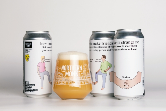
Packaging design rarely has much of a chance to be truly subversive. After all, you want people to buy you product, not take a picture of it, smirk and move on. The craft beer community, however, has been a safe space for subtle subversion, at least when it comes to design.
Enter Leeds brewery Northern Monk and their collaboration with the internet’s oddest illustrator, “Chris (Simpsons artist).” The design for their “how to make friends with stranger” beer is typically bizarre and only truly clicks when you’re about three beers deep. I’d like to think that’s entirely the point.
Demi Bai

Designed by the always inventive Han Gao, this design takes a bleakly utilitarian approach to hand cream design and somehow looks better the more the tube is used. The idea was to “embrace the degradation” and imbed that process into the design story of the product.
It’s a pretentious way of saying the tube looks cooler when it’s scrunched up and the mono-spaced font and austere grey colour palette makes it feel so alien and unique. Also, the whole idea of hand cream is that it’s meant to make your skin feel softer and smoother, so the idea of the packaging reflecting the opposite sentiment quite tickled me.
SK-II Beauty Broadcast
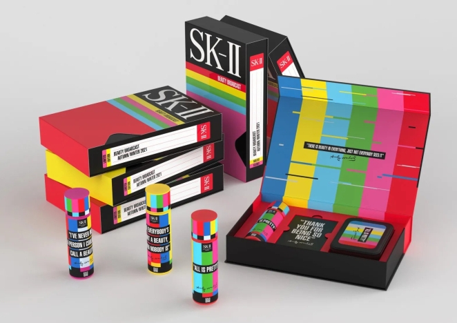
I grew up living above a corner shop my parents ran and we were the only place in our village from which you could rent VHS tapes. So, I have something of a strong nostalgic pull towards all things VHS (we also stocked Betamax, but let’s not go there). Needless to say, when I saw the design by Manchester-based creative agency Love for the collaboration between skincare brand SK-II and The Andy Warhol Foundation I was a little bit smitten.
Love chose to tap into Warhol’s fascination with the relationship between art and mass media for the collaboration. The limited-edition includes two gift sets, one taking the shape of a 1990s VHS tape, and another designed to look like a Warhol-era analogue TV, paying homage to the artist at the vanguard of developments in television, with his own MTV cable shows. It’s incredibly kitschy, of course, but that’s why it works – it captures the vibrancy and the absurdity of Warhol perfectly.
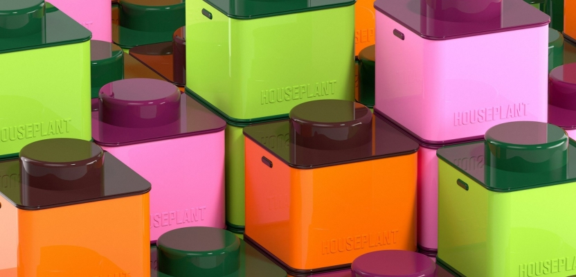
Houseplant
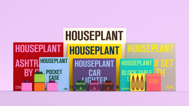
Cannabis is big business in California and there are few names as synonymous with the wacky baccy than comedian and actor Seth Rogen. In Spring this year, Rogan’s legal weed brand Houseplant (wonderful name, by the way) delivered a rebrand for their packaging that combined stackable, collectable products with a punchy custom typeface and modernist product design visuals. The result is packaging that stacks like Lego and looks like something you put on your shelf to look sophisticated. And I dig it.
Created by design studios Pràctica and Ma-Ma, the structure of the design remains simple - a drawer system has been implemented alongside a selection of bold block colours. A complimenting colour then features within the typography, line illustration, pull tab and eco-foam within. In efforts to keep the packaging as sustainable as the jars, Pràctica and Ma-Ma also designed a simple label wrap for the tins made out of cardstock paper with printed graphics.
Kiddi Winks

While some brands are still searching for the best way to captivate Gen Z, KiddiWinks – a plant-based milk brand for kids – is already looking to Gen Alpha, an age group born from 2010 onwards (the same year the iPad was invented). KiddiWinks launched on 22 November, with branding from Brooklyn-based studio Young Jerks and London creative agency Wildish & Co.
According to the two agencies, the central challenge to the work was not just catering to this upcoming market but to the parents buying the product, revealing elements such as nutritional information alongside playful accents, like animal mascots. An incredibly wholesome idea that really warmed my cockles. And tis the season for that kind of thing, right?