
In the UK, those standing for parliament always use the branding of their party. During the run-up to the recent general election, you may have noticed Labour candidates' posters were red and yellow with a red rose; Tories were all blue and white with their oak tree; and Lib Dems deep blue with a yellow bird device. Even UKIP stuck rigidly to their purple pound sign.
This isn't the case in America. Because their system demands candidates fight each other (electorally, not physically) for the right to stand for the presidency, they're all free to chose any logo they feel will give them the advantage. Some master the art admirably, others not so much. And with the whole campaign machine gearing up, ready to select a replacement for Obama, here's six political logos our US cousins will be seeing a great deal in the coming months...
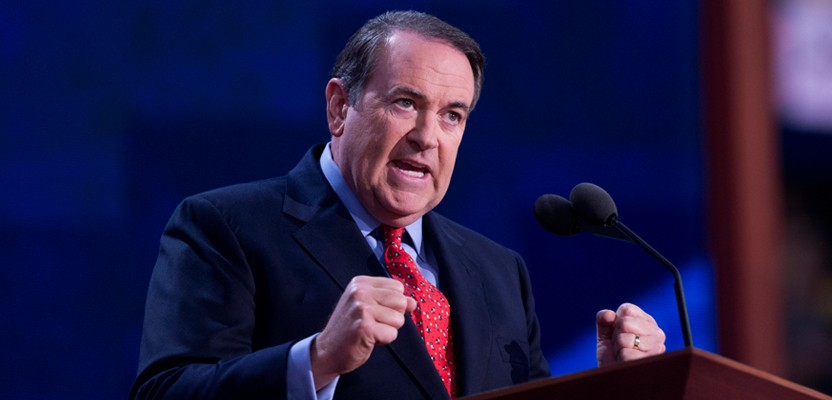
Mike Huckabee
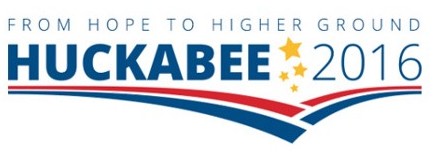
Crazy name, crazy logo - and sadly not a particularly good one. The red and blue swooshes feel broken and the gold stars very Disney-esque. The strapline's a bit meaningless too. 3/10
Lincoln Chafee
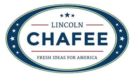
Another extraordinary name, but less of a scrappy marque. Lincoln's gone for stars again, but they're much more in line with those on the US flag. No need to add some extra ones over his name though, and the concentric elipses are somewhat old-fashioned. It may just be the man's surname's closeness to the word 'cafe' but this has the feel of a coffee brand. 5/10
Carly Fiorina

Something more modern here, from Ms. Fiorina. The message is very clear, but it's brave to use a red star, which is usually an indicator of communism. What's most striking is the lack of a second name. You'd think that'd be essential when you're chasing votes. Still, quietly classy and cool. 6/10
Martin O Malley
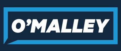
It wouldn't occur to many Americans, but to me this immediately reminds me of the original Oasis logo; which itself was an adaptation of the old 'mono' sign. At first I was confused by the triangle breaking through the bottom left corner, but now I see it's producing a speech bubble. This is a welcome effort, principally because it looks un-political, allowing it stand out amidst all the cliches. No stars either. 8/10
Rick Perry
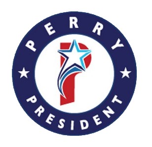
Ah! We're back to the stars again. Being sparing with the words only makes room for an awkward 'P' and a clumsy shooting star. The overall feel is something you'd see on a sports shirt - which, when one considers the gladiatorial nature of the American political rallies, might not be an entirely bad thing. 4/10
Hillary Clinton
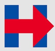
And here's the candidate many expect to win the White House. Her logo's attracted a lot of praise too. I'm less keen, I must say. Of course, the simplicity here is a virtue and the bold arrow is positive in its way, but I just feel I've seen this sort of thing on dozens of haulage trucks. Still, at least Mrs.C has swerved the cheesy straplines and overuse of stars. 7/10
Altogether now "Oh! Say can you see, by the dawn's early light..."
Magnus Shaw is a blogger and copywriter