
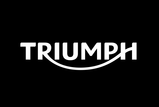
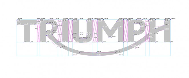
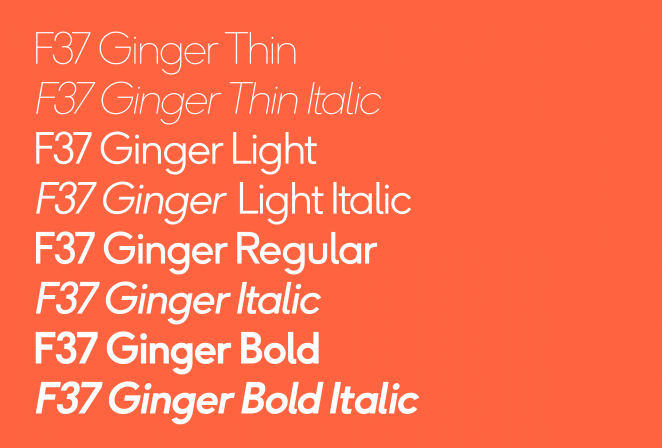
Rick Banks is an award winning, London-based designer, otherwise known as Face37. He has created brand identities, bespoke typefaces and logo designs for some of the world’s biggest companies, including Triumph, Douwe Egberts, Nike and Adidas. He is also the design genius behind F37 Bella and Ginger, two of the most popular fonts in HypeForType history.
We represent Face37 here at Jelly London and recently caught up with Rick to dig a little deeper into the way he works, and to find out who and what inspires him. (We also persuaded him to get Instagram. Go follow him: @_face37)
You have worked with an impressive range of diverse clients. How important do you think bespoke typefaces and fonts are in branding and design?
For me it’s hugely important and can have a massive impact. A distinctive font makes a brand memorable. It is a badge of distinction, a bold statement of individuality. It gives a brand an ownable, unique asset and it can give a company a sense of identity. The idea of creating bespoke display typefaces is becoming the norm now. The usual corporate ‘text’ typeface with little personality just isn’t enough anymore. Bespoke type has become synonymous for brands like Macmillan, EE or more recently Channel 4. Take their logos away and the brands are still recognisable due to their powerful brand asset.
What’s one of your favourite uses of a bespoke typeface by a brand in recent years?
Ian Brignell's alphabet in 2011 for Coca-Cola and their 'share' campaign. The personalised bottle idea proved to be a hugely successful campaign — the first time sales increased in 10 years. It’s no surprise Coke chose to expand their logo into a typeface. The ‘you’ typeface has become as iconic as the logo itself.
We think it’s safe to say that not everyone will know or understand the process behind creating a bespoke typeface or font. Can you talk us through the way you work?
My design process is quite simple really. I always try and strive for that one idea. That idea could be as subtle as ‘perfect' circles within a font, or the ’T’ found in the Triumph logo. I also have a mantra which is ‘Copy, Twist & Execute.’ With every project, be it type or branding, my first stage is delving deep into inspiration. Stage two is twist; creating something brand new and exciting with a great idea within it. Stage three is putting in the hard work and executing it so it looks beautiful.
What are some other benefits of investing in a bespoke font rather than a standard, licensed font?
Bespoke fonts have many attributes. Along with having a unique brand experience, companies can cut costs too. A brand can avoid having licensing problems by owning all rights. Traditional font licenses often have surcharges or additional licensing required, not only to give to printing vendors and partners, but to embed the font in an ebook, use for web, or on a car’s dashboard.
Also, global companies license off the shelf fonts for language support in certain countries. With a bespoke font it can grow as a company grows and evolves i.e. adding global alphabets to it.
What sort of briefs do you prefer working on?
I prefer tight briefs from clients. But briefs should always be challenged and pushed to the maximum.
What, and how, do you share your work with the client along the way?
The process starts with research and this is shared with the client. Stage two is conceptualising three routes for the client to pick. Refining and executing the clients preferred route is the final stage.
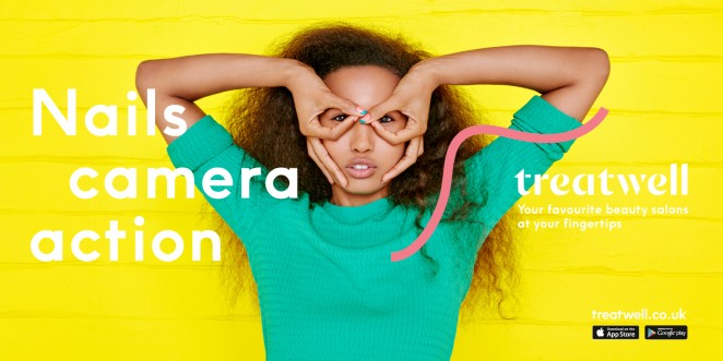
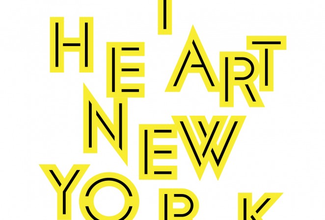
You can currently see your Ginger typeface splashed across the London Underground for Treatwell’s rebrand. Can you tell us your inspiration behind Ginger and Bella?
Like in a lot of my work, the main inspiration for Bella & Ginger was geometry. Bella features perfect circular ‘ball’ terminals which is very unusual in type design. Ginger’s ‘counters’ also feature near perfect circles.
If you could describe yourself using any font, what would it be?
Probably Helvetica. Understated and a real work horse.
You teamed up with renowned graphic designer Milton Glaser to bring one of his most famous typefaces to the digital age. Tell us more about that.
It was a dream come true working with Milton. I’ve loved his font Glaser Stencil and all its weights since I first got into graphic design. I emailed him asking about digitalising the lighter weights and he sent me an original scan from the 60’s. It was a real honour and privilege working with Milton to bring the whole font family back to life.
Who else inspires you?
I get inspired by everything. Not just design. It could be a film, a book or something I over hear on the tube. I’m never switched off and I’m always thinking.
Face 37 has donated over £20k to charity. Can you tell us more about your charity work?
Back in 2013, I published a book called Football Type. A book that traced the history and development of type in football, from the hand stitched numbers first used on kits in the 1930s to custom fonts created for major clubs and sports brands today. The book took 2 years and nearly killed me!
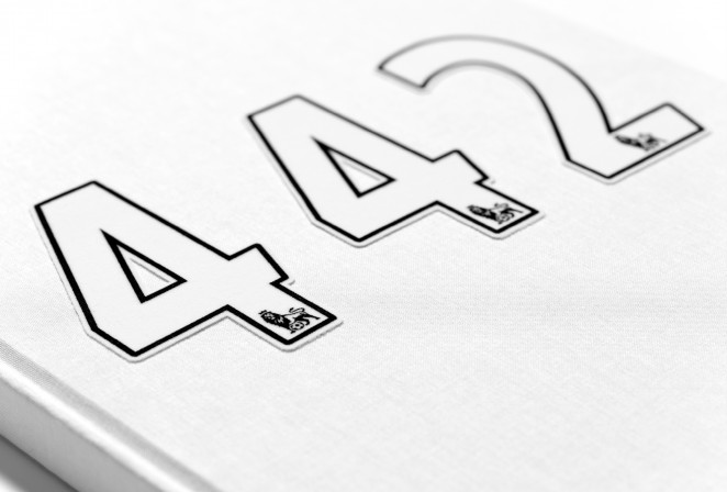
I gave all the profits to charity and it was the most rewarding thing I’ve done in my career. The £22.4k raised went to a Bolton grassroots football club (where I’m from) and the money will go towards new changing rooms and pitches. Let’s hope Bolton produces the next Messi!
Last but not least, do you have any exciting projects in the pipeline?
I’ve got a new sans-serif font coming out next month called F37 Bolton. I’m also publishing another football book with designer Craig Oldham called ‘I Belong To Jesus’. The book brings a myriad of graphic, illustrated, and declarative communiqués created by footballers and revealed to the masses after scoring a goal and removing their strips. Covering Politics, Religion, Personal Matters, and Football Folklore, from some of the worlds greatest players, the book provides a visual narrative of perhaps one of the last real, personal, unchecked forums and genuine connections between player and supporter. The book is a graphic celebration of those celebrations. The memorable and meaningful moments created when a player connects with their supporters, sharing the collective euphoria of a goal.
Stay up to date with all things Jelly: Facebook | Instagram | Twitter | Pinterest