
Colour psychology is defined as the study of hues as a determinant of human behaviour. In simpler terms, colours can have a deep and sometimes subconscious impact on our thoughts, actions, and habits. While this concept can be applied to many aspects of human life, it’s interesting to observe how brands exploit colour psychology to increase their success.
84.7% of consumers name colour as the main reason they purchase a particular product, which supports the idea that colours can have the power to influence how we behave - especially when it comes to our purchasing habits.
Heriot-Watt University takes a deep dive into the reasons behind colours powerful influence and how some of the biggest brands use colour psychology to improve their business.
Coca-Cola – Red

This iconic red branding can be spotted almost everywhere. Although red is often associated with danger, it also signifies passion, power, and energy, making this hue a fantastic choice for a company that sells fizzy drinks.
The colour red demands your attention, and it’s been proven to quicken the human heart rate at the same time as raising blood pressure. When this logo is spotted, the average human feels courageous and ready to take action. Because it can evoke feelings of urgency and excitement, it triggers impulse buys, boosting sales of the fizzy drink. That’s exactly the outcome a drink manufacturer would want!
Coca-Cola's branding journey hasn’t always been a smooth ride. When they released Diet Coke and Cherry Coke in the 1980s, the lack of consistent colours (plus a new block-like ‘Coke’ logo replacing the emblematic ‘Coca-Cola’ script) caused people to think that these variations were not part of the same family but competition from different manufacturers.
Once the branding team rectified the issues and created a more harmonious approach to the spin-offs, Coca-Cola continued to thrive and remains the market leader and world’s most valued soft drink brand. The famous red colour can be found in each Coca-Cola variant, including Coke Zero and Sublime Lime. As of 2022, the company is worth $271.28 billion.
Ford – Blue
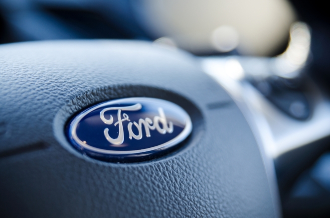
Blue is used in branding and marketing to evoke trustworthiness, dependability, and commitment, which could be why automobile manufacturer Ford transitioned from their greyscale logo to (permanently) blue in 1927. Now it’s one of the world’s most recognisable brands.
Ford joins Facebook, Oreo, Skype, and PayPal as big trade names that utilise the colour blue in both their logo and marketing efforts. Some of those studying a psychology degree believe that the blue hue signifies peace and consistency because it’s the same colour as the sky and ocean, something humans often see and associate with calmness.
When it comes to something as serious as purchasing a car, we want to know that we’re in safe hands, so it’s crucial that Ford’s audience views it as a trustworthy, steady brand. Choosing a blue background with white text (which portrays elegance and purity) certainly plays a massive part in this.
Founded in 1903, Ford went through four different logos before introducing the notable blue colour once in 1912, and then again in 1927. While the logo has been tweaked and updated since, they’ve never steered from the soothing blue. Now, the company is worth $63.20 billion.
McDonald’s - Yellow

This giant fast-food restaurant needs no introduction. Since the 1960s, McDonald’s has been represented by the colours red and yellow. Similarly to Coca-Cola, red evokes feelings of energy and excitement, and it’s been proven to boost the human appetite. This, paired with the yellow, which promotes happiness and optimism, makes the McDonald’s logo a very powerful symbol.
The brain processes colours ahead of words and shapes, which is why it’s fundamental that businesses choose the right colours to represent their brand – and stay consistent with them. Despite going through many more logo variations since 1961, the yellow and red colours have remained a staple part of their brand identity.
Yellow is often associated with sunshine, hope, and laughter, all of which make humans feel happy. For someone chasing a dose of cheerfulness, a visit to McDonald’s would be a simple, fast, and cost-effective way to secure it. So, if this fast-food chain continues to use the colour yellow throughout its branding and marketing, it should continue to enjoy the astronomical levels of success first achieved in 1955. As of 2022, McDonald’s had a market cap of over $191.58 billion!
Nickelodeon – Orange
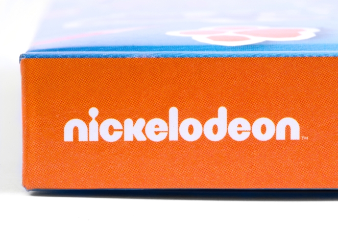
Nickelodeon (sometimes referred to as Nick) launched in 1979 as the first cable channel for children. Nickelodeon has consistently used orange throughout its logo and marketing since 1984, taking advantage of the creativity and youthfulness this colour represents.
To children, the colour orange evokes excitement, playfulness, and entertainment, and for adults, it’s safe, reassuring, and appropriate. A company like Nick needs to be able to convince both parents and children that what they produce is worth tuning into, as that determines their level of success.
Nickelodeon started as a cable channel for children, but the brand has since launched popular games, movies, mobile apps, magazines, radio stations, hotels, cruises, and theme parks. Each spin-off features the colour orange in some way, whether that be on the hotel balcony or through the placement of the iconic logo.
Although the channel lost a large percentage of its audience – around 60% between 2010 and 2020 – it's still regarded as a successful, enigmatic brand with an estimated net worth of $1.19 billion. Whether you’re a fully-fledged adult or a growing child, you’re likely to recognise the Nickelodeon logo and experience the joy that the orange colour encourages.
Colour psychology is a powerful concept
Think about your favourite brands and the colour that they’re associated with. Now that you have a better understanding of colour psychology and the power it has on human behaviour, you’ll likely conclude that the colour wasn’t chosen at random; c ertain colours are associated with different emotions.
Red is synonymous with action and passion, orange represents creativity and youth, pink is for femininity and romance, green is associated with growth and renewal, and yellow represents happiness and hope. We’ve only scratched the surface here!