
Being an exhibitor at an industry event or trade show like Sigma, offers companies a unique opportunity to attract and engage with prospective customers. It’s the perfect place to create a positive first impression and generate new leads.
But for any brand to undertake a stand, there’s a lot more to getting it right than meets the eye.
We sat down with Rebecca Barbara Sant, Founder of The Authentic Brief to discuss one of her most recent designs for Valletta Pay, a company that specialises in next generation bank accounts.
Where did you kick off with Valletta Pay’s stand at Sigma? What was your starting point?
To me, it always starts with perfecting the brief. I need to know what exactly my client wants to achieve. What their overall objectives are and how would they define it as being a success.
For Valletta Pay, it was a mix between creating an eye-catching design but also a functional space with different meeting areas and ample storage room. This brand is focused on speed, accuracy and flexibility - values which needed to be reflected in the space they booked.
Does the size of the stand impact your design?
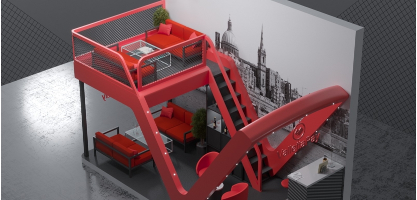
It’s true that larger areas might allow for more creativity but on the other hand, I’ve seen some impressive smaller stands over the last few years which are still breath-taking for their clever use of space. For Valletta Pay, we had a 6x3m floor space, which is still a pretty decent size to work with.
We needed to maximise the floor space as much as possible, so taking up the height of the stand to create a second floor was a creative solution. Another important aspect is not enclosing the stand with high walls and confined spaces. Instead I wanted something more open and airy. Inviting, but at the same time sleek. We also needed plenty of meeting areas, so moving upwards was a good direction to take.
How does branding influence your design?
My next step is always to look at the brand itself. Valletta Pay recently updated their website design and I wanted a stand that reflected their new image as closely as possible. Elegant but interesting.
Their brand colours are a combination of a vibrant cherry red and a more formal, almost knowledgeable dark grey. This was interesting as it gave me the opportunity to create bold contrasts in the stand design using their colours.
Talking of sleek design, talk to us about your innovative treatment of their logo into the stand’s structure?
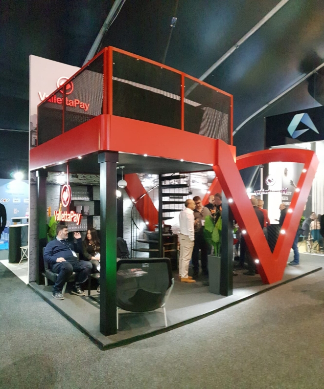
We knew we needed height, at least three separate meeting areas and that we didn’t want the stand to be too closed off. Based on the name Valletta, a city renowned for its bold architecture, I was inspired to turn the V into a sculpture, something which the rest of the stand’s structure would be based upon and almost ‘grow out of’.
We used this open V design to then extend and create the second tier of the stand, which would house a third meeting area. The rounded edges inside their logo were also important. I didn’t want hard lines and strong edges, instead it had to be an open flow. The overall result was smart, inviting and also unusual.
So how did the flow on the stand work?
Aside from strong branding on both the top and bottom levels to make it visible to people from different sides, we thought about how people would need to use the stand. We had a small reception desk with storage and a general meet and greet area used for first introductions to the company.
Just behind this, we placed a bar complete with a fridge where staff could offer prospective clients a glass of champagne or whisky. To the left of the stand, we placed a set of sofas which could be used as a second meeting area.
This was directly underneath the top floor which held a more private meeting area, or an area where staff could quietly catch up with work. We added large wall prints with beautiful aerial shots of Valletta in sync with their brand look on the website.
How important are the smaller details? The finishing touches?
I’m a great believer in paying attention to smaller details. They’re often one of the most important element on a stand because if you can get people into the area, what makes a person want to stay would be their physical experience of the space.
For Valletta Pay we even included scents – sometimes something as simple as a great smell can create a positive reaction. We made sure we kept clutter on the stand to a minimum through clever storage spaces, even though the space we had available was limited. It was designed for comfort for the visitor.
Cold drinks such as champagne and whisky, comfortable seating and areas to talk privately. I also wanted to play on the contrast of colours, so cherry red sofas and seating which would contrast nicely with dark grey uniforms for the staff.
Was the outcome successful for Valletta Pay?
Overall yes. We gave the brand an opportunity to be noticed and leave a lasting positive impression. The stand design was both impressive but also functional.
What advice would you offer other companies looking for something fresh and innovative for their stand designs?
I think it comes down to who you partner with to achieve your goals. I’m a strong believer in taking the time to get to know your supplier/client.
That way you can be sure that the person bringing your brand to life has the same values you do and will deliver on your expectations. Combine this with clear and constant communication and you have a recipe for success. The more authentic the brief and the partner, the better the result.