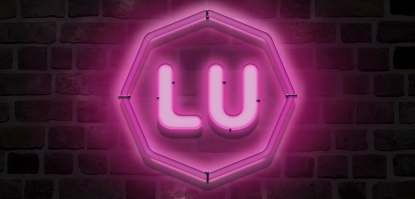
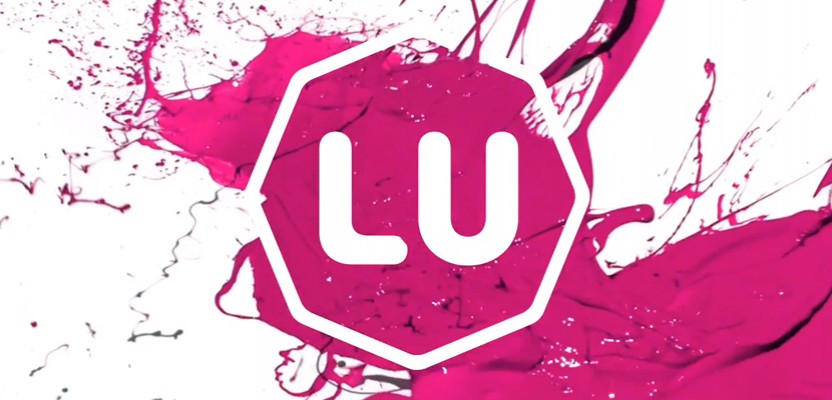
Loughborough University announced this week that it will be temporarily halting the rollout of its new visual identity as a result of a petition set up to revoke the revised logo, which was supposedly developed with the aim of bringing the branding and visual collateral of the university, but ended up instead causing a minor controversy. The new more subtle, octagonal logo was designed by an in-house team in conjunction with Campbell Rowley, and was intended to replace the classic shield design, which the University has been using since 1996. The octagonal design was set to be used in conjunction with the University's coat of arms, which was first developed in 1909 when it was founded, but many students (both former and current) have argued that the new design simply doesn't reflect the quality and heritage of the educational institution.
Loughborough University Visual Identity Examples
The petition to keep the old logo was set up by University alumnus Scott Lawrence, and has already surpassed 12,000 signatures. It states: “This is not a petition against change, it’s a petition against bad brand design. The purple and pink shield emblem has become iconic in attaching Loughborough University’s ideas of prestige, heritage and respect. The new brand identity instantaneously loses all of these values and the new logo completely devalues all sense of quality as a trusted academic institution.” Comments on the petition page are surprisingly heated for such an issue, with one student claiming the new logo undermines the University's credibility and another inferring that the simplistic design takes simplicity too far.
Loughborough University will be temporarily halting the rollout of its new visual identity as a result of a petition set up to revoke the revised logo
Despite this backlash, according to Emma Leech, director of marketing and advancement at the institution, open presentations showing off the new identity and calling for feedback from student union executives, the alumni advisory board and staff, yielded positive reactions. She said: “The shape of the device allows us to have recognition and consistency. The octagon is designed to be an agile device that can be exploited in digital and print, and has limitless possibilities to be dynamic.” Indeed, it would appear the logo was designed very much with digital and social media platforms in mind, as (like with any good digital logo) it's simple, clear, flexible, and can be infinitely customised with little effort.

The coat of arms was also never intended to be scrapped completely, with the University still claiming it had every intention to use the iconic brand for ceremonial purposes, such as on degree certificates. The argument used by the University, however, is that the more ornate elements of the design simply didn't work well with most digital applications, and I can see why! There is also a deceptive element of history behind the new octagonal design, as it represents the shape of a fountain installed outside the university building in 1938. The octagon aims to be used as a base shape behind which a range of imagery can be placed, and according to Leech is just a small part of a wider ongoing change for the University, which will be expanding this yeah with a new London campus. Whilst Leech is adamant that the new identity will go ahead (in one form or another), it has been paused momentarily whilst the University conducts a series of open meetings to help reach a compromise. It has also supplied an email address that will allow students to provide input into the development process of the identity.
The petition to keep the old logo was set up by University alumnus Scott Lawrence, and has already surpassed 12,000 signatures
Leech added “The debate has become about a small, graphic element of a much broader shift and change in strategy. We need something that will work across campuses and allow our print and digital collateral to reflect prestige, quality, modernity and innovation. There is clearly strength of feeling around the change in the visual identity. It is important that this is acknowledged. There are, in my view, very strong reasons for the change and we have clearly failed to communicate some of these. Equally, I am happy to admit that there may be concerns we haven’t fully anticipated and changes may be necessary. I hope to be able to harness the engagement that this issue has generated to positively benefit the university we are all committed to.”


Benjamin Hiorns is a freelance writer and musician from Kidderminster in the UK. He honestly doesn't mind the logo, but then he never went to Loughborough University, so what does he know?


