Mad River
Bournemouth
ABOUT
The Brief
Mad River was tasked with reimagining Roastworks for a market where trust is in decline and brand claims are increasingly met with scepticism. In a crowded coffee category shaped by polished storytelling, surface-level ethics and familiar visual tropes, the challenge was to create a distinctive identity that could cut through while expressing something far more meaningful: truth. The goal was to reposition Roastworks as a challenger brand with conviction and build a cohesive identity system that could work powerfully across packaging, retail and digital touchpoints.
Concept
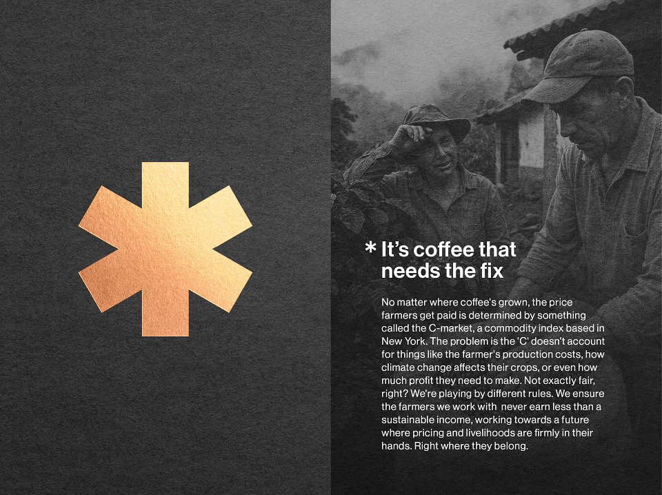
Our strategy centred on a single, powerful idea:truth as a visual language. In a world shaped by misinformation and declining trust, we saw an opportunity to create a brand that did more than communicate. It would disclose.
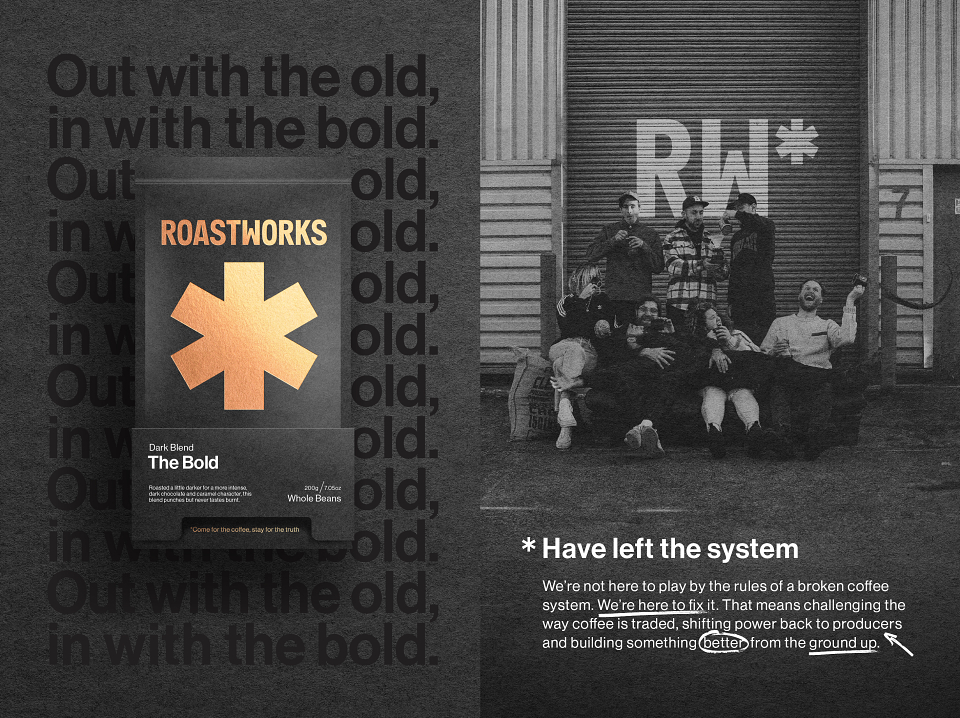
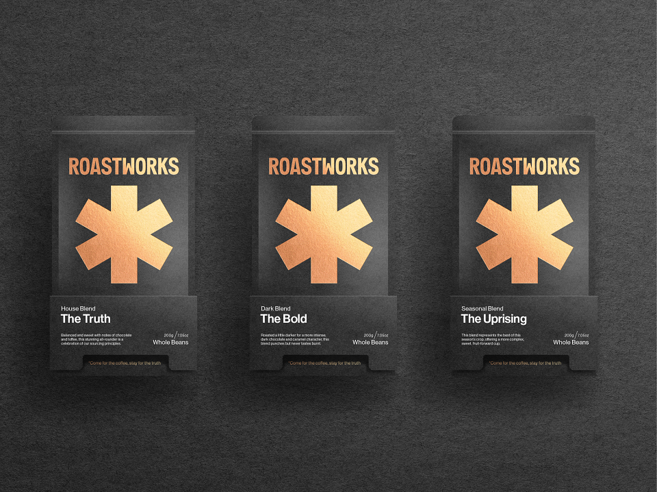
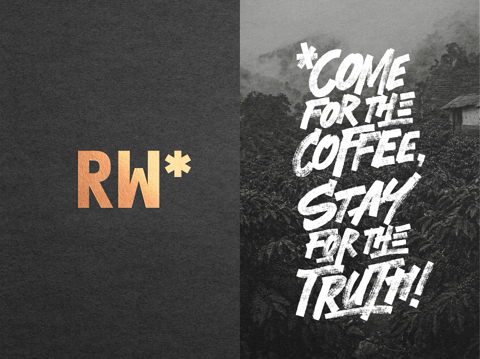
At its core is the asterisk (*) reclaimed from its traditional role for hidden small print and transformed into a symbol of openness. Rather than concealing information, the asterisk invites discovery, prompting audiences to question, explore and understand the deeper realities of coffee production.
This device anchors a wider identity system that pairs real statements with real imagery, stripping away artifice to reveal uncomfortable truths about sourcing, pricing and sustainability. In a world where trust must be earned, the identity positions Roastworks as a brand that uncovers the deeper realities behind coffee production, sourcing and value.
This transformed a familiar graphic device into something much more powerful: a mark of honesty, curiosity and belief.
Execution
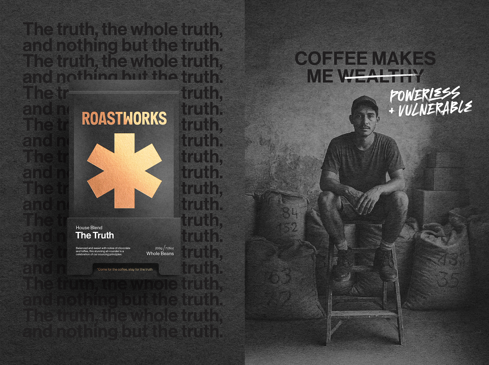
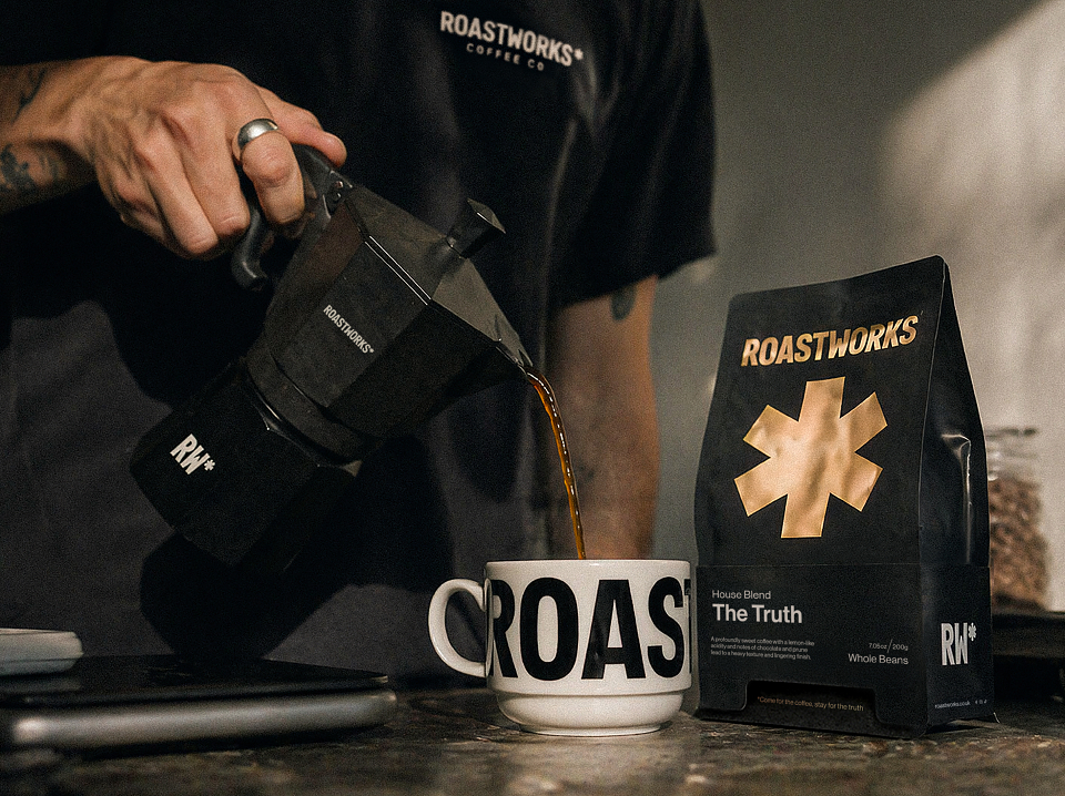
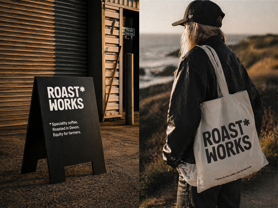
The asterisk became the defining device of Roastworks, anchoring the entire identity system as both a visual marque and a storytelling tool. It created a flexible and instantly recognisable framework that could travel consistently across every touchpoint, from pack to screen to shelf.
The wider design language was deliberately stripped back for clarity and confidence. Real statements were paired with real imagery to remove artifice and challenge the category’s reliance on polished but often empty narratives. Typography, layout and messaging were designed for immediacy, directness and impact, allowing the brand to speak with the same clarity as the truths it was revealing.
Rather than adopting the expected codes of speciality coffee, we created an identity with sharper intent: bold, purposeful and culturally aware.
Results
Roastworks repositioned the brand as a more distinctive and credible challenger in a competitive market. The identity created greater cohesion across packaging, retail and digital communications, sharpened brand cut-through and gave Roastworks a more ownable expression of its values. More importantly, it established a long-term communications platform built on revealing rather than concealing, proving that branding can do more than differentiate. It can build trust.
The impact was both immediate and measurable. Since launch, the website has seen a 14% uplift, while independent stockists have reported strong anecdotal increases in both new and repeat customers. Most notably, Waitrose and Ocado delivered a 90% increase in unit sales in the seven months after the rebrand versus the seven months before. In the words of Gee Owen, Marketing Manager: “Orders have been going bananas, above forecasts!”
Roastworks demonstrates how visual identity can move beyond aesthetics to become a force for clarity, honesty and change, proving that in today’s world, the most powerful brands are those that tell the truth.