Made by Campfire
Subiaco
ABOUT
Challenge:
Say With Chocolate is a cheeky and fun anagram chocolate and gag chocolate company based in Perth, Western Australia. Crafted using Affinity Designer + Photo on the iPad Pro, in 2020, we had the delightful opportunity to work on the launch of the new company and product "Say With Chocolate." My role was to focus on branding and packaging, aiming to create a brand that could expand to multiple sub-products.
The Outcome:
The result was a fresh, colorful, and innovative design that not only stood out in the crowded chocolate market but also perfectly complemented the quirky nature of the product.
PHASE ONE
DEVELOPING THE STRATEGY
In a whirlwind one-day facilitated session, we uncovered the challenges that Say With Chocolate faced as a company. During this process, we prioritized the needs and goals of the business and its customers, revealing issues with the current brand that were driving away potential clients. This session became the bedrock for the branding and marketing plans for 2020 and beyond.
DEFINING THE BRAND
Through a series of engaging exercises, we were able to distill and refine the key pillars of the brand, defining its personality—how it should look, sound, and behave.
UNDERSTANDING THE USERS
Say With Chocolate finds itself swimming in a sea of chocolate brands. To stand out, it was crucial to pinpoint and narrow down their target audience to design a brand and product that resonated with them. We created unique user profiles to represent a diverse range of attendees, painting a vivid picture of their demographics, psychographics, needs, and desires.
POSITIONING
Understanding the essence of the Say With Chocolate brand and identifying who they champion helped us craft a compelling positioning statement for the organization.
PHASE TWO
Brand Refresh
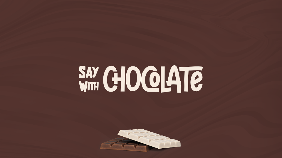
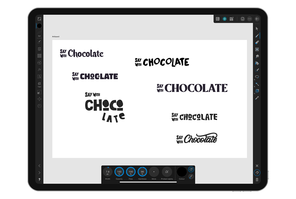
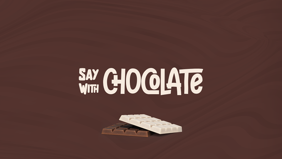
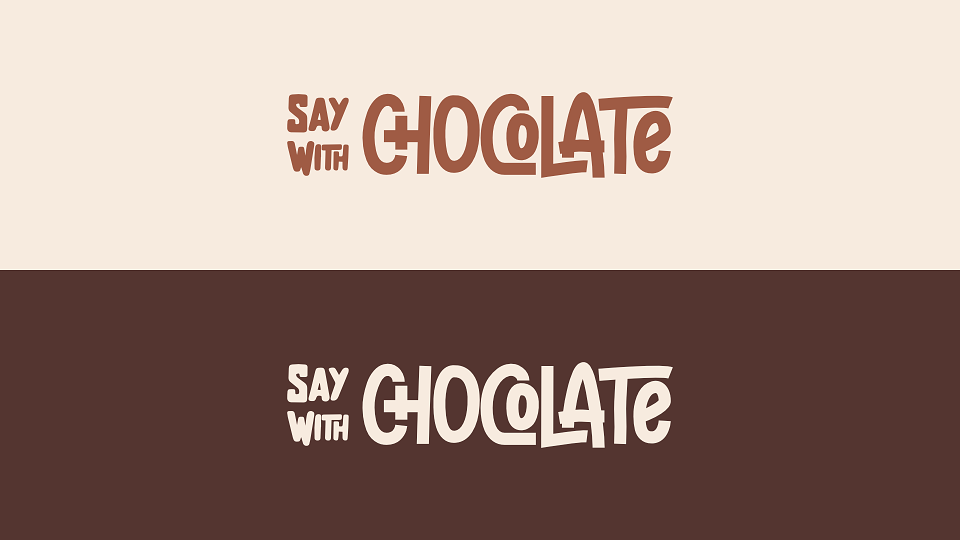
When it came to the logo, the client wanted versatility, allowing the "Say With" part to remain consistent across sub-brands while the accompanying word could change depending on the sub-product. We designed "Say With" with a custom typeface that works well and looks sharp with various other types and word lengths.
The design placed "Say With" on separate lines, maintaining the same point size and font across sub-products. The product text (in this case, "Chocolate") was aligned to the right, accommodating different fonts and word lengths without compromising the design’s integrity. This approach allowed the product text to take on more character and style, reflecting the brand’s playful personality through the letter design.
PHASE THREE
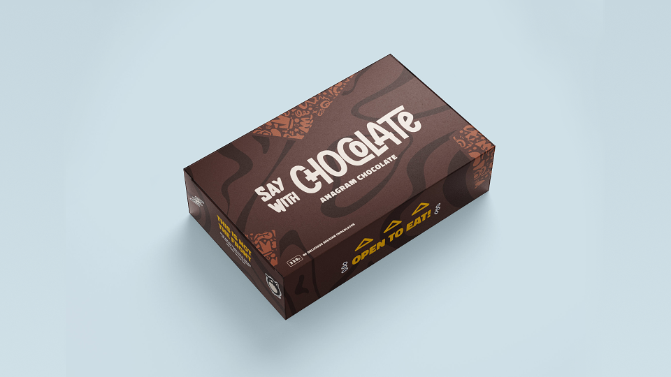
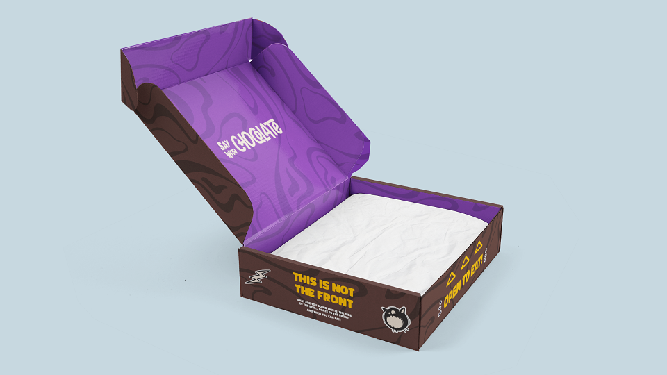
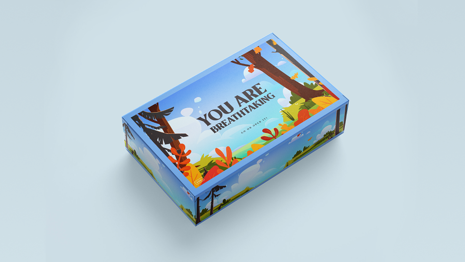
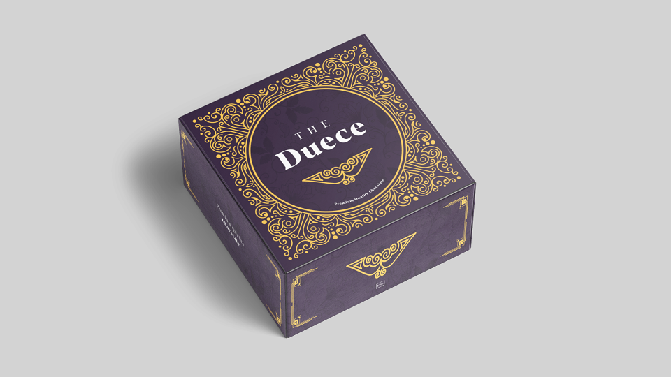
IT'S JUST A BOX, RIGHT?
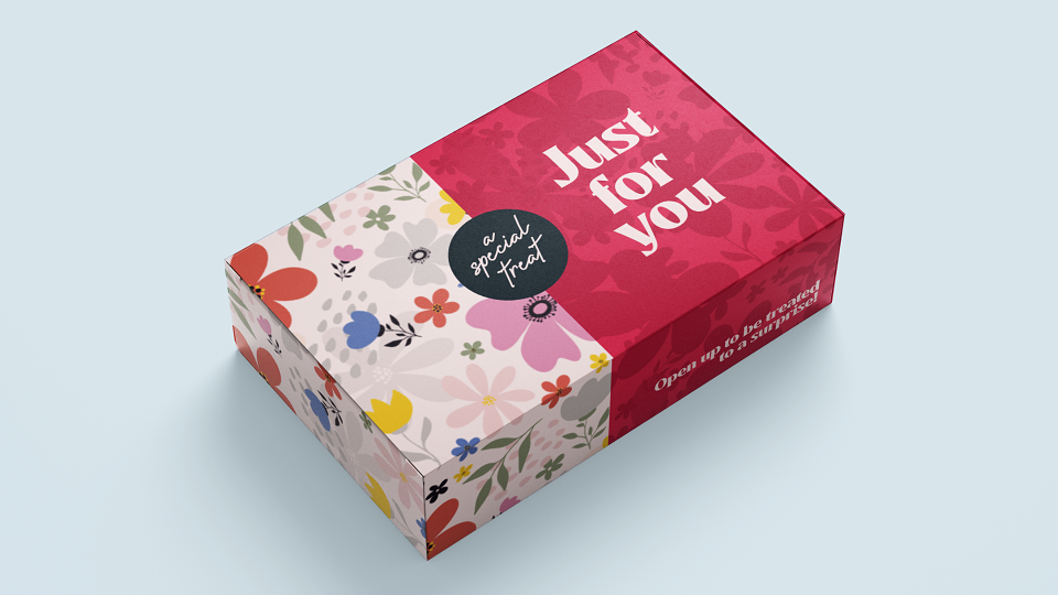
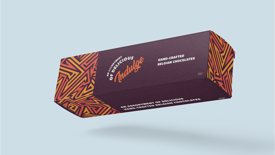
Chocolate isn’t just about the logo; it’s also about the box it comes in! We aimed to create a box that felt like chocolate as soon as you saw it, making you want to snatch it off the shelf and indulge immediately. The design featured chocolate swirls and a patterned shape incorporated within the overall design—elements that would be consistently used throughout the branding plan.
Given the brand's quirky nature, we wanted to infuse the packaging with humor. Each side of the box featured a funny message to entertain and delight the buyer.
Thank you for checking out some of my work. If you’d like to work together, then fire up the dial-up!
We are your full-service graphic design studio for small businesses. Grow your customer base, build trust, and increase sales through bespoke branding packages made accessible through flexible payment plans.