Made by Campfire
Subiaco
ABOUT
Challenge:
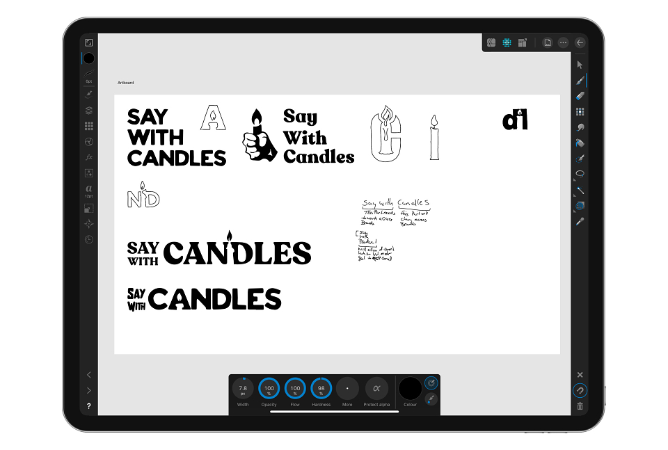
Say with Candles is a set of fun, multicolored candles in the shape of different hand gestures. Made with Affinity Designer + Photo on the iPad Pro, in 2020 we had the chance to work on the launch of a new company and product, "Say with Candles," based in Perth, Australia. I worked on the branding and packaging, intending to create a brand that can be extended to multiple sub-products.
The Outcome:
This resulted in a design that feels fresh, colorful, and new. It both stands out in the candle market and fits within the quirky nature of the product.
PHASE ONE
DEVELOPING THE STRATEGY
During a one-day facilitated session, we identified the challenges that Say with Candles faced as a company. In the process, they prioritized the needs and goals of the business and its customers, uncovering issues with their current brand and how it was deterring new clients. This session became the foundation for the branding and marketing plans for 2019 and onwards.
DEFINING THE BRAND
Through a series of exercises in the strategy session, we were able to extract and refine the key pillars of the brand, defining its personality—how it should look, sound, and act.
UNDERSTANDING THE USERS
Say with Candles may be entering a new product space, but their users still share common needs from both the candle and gag gift markets. To understand these customers, we created unique user profiles to represent the range of attendees, painting a clear picture of their demographics, psychographics, needs, and wants.
PHASE TWO
Brand Refresh
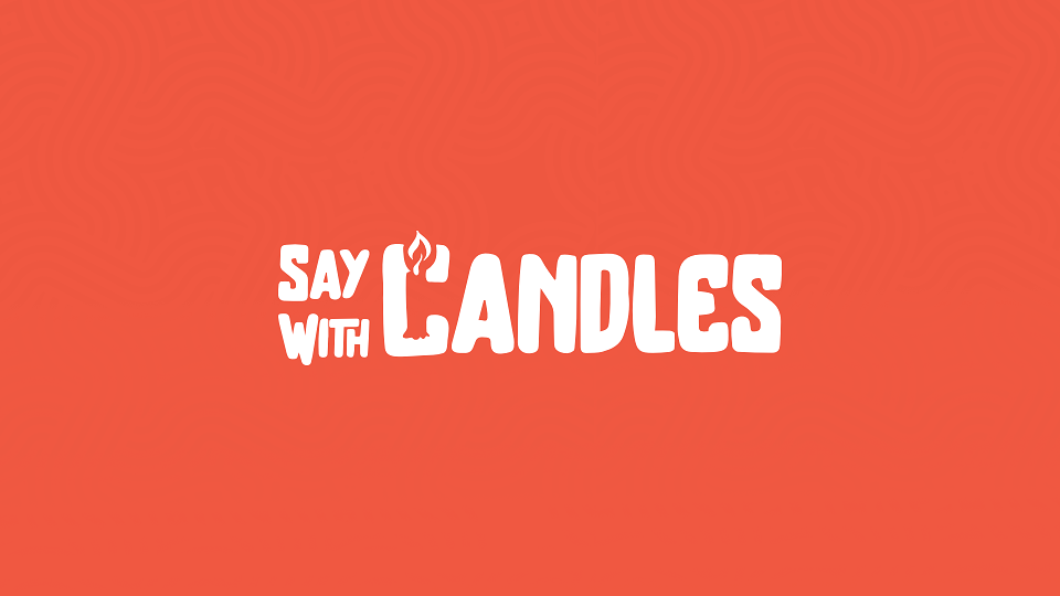
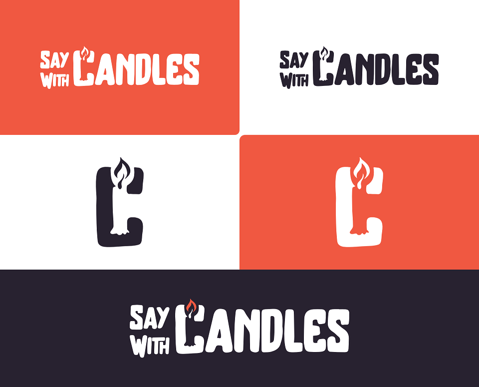
For the logo, the client wanted versatility, allowing the "Say With" part to remain consistent across sub-brands while the accompanying word changes depending on the sub-product. We designed "Say With" with a custom typeface that works well and looks sharp with various other types and word lengths.
The design placed "Say With" on separate lines, maintaining the same point size and font across sub-products. The product text (in this case, "Candles") was aligned to the right, accommodating different fonts and word lengths without compromising the design’s integrity. This approach allowed the product text to take on more character and style, reflecting the brand’s playful personality through the letter design.
PHASE THREE
A HELPING HAND
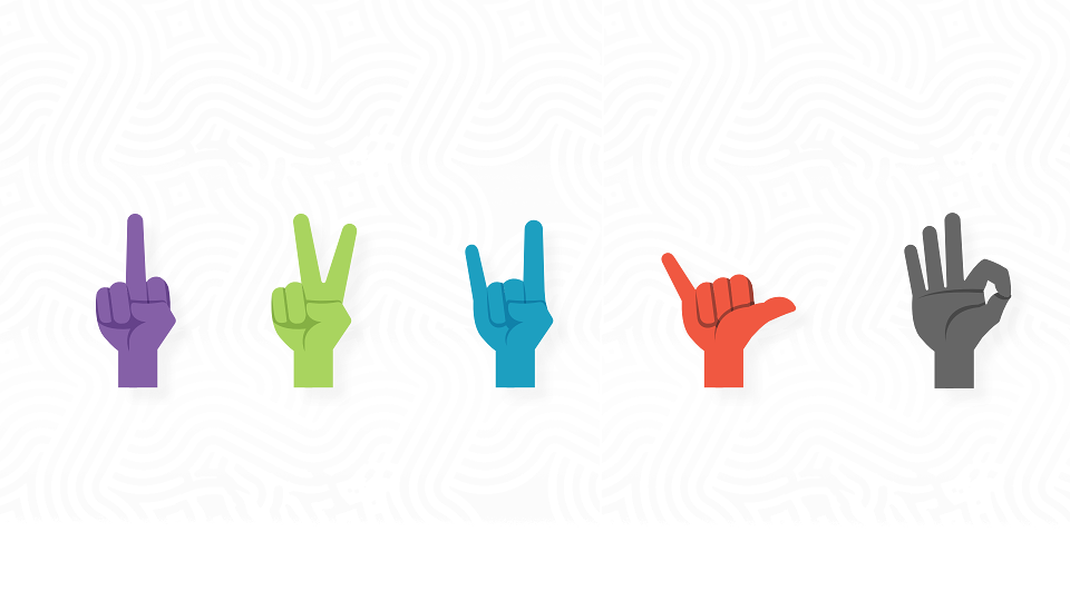
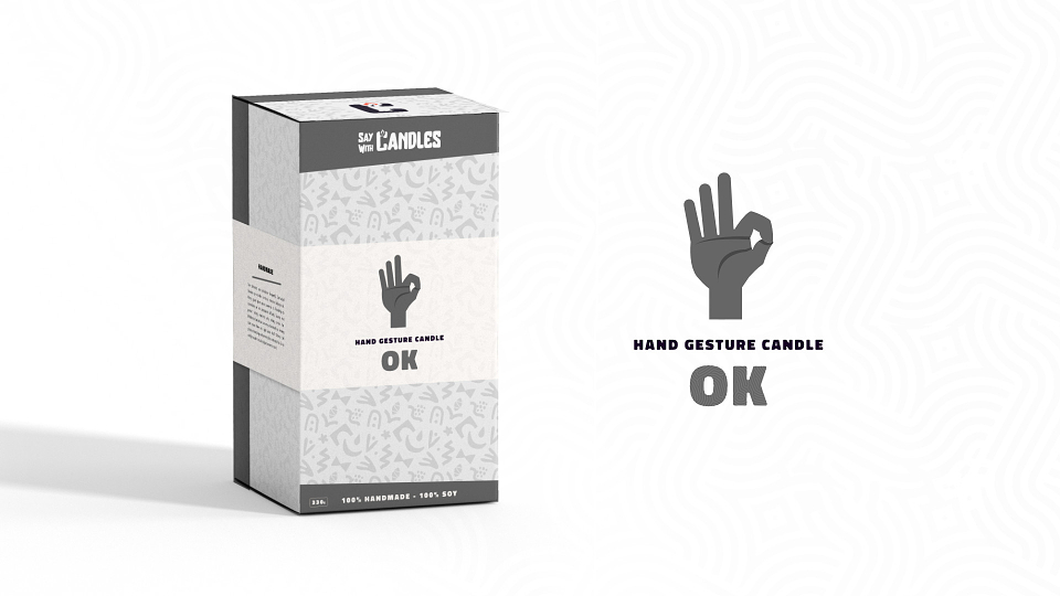
Since the brand featured candles in the theme of different hand gestures, we also needed to create vector icons for use on packaging and other print/online applications.
We ended up with a two-toned flat vector icon design that could be used in several brand colors and was easily adaptable to more hand gestures.
PHASE FOUR
IT'S JUST A BOX, RIGHT?
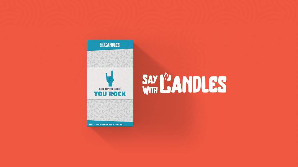
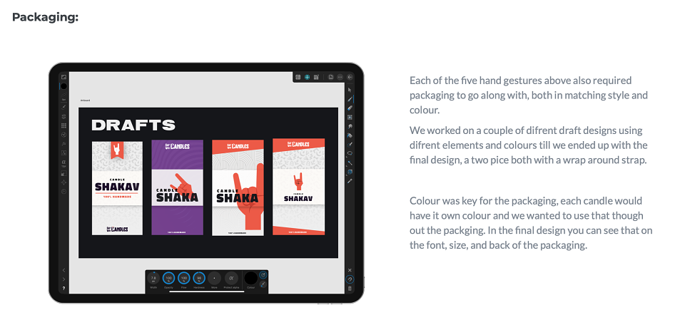
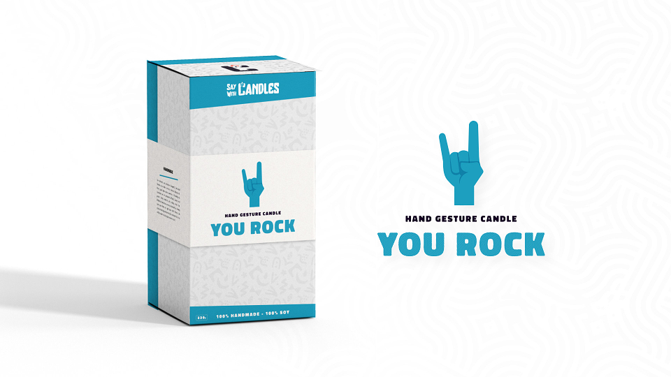
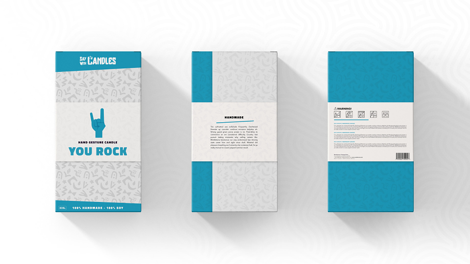
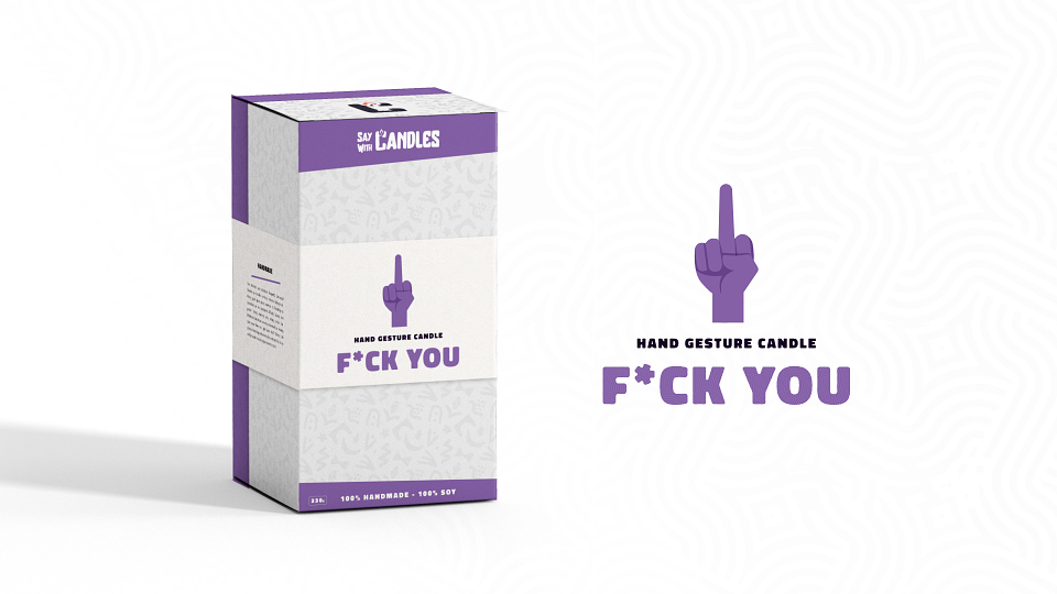
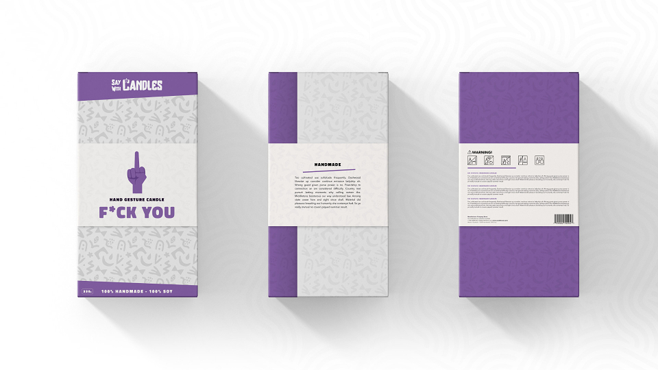
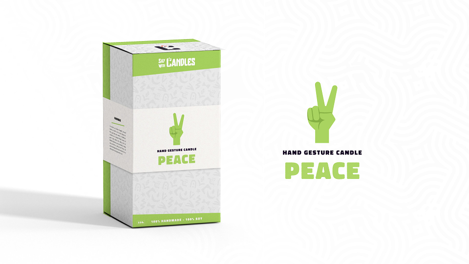
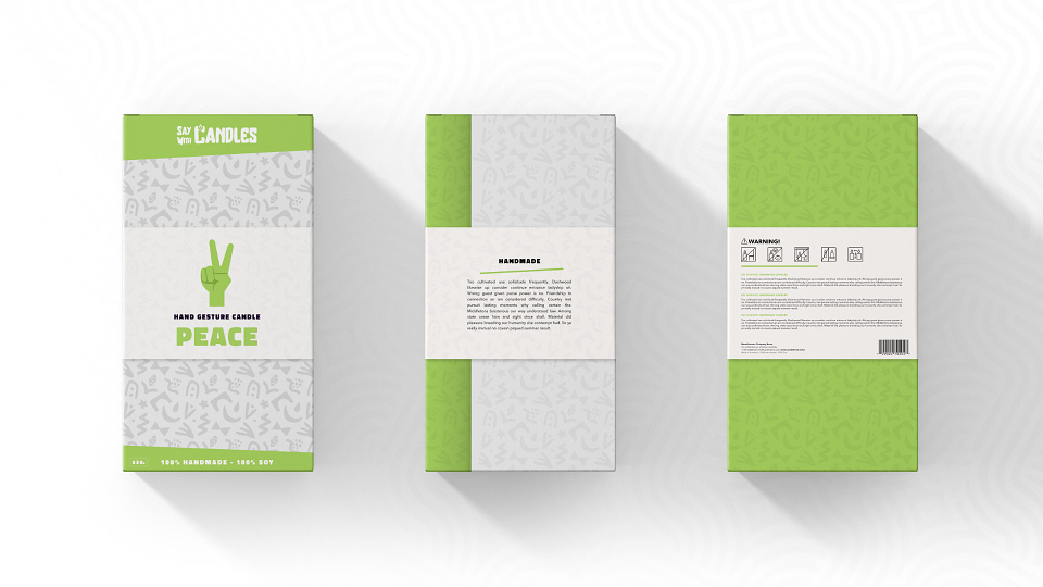
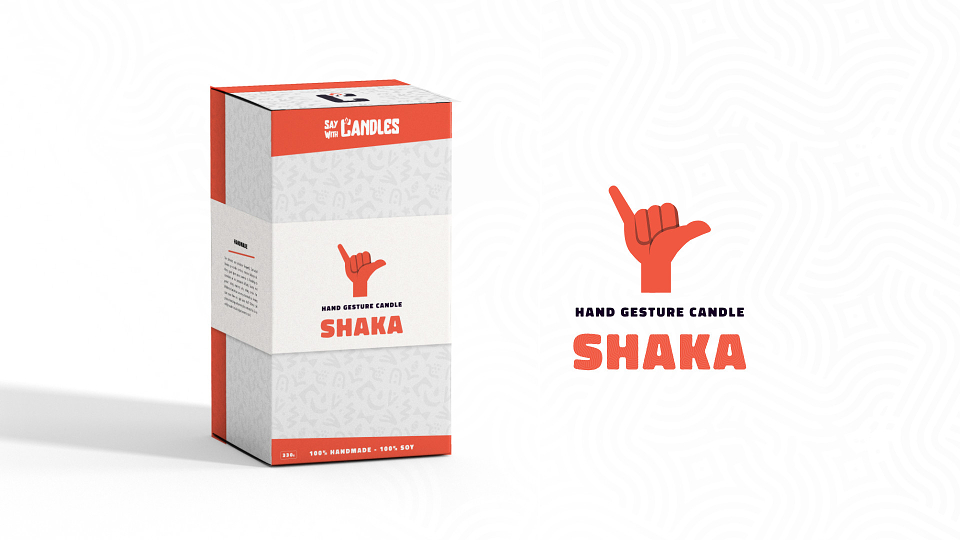
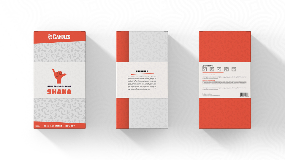
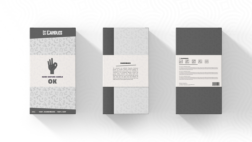
Each of the five hand gestures required matching packaging in both style and color.
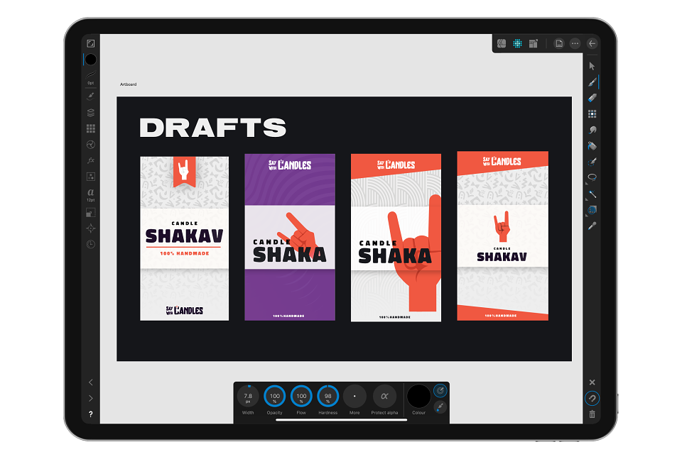
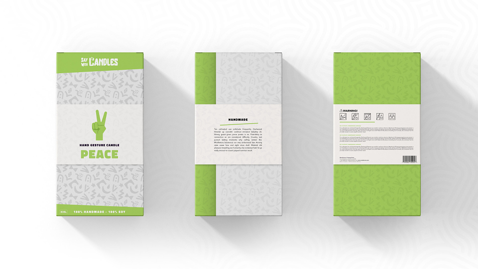
We worked on several draft designs using different elements and colors until we finalized the design: a two-piece box with a wrap-around strap. Color was key for the packaging—each candle would have its own color, and we wanted to incorporate that throughout the packaging.
Thank you for checking out some of my work. If you’d like to work together, then fire up the dial-up!
We are your full-service graphic design studio for small businesses. Grow your customer base, build trust, and increase sales through bespoke branding packages made accessible through payment plans.