Muhammad Adam
Creative Director
ABOUT
PROJECT DESCRIPTION:
People Arches is a progressive McDonald's franchise dedicated to serving local communities through hospitality, teamwork and meaningful local initiatives. While operating within a globally recognised brand, the organisation wanted its own identity to represent its community programmes and strengthen its local presence. I was commissioned to create a complete visual identity that balanced corporate professionalism with a warm, people centred approach.
THE BRIEF:
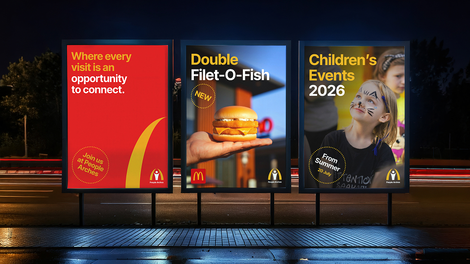
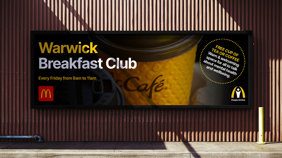
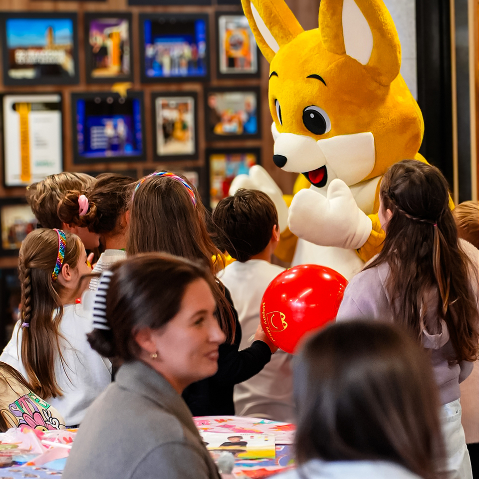
The brief was to design a distinctive logo and visual identity that reflected the values of connection, support and community. The identity needed to feel approachable and welcoming while remaining versatile enough to work across children's events, charity partnerships, breakfast clubs, internal communications, social media, advertising and printed materials. It also had to complement the wider McDonald's brand without competing with it, creating a recognisable identity for local community initiatives.
MY APPROACH:
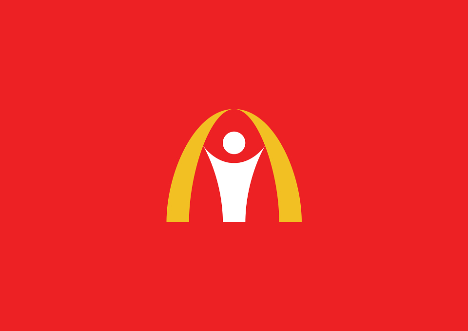
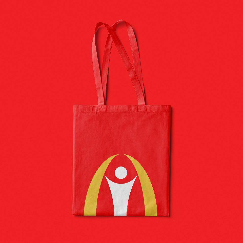
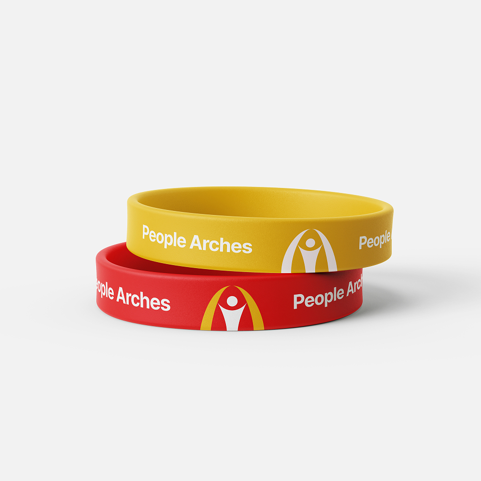
My approach focused on creating a simple yet meaningful identity centred around people. The logo combines a human figure with an arch, forming a distinctive symbol that represents support, connection and unity. The mark was intentionally designed to feel inclusive and approachable, reflecting the organisation's commitment to putting people at the heart of everything it does.
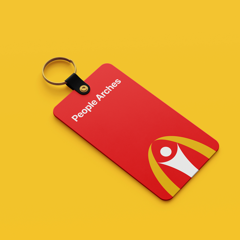
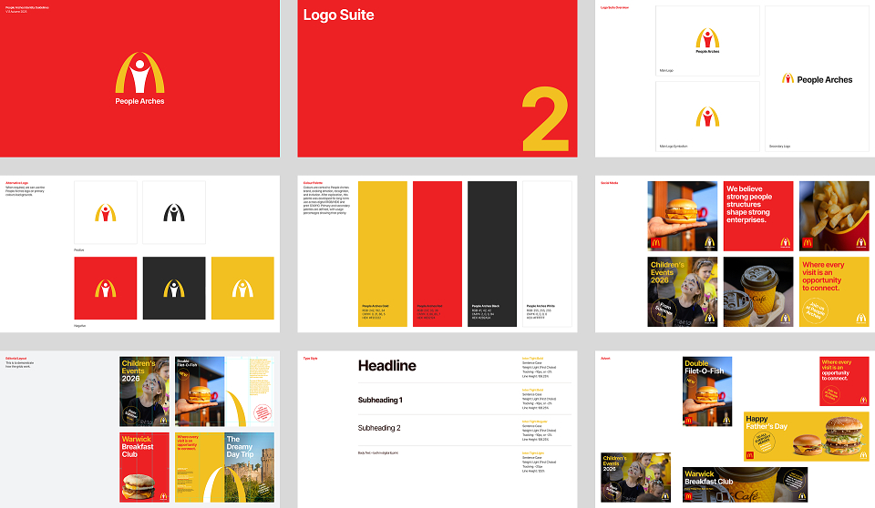
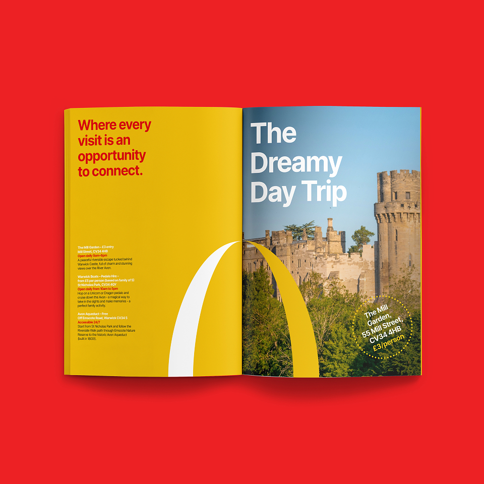
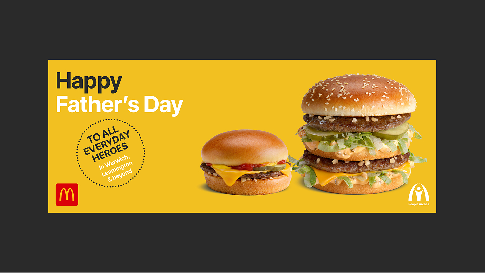
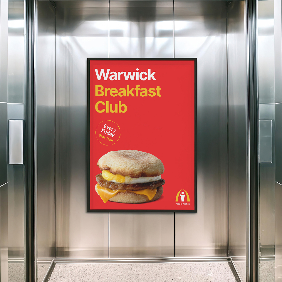
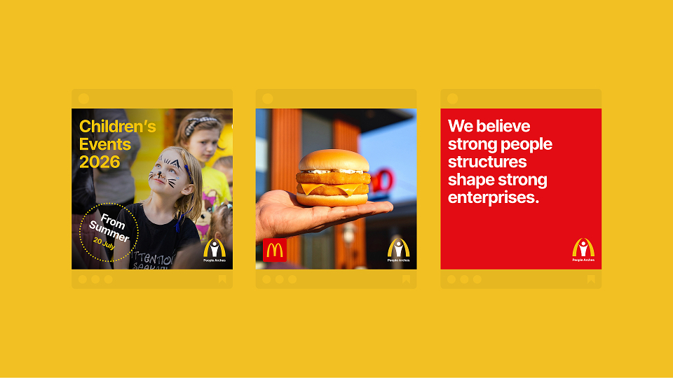
Alongside the logo, I developed a complete visual identity system including typography, colour palette, imagery, editorial layouts, social media assets, advertising and comprehensive brand guidelines. Every element was designed to create a consistent and flexible brand that could adapt across both digital and printed communications while maintaining a strong and recognisable presence.
THE RESULT:
The final identity gave People Arches a bold and recognisable brand that successfully connects its franchise operations with its community outreach programmes. The flexible visual system works across a wide range of applications, from children's events and local breakfast clubs to promotional campaigns and internal communications, creating a consistent and welcoming experience throughout.
The client was delighted with the outcome, particularly how the logo captured the organisation's mission of keeping people at the heart of its work. The success of the project led to a long term creative partnership, with Usuren continuing to support People Arches through ongoing brand development and identity management.
MADEIT CREDITS
-

Dawood IbtehsamClient
-

Muhammad AdamCreative Director -

UsurenBranding Agency