LYON&LYON
Sheffield
ABOUT
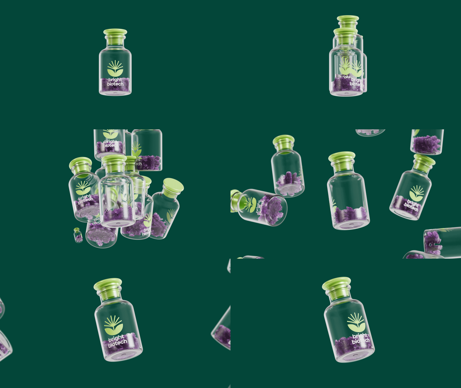
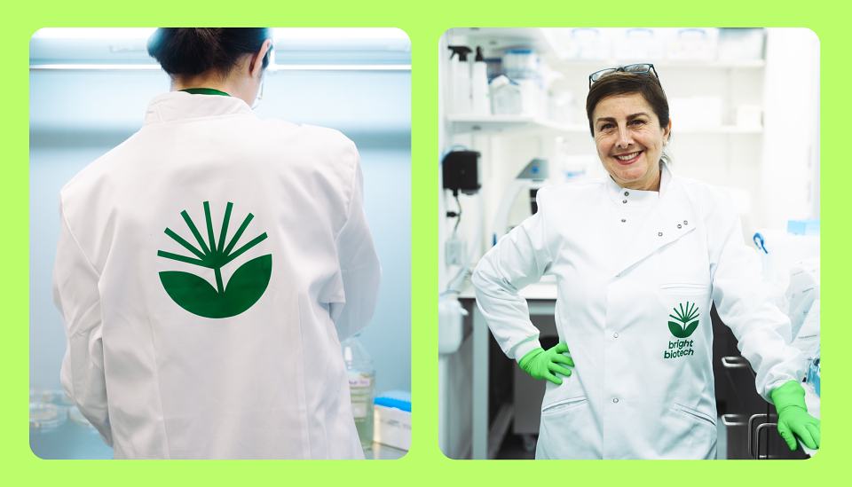
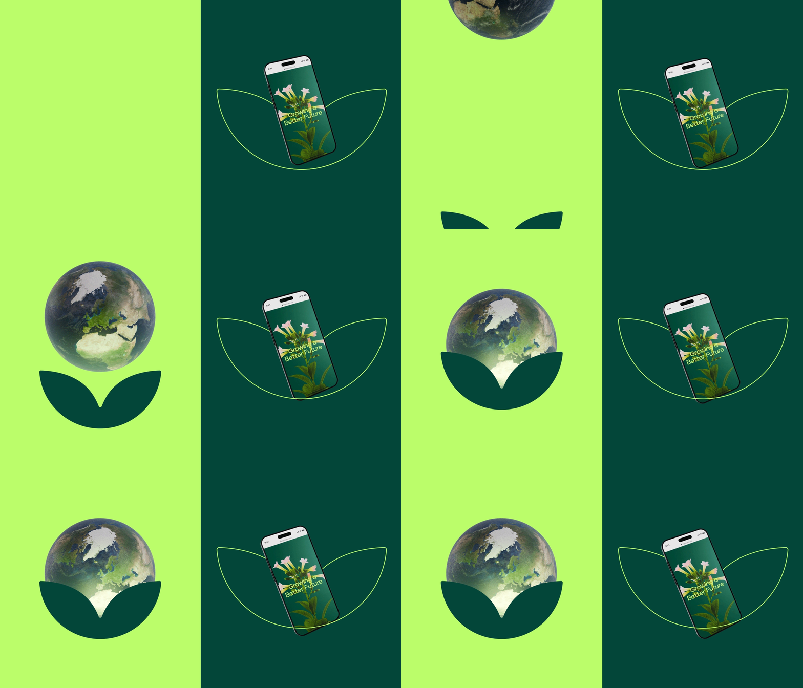
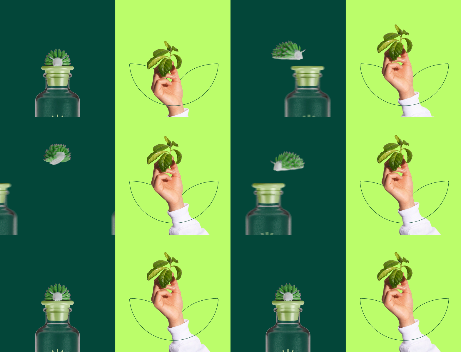
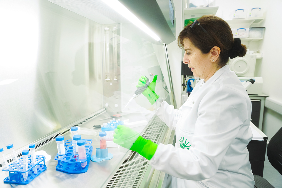
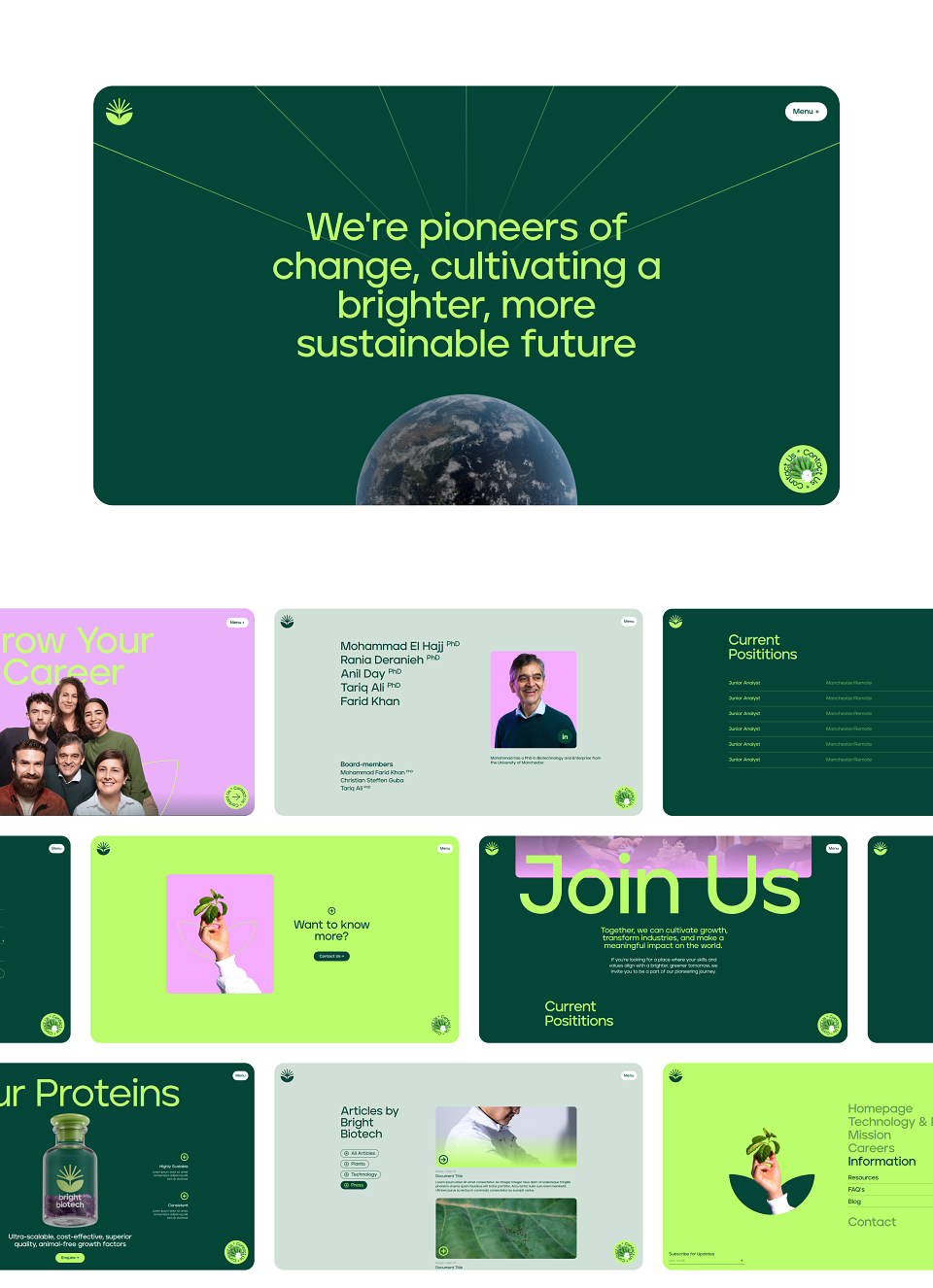
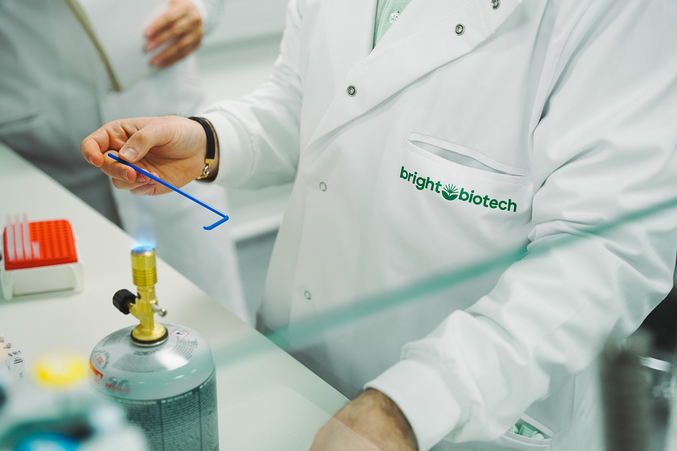
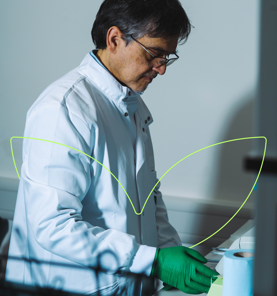
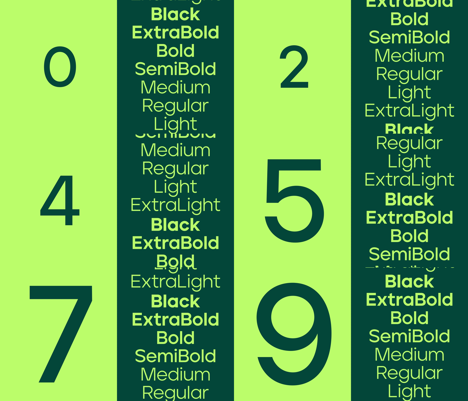
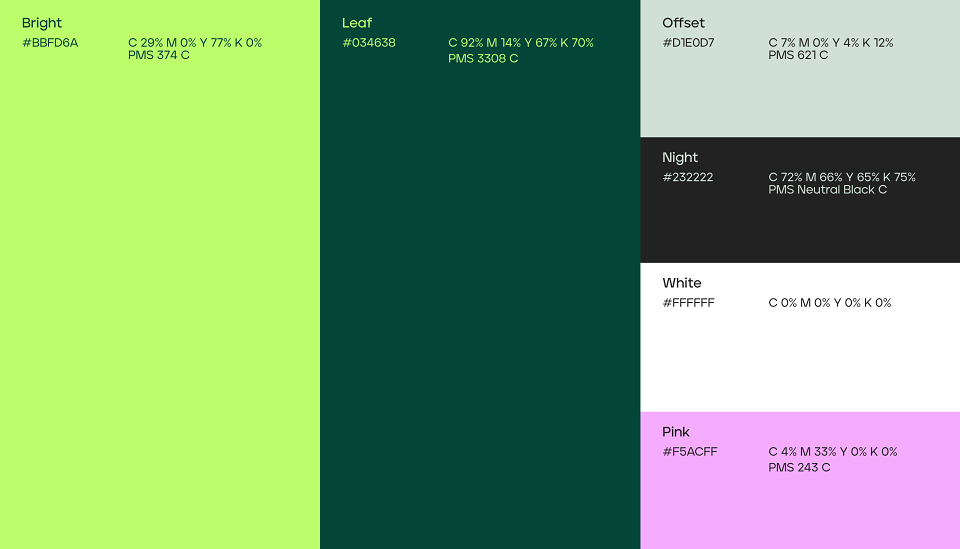
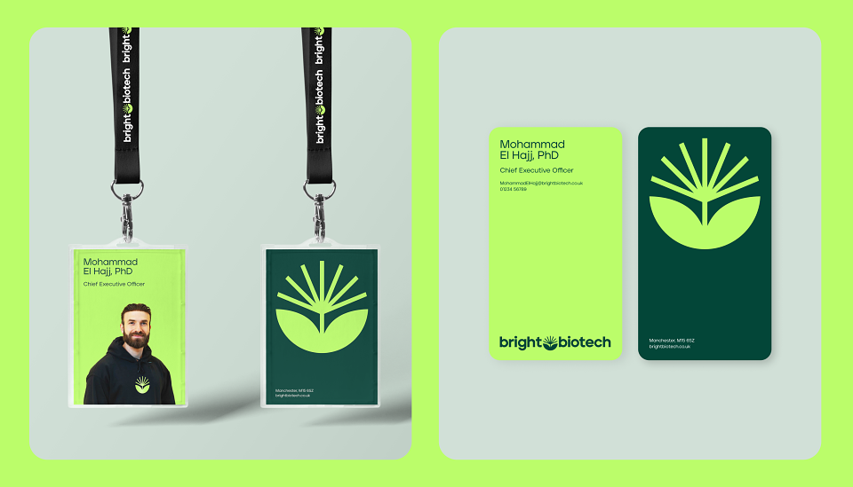
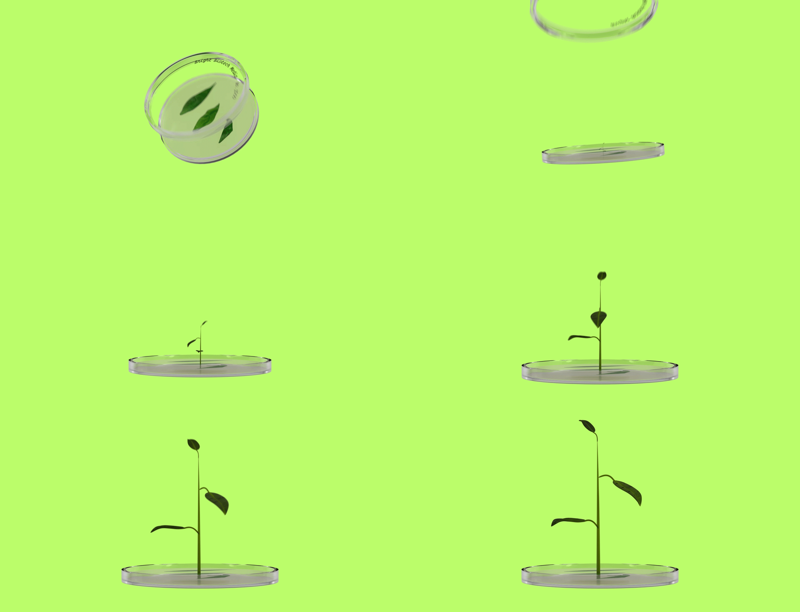
Bright BiotechSTRATEGY, BRANDING, IDENTITY, WEB-DESIGN & MOTIONBackgroundWhat is Bright Biotech?The short answer: They're a pioneering, sustainability-focused company who use chloroplasts to express high amounts of proteins in plants, for use in life sciences and food.The long answer: they transform chloroplasts into natural bioreactors to produce ultra-scalable growth factors for cellular agriculture and regenerative medicine. Phew!Sounds complex, but it's all about using plants to make essential proteins in a sustainable way.BriefThey approached us as they were on the cusp of a significant growth stage. With expanding the team and more raises on the horizon, co-founder Mohammad sought Lyon & Lyon to make a real change to their brand. The existing branding and website was (for the biotech World) good but it wasn't World class. He wanted something that would shake up the industry, clearly tell their story and attract the best talent. SolutionStarting with strategy, we soon landed on the brand essence “ Growing Brighter Futures” . This became a real mantra for the whole visual language starting with the logo. We developed a new ID which cleverly merged a bright spark and geometric plant paired with vibrant RGB focused colour palettes. A revolutionary biotech firm needs a revolutionary website, and we created just that! The opening sequence uses coded animation to take users on a journey, guiding through different levels of understanding. Team imagery is sharp and normally accented with the leaf or a pop of gradient from what we call the “Bright” green. Together all these elements combine to represent real change graphically and symbolically for all the team at Bright Biotech. .