Louise Swanepoel
Graphic Designer
ABOUT
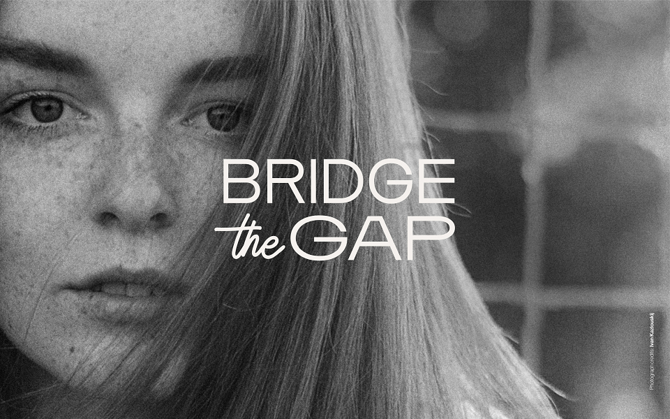
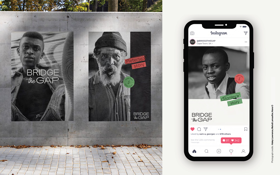
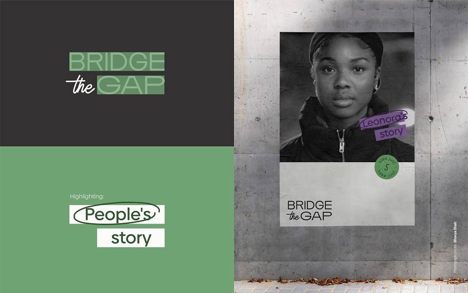
Bridge the Gap is a non-profit organisation that wants to bridge the gap between rich and poor by telling the stories of people in a way that preserves their dignity and helps others see them in a new, and perhaps a more human, light. Bridge the Gap wanted a visual identity that was bold and simple, while keeping the focus on the 'human element'. It needed an identity that would not be scrolled past and would generate enough curiosity to spend 5 minutes listening to someone else's story. Considering the nature of the Bridge the Gap (a non-profit with a small budget and documenting stories on the go), it also needed the visual identity to allow for factors like varying quality and crops of photographs since they would mostly be taken by unprofessionals with amateur equipment in varying circumstances. For that reason grainy, black and white photographs were chosen for this identity,
to create an editing style that can consistently be replicated irrespective of the quality of the photographs taken. A simple and flexible grid of thirds, easy-to-use visual assets and colour palette also cater to the other expected constraints.