Louise
Graphic Designer
ABOUT
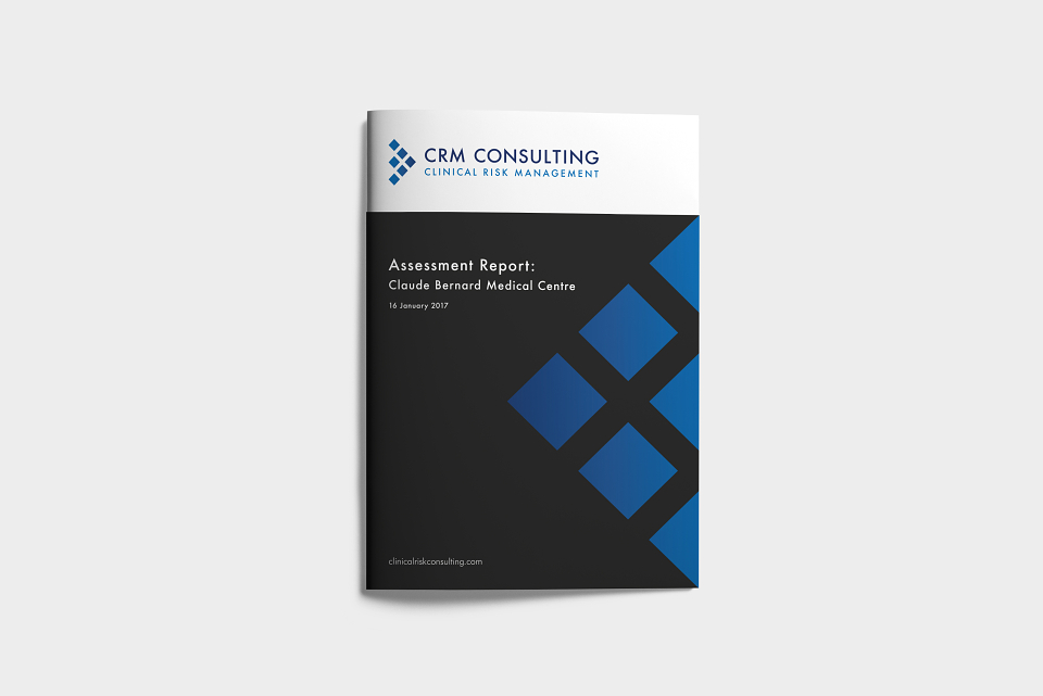
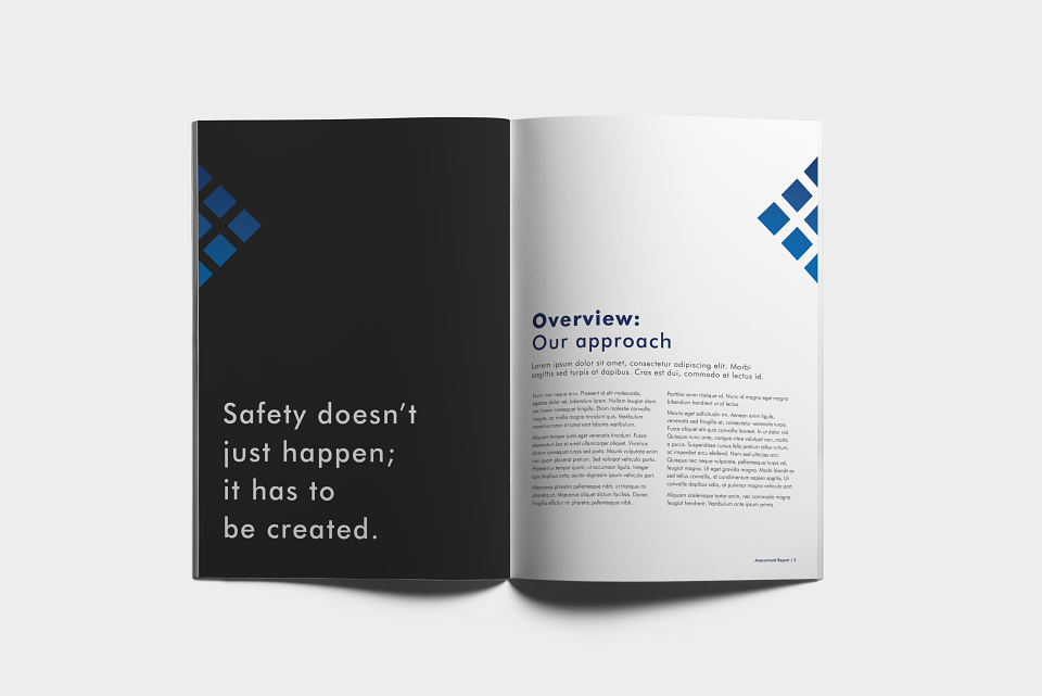
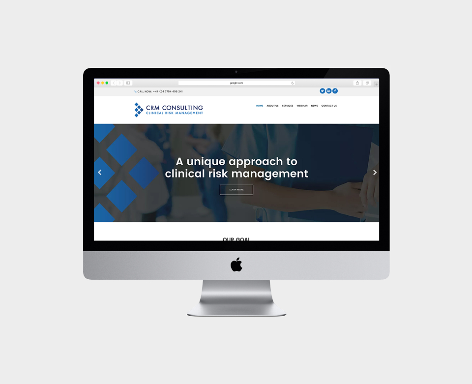
The client needed branding and a responsive website for his medical consulting company.
The logo comprises six diamond-like shapes, representing the six domains of the RADICAL framework, which is the basis off which the company consults.
The diamond shape represents quality, longevity and perseverance. The six diamonds hold together in a solid framework and structure, symbolising the strength and order needed to implement quality improvement.
The six diamonds form an arrowhead. This symbolises advancement and forward thinking whilst also suggesting that CRM Consulting is the ‘go-to’ company for clinical risk management.
The blue colour symbolises health. The colour gradient represents the strengthening of processes and practice through education and training and also through continual improvement of systems.