Lindsay Palmer
Head of Creative
ABOUT
Description
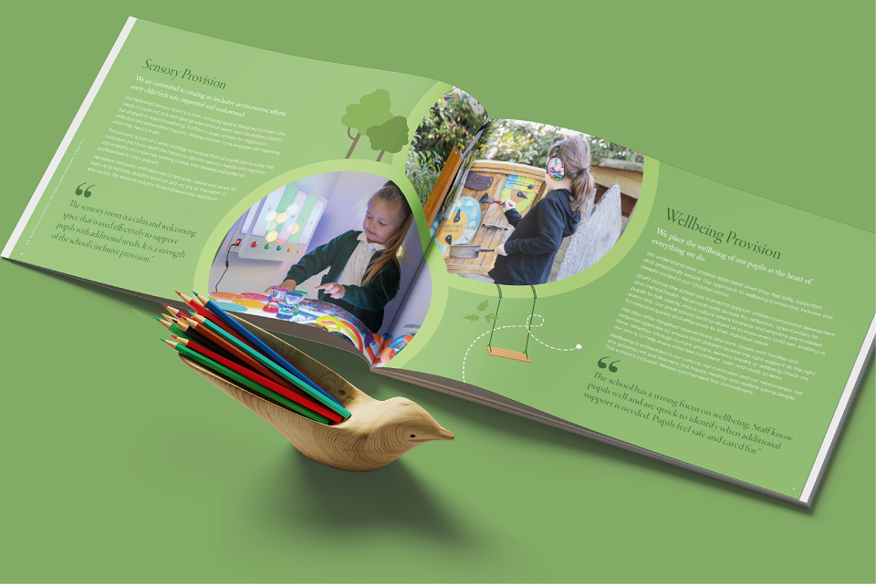
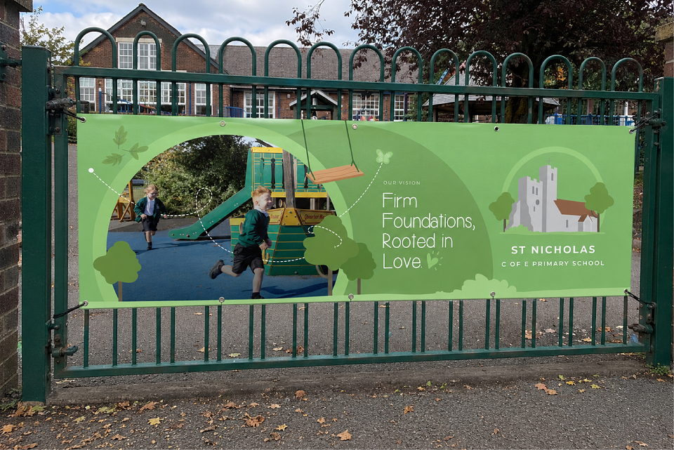
I led the creative direction for a brand and communications project for St Nicholas C of E Primary School, part of the Vine Schools Trust, helping to strengthen the school's visual identity across print and digital channels. Working collaboratively with colleagues across content and client services, I developed a creative approach that captured the school's character while creating a more professional, engaging and consistent experience for pupils, parents, staff and the wider community.
Brief
St Nicholas needed a visual identity that could communicate with a broad audience while remaining warm, approachable and authentic. The challenge was to create communications that felt high quality and credible, without losing the accessibility, personality and sense of community that sit at the heart of the school.
Summary
As Creative Lead, I was responsible for shaping the visual direction across a range of school communications. The creative approach used photography, colour, layout and storytelling to create a more engaging and recognisable identity that reflected the unique culture and values of St Nicholas.
Working across both print and digital assets, I helped establish a more consistent visual language that balanced professional design standards with warmth and accessibility. By taking the time to understand the school's history, ethos and community, the creative work was tailored specifically to St Nicholas while remaining aligned with the wider Vine Schools Trust family.
The result was a more cohesive and confident brand presence that helped strengthen communication with pupils, parents and staff, while creating a stronger sense of identity across all key touchpoints.
Successes
The project helped transform how St Nicholas presents itself across its communications, creating a stronger and more engaging visual identity that resonated with both children and adults. Through creative leadership and collaborative delivery, the work built greater consistency, recognition and community connection, while demonstrating how thoughtful design can be both child-friendly and professionally polished. The refreshed identity gave the school a platform for more effective communication and a stronger sense of pride in its brand.