Liam Gorman
Founder, Designer
ABOUT
// Brief //
Methods Group is a 60m umbrella of industry leading technology firms working under an holding company. They recently took the decision to consolidate all brands into a single company to make a bigger impact on the private sector. Going head-to-head with the ‘Big Four’ meant that they needed a recognisable brand that had a clean boldness, yet catered for the grey-haired leaders of big business in their new market with a sense of established familiarity.
The brief stated that they needed a recognisable brand with a clean boldness, yet met expectations for the grey-haired leaders of big business in their new market with a sense of established familiarity. ‘On the sharp edge of normal’.
// The Execution //
Although in some ways a new brand, Methods has a history. We soon realised that the brief consisted of two parts, the outward client facing aesthetic and the internal implications of change. In a sense there were two clients, and we used this as a benchmark for all concepts that were created.
Going up against the established 'Big Four' meant that we had to highlight Methods' value that set them apart. While the 'Big Four' dominate the market, there was a perception that they were stuck in their ways, charged huge fees and were possibly too old to appear cutting edge.
It became clear that Methods' USP was their history. A consolidation of several industry leading companies into a single service meant that solutions could be adapted for each brief, using the right amount of expertise from each area to create a service that is unrivalled in terms of efficiency and bespoke tailoring.
Focussing on the history would also champion the great work that had come before by the leaders of the single companies, giving them a single brand that they could get behind.
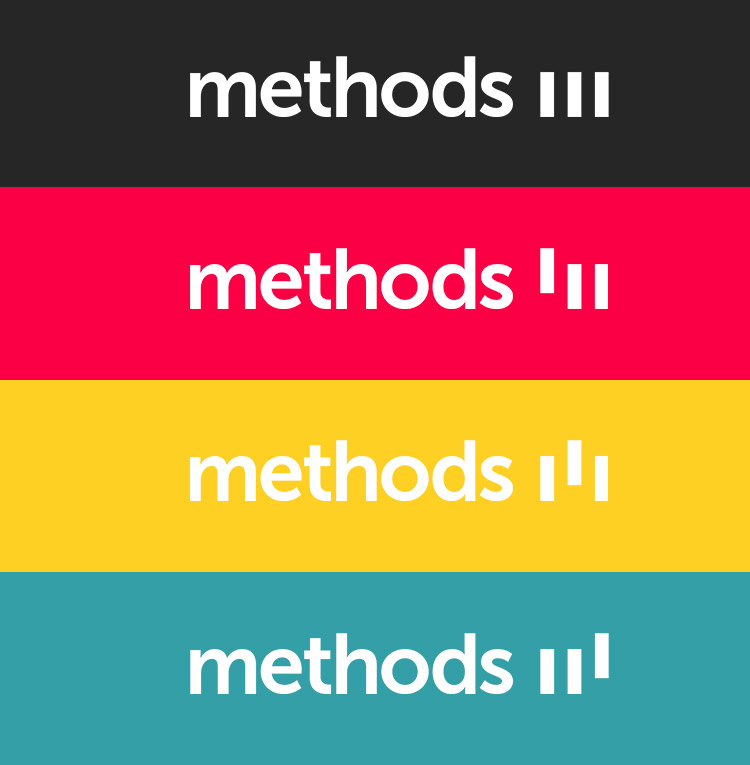
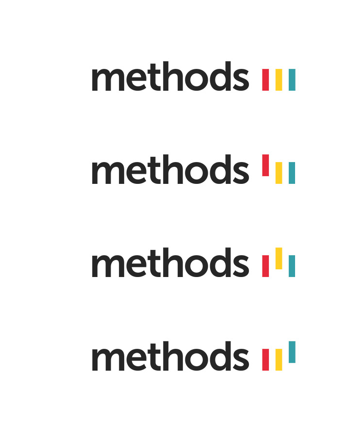
The solution teams a solid, modern typographic approach with three pillars. Each pillar represents one of the former businesses and their expertise. This meant that the pillars could rise depending on the emphasis of which expertise were being used for a particular context - like a data visualisation of their own adaptable service.
// Rolling It Out //
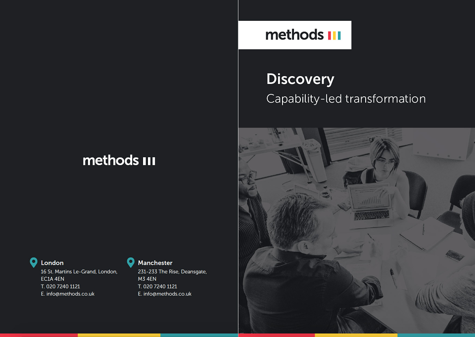
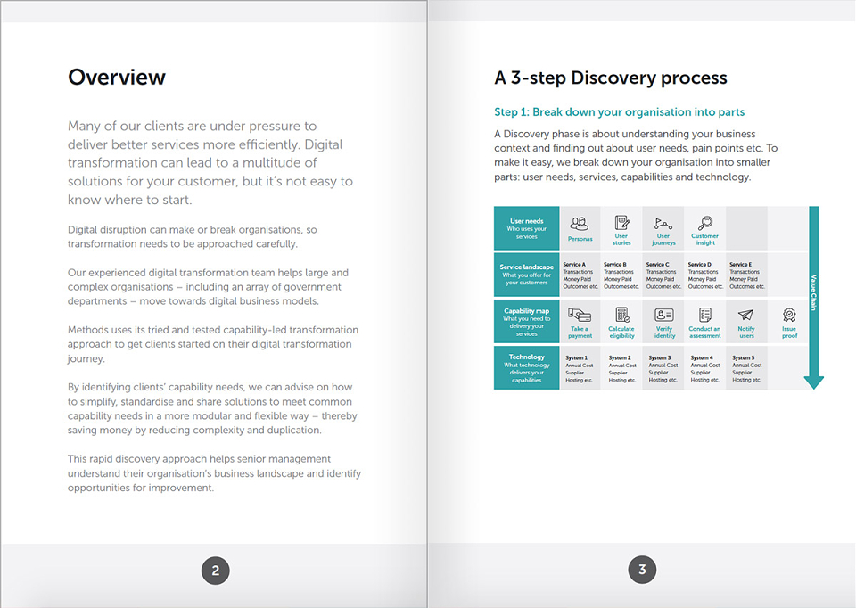
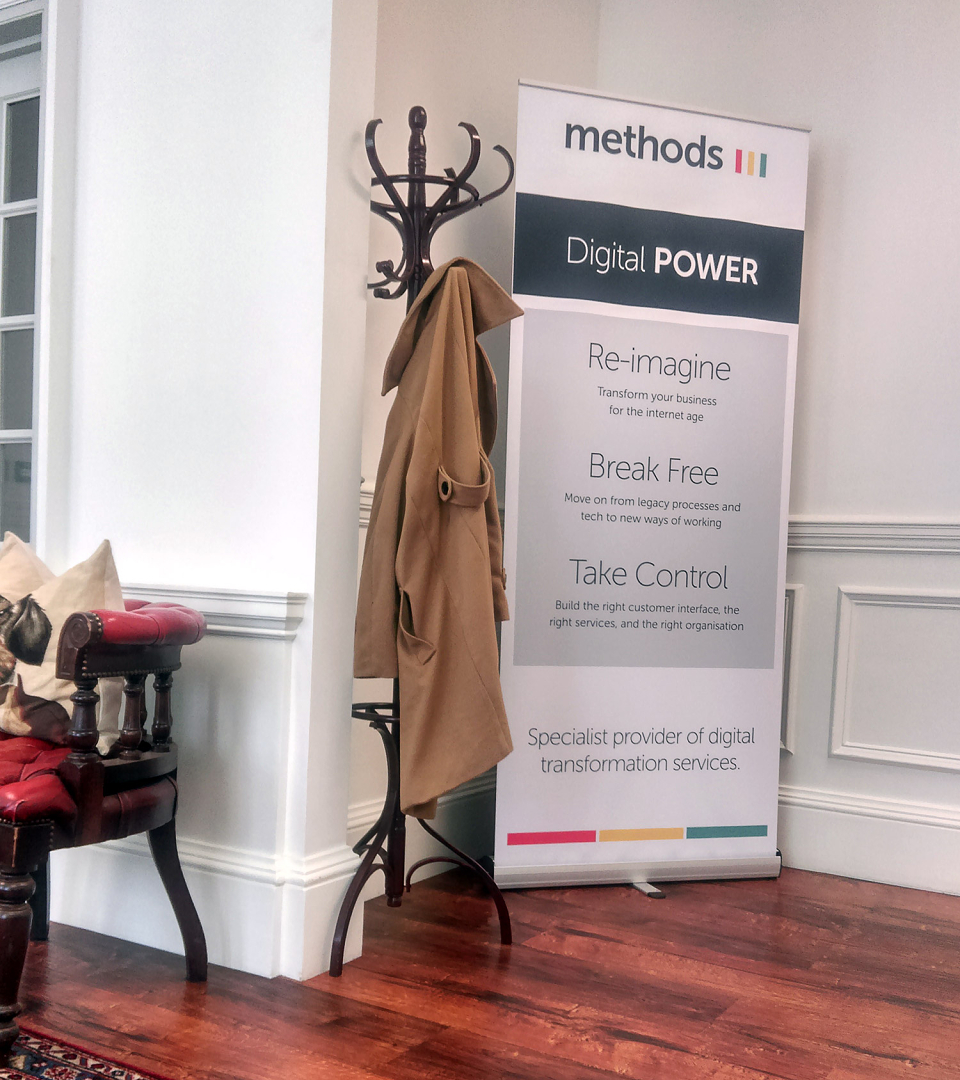
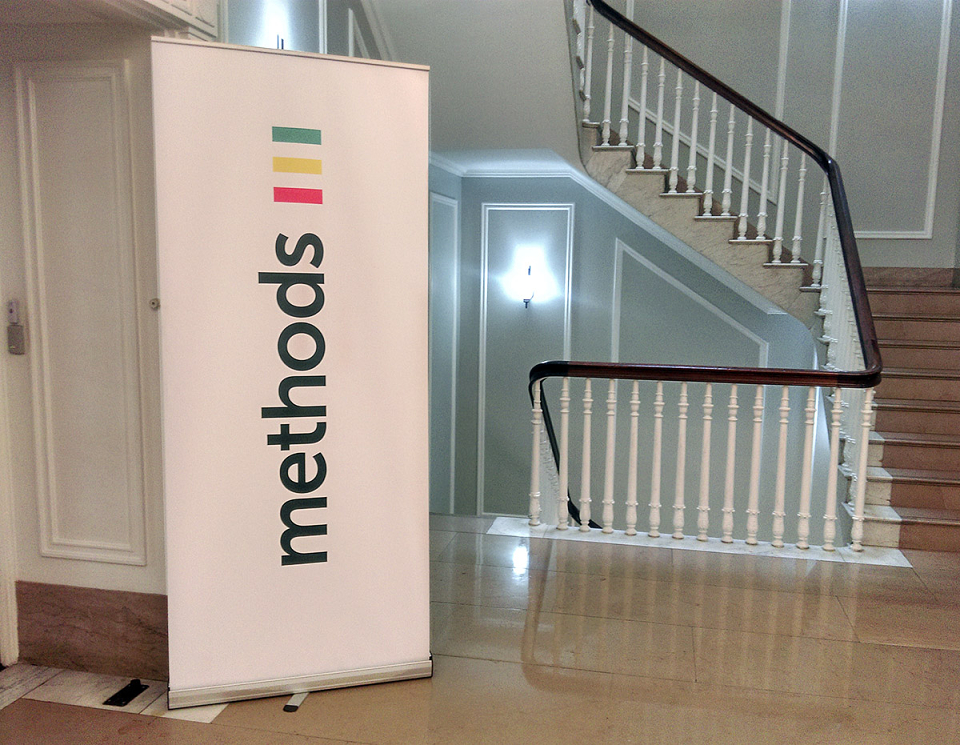
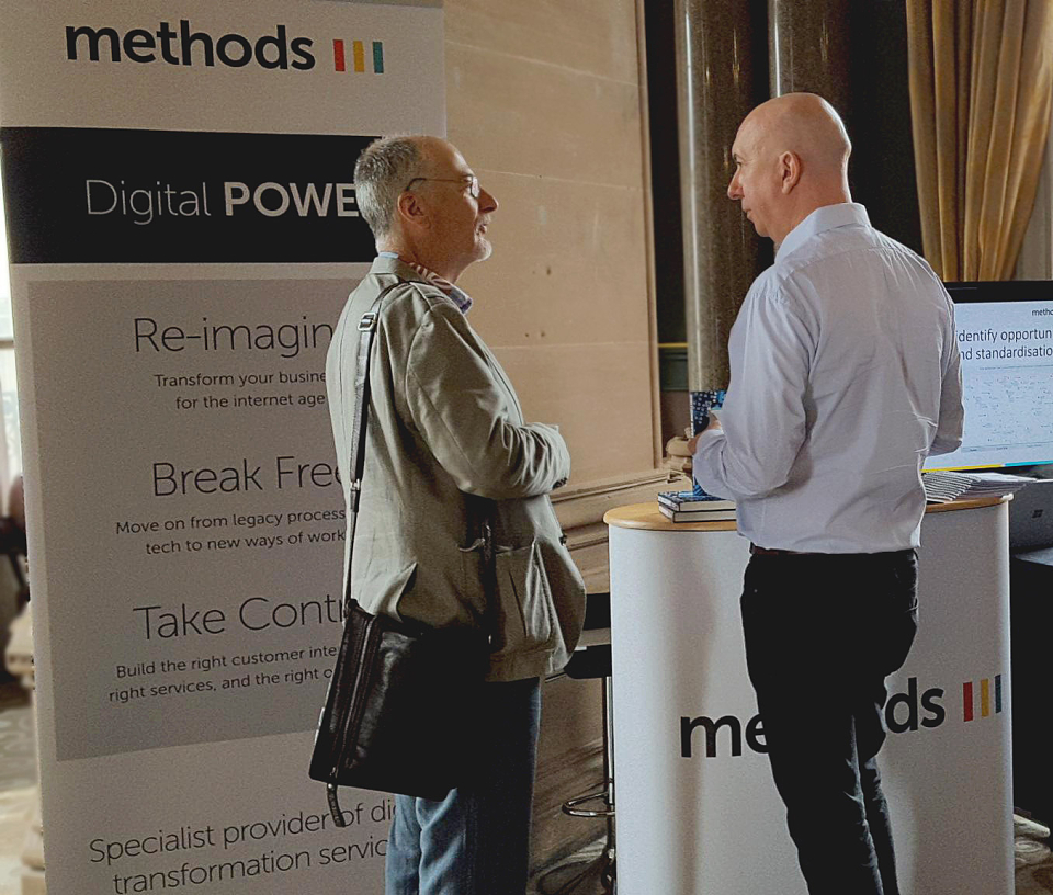
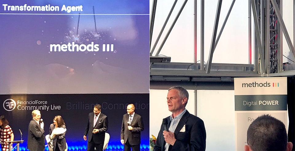
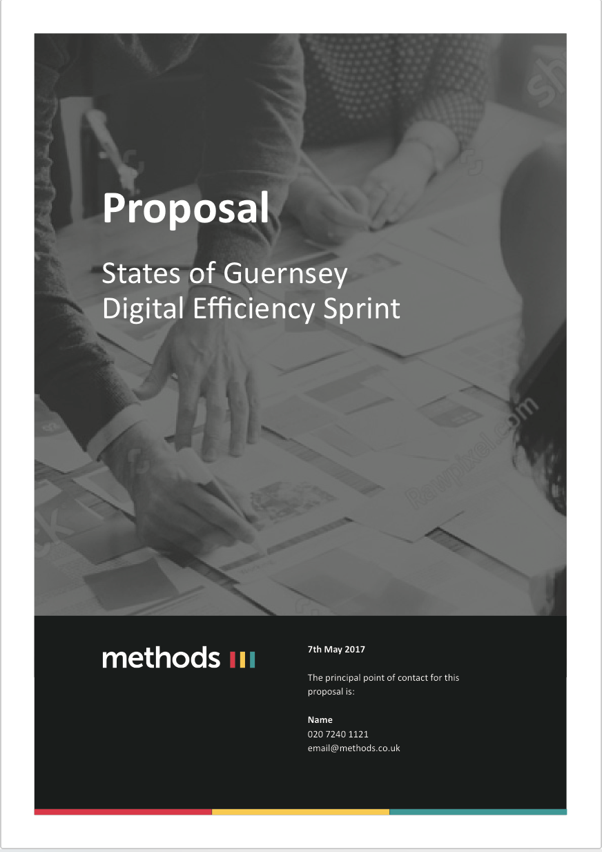
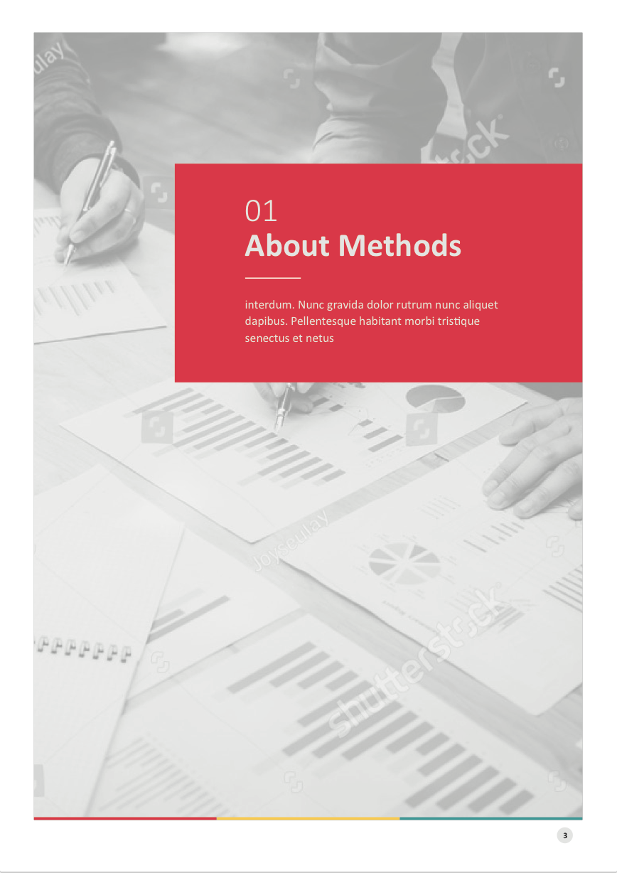
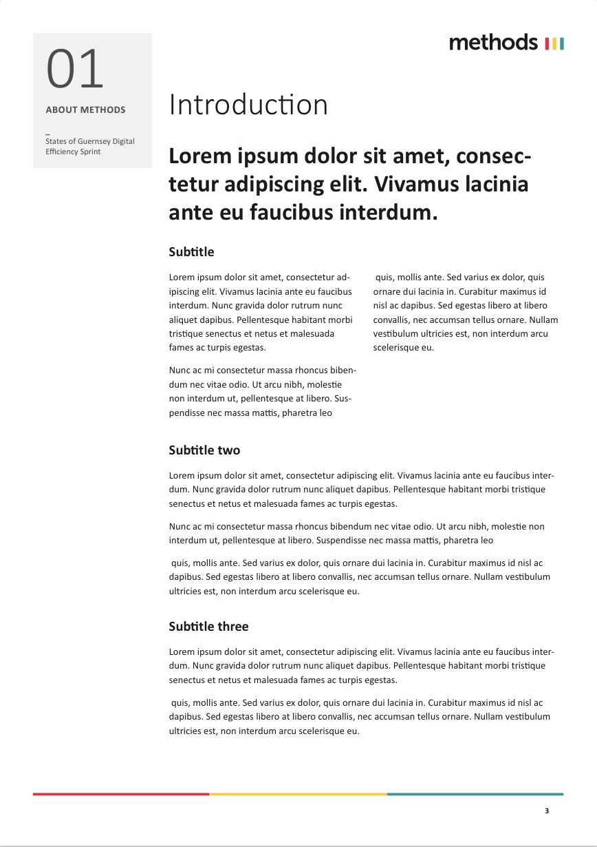
In addition to the branding delivery of logo and full brand guidelines, Methods had a huge amount of collatoral to produce. As a big company, the teams needed everything branded from slide decks to invoices and event materials.
We worked quickly to produce much of the work within days from the new brand unveiling. One of our favourite parts of the project was producing a fully interactive Microsite for the internal teams to instruct on the new business model, raising excitement for the future vision.