Lesley
Creative Director
ABOUT
The brief was to create a look and feel that portrayed what Penny did in a professional manner but with a hint of fun. Although there is an obvious connection to Mary Poppins, Penny didn’t want to include any Mary Poppins figures or umbrellas or make the logo too feminine. It had to appeal to a wide audience and work across all mediums including clothing and van graphics.
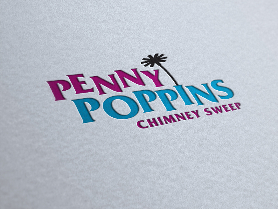
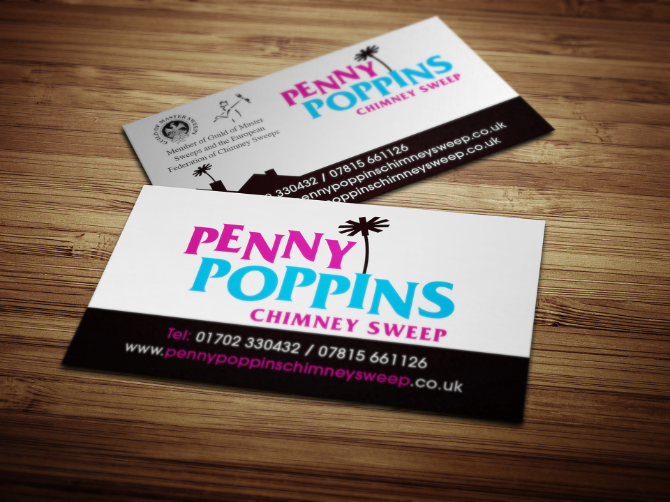
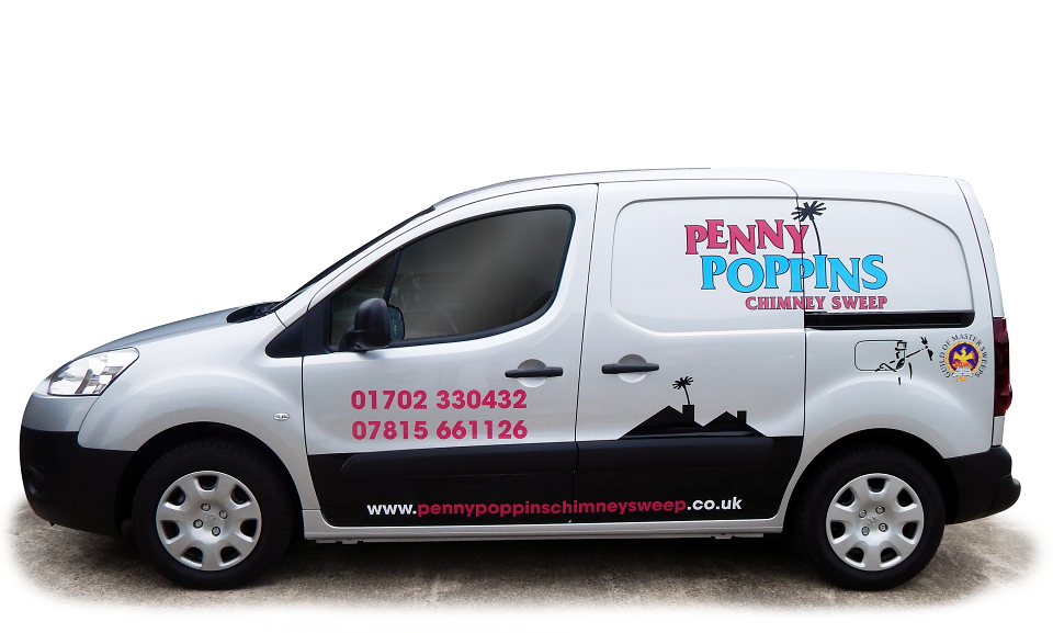
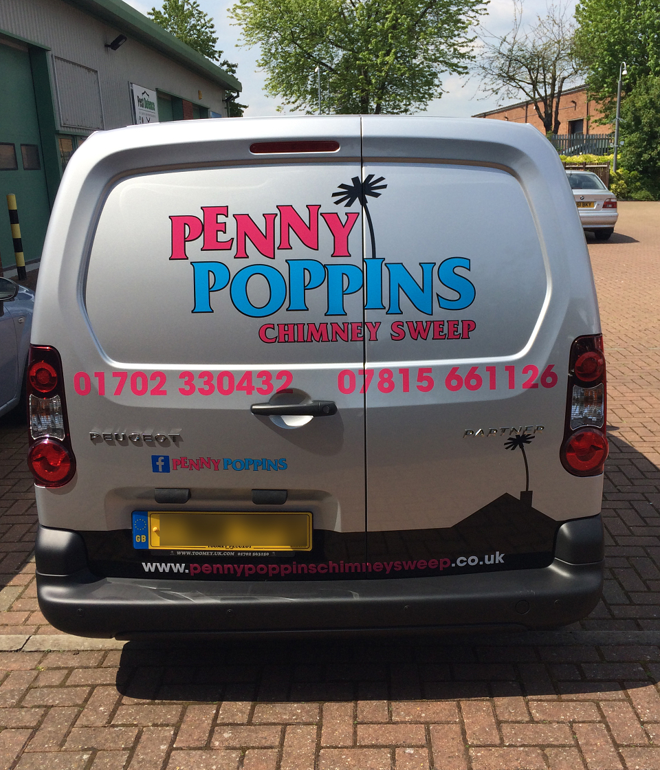
A modern colourful logo, that is professional yet with a hint of fun. A subtle nod to Mary Poppins with the staggered letters, the introduction of the brush coming out from the top of the ‘I’ can be interpreted as a chimney. As well as the logo, the brand identity included a simple rooftop graphic and this has been used throughout promotional collateral including business cards, flyers, website and van graphics.
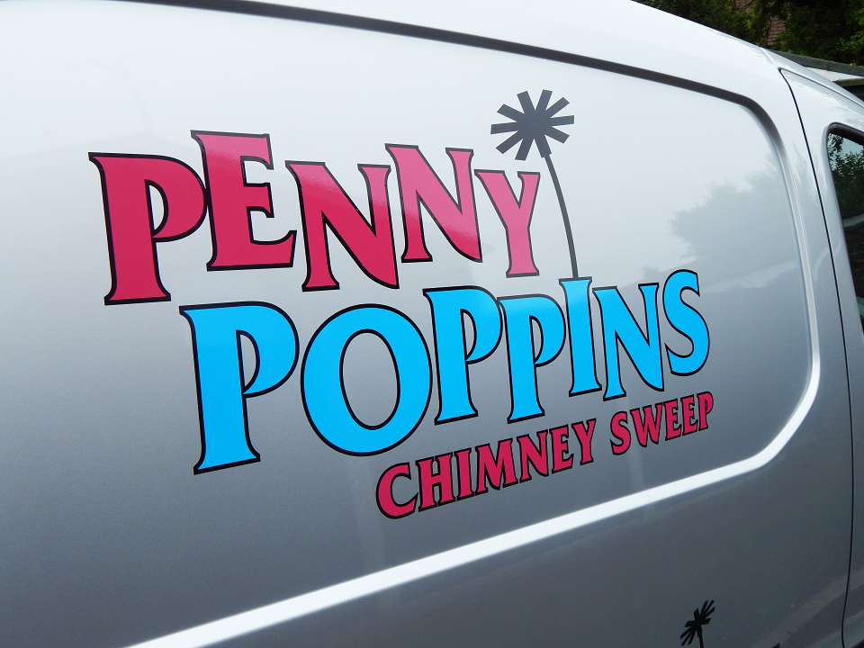
The vehicle livery in particular has been a great success, there are little touches like the brush on the back doors just touching the vehicle’s name badge which really make it stand out from its compeititors. Penny Poppins has enjoyed some great media coverage with several local and national newspapers picking up on the story.
MADEIT CREDITS
-

LesleyGraphic Designer