Lee
Freelance Design Director
ABOUT
The Children’s Commissioner approached me to create an identity and visual look and feel for their nationwide engagement campaign. The Takeover Challenge sees thousands of children and young people up and down the country ‘takeover’ a huge variety of organisations and companies by placing them in the the working roles of adults. Its primary objective is to put young people into decision-making positions and encourage organisations and businesses to listen to their views and think differently about how to engage children and young people.
After the recent rebrand of the Children's Commissioner it became clear that this initiative had to also be rebranded to sit comfortably alongside the parent brand whilst also having a distinctive identity of its own.
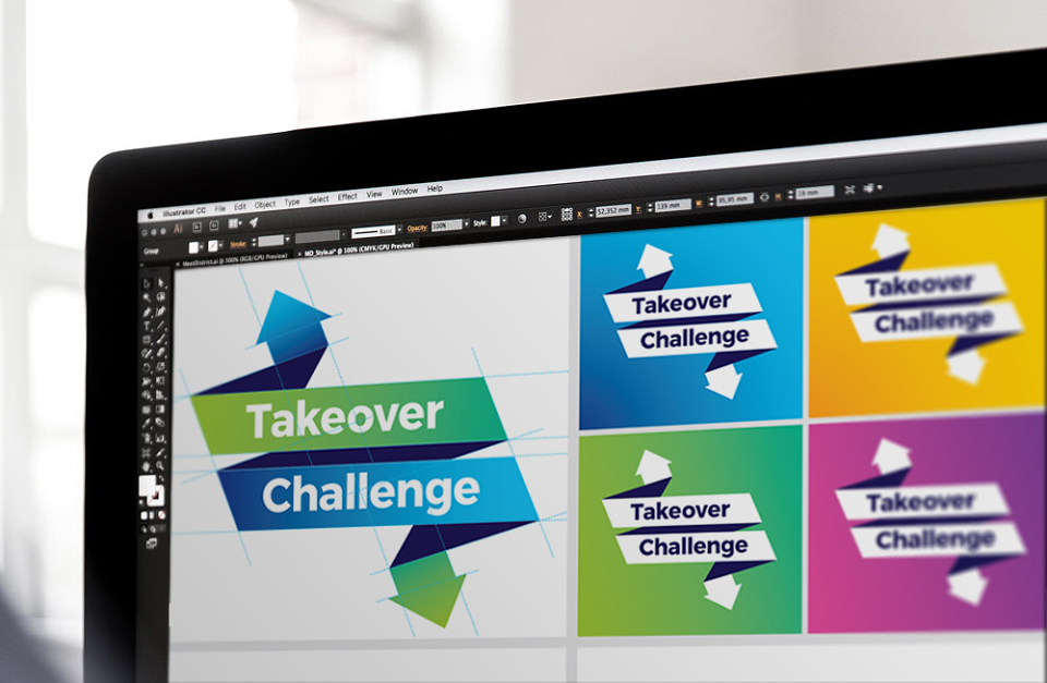
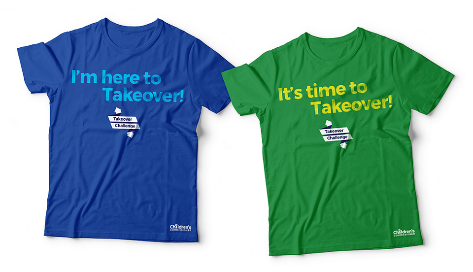
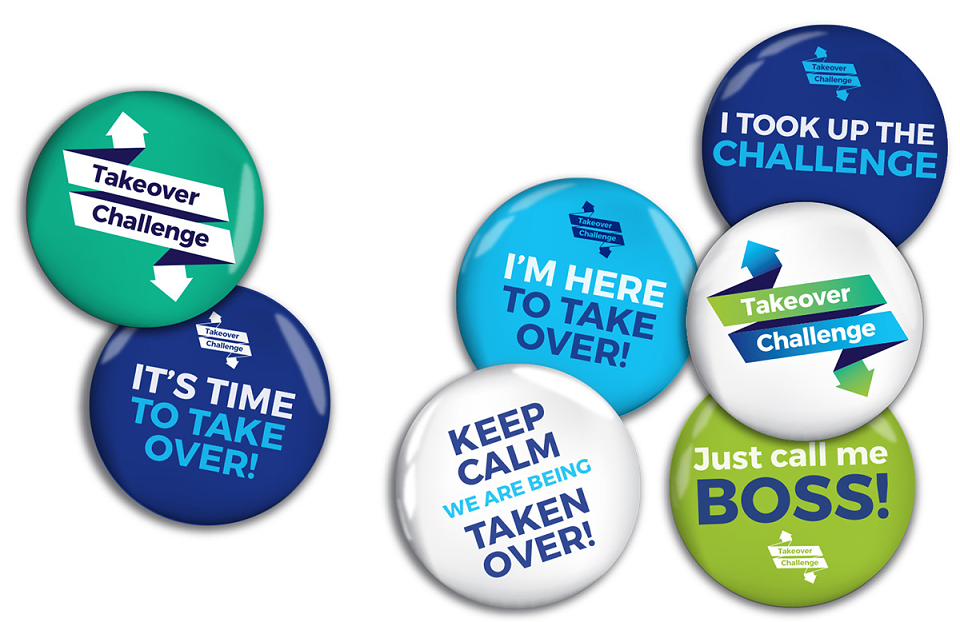
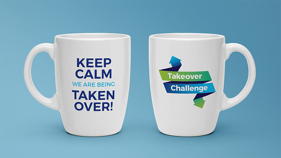
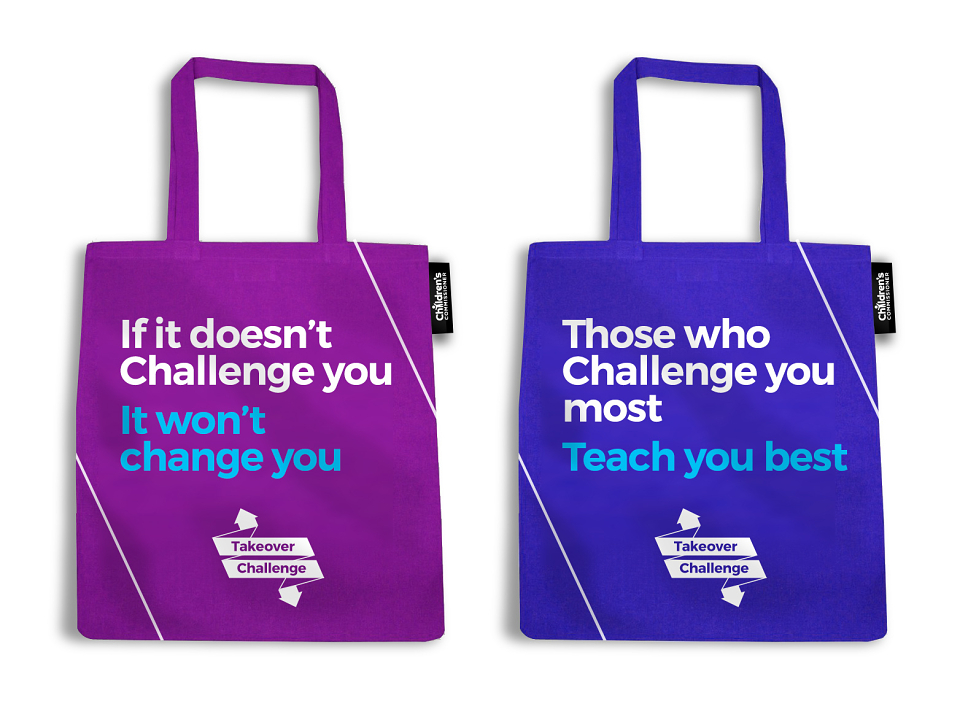
The logo utilises key aspects of the children's Commissioner brands visual identity with its use of gradients and bold, simple typography - yet the dynamic flowing shape allows it to stand confident alone as a campaign identity. The flexibility of colour variants allowed for more creativity in application as well.
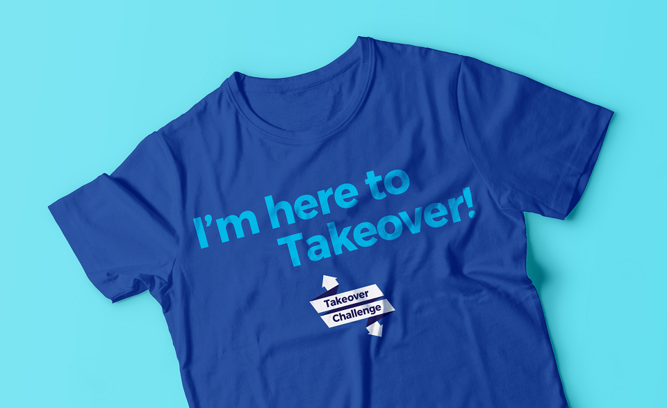
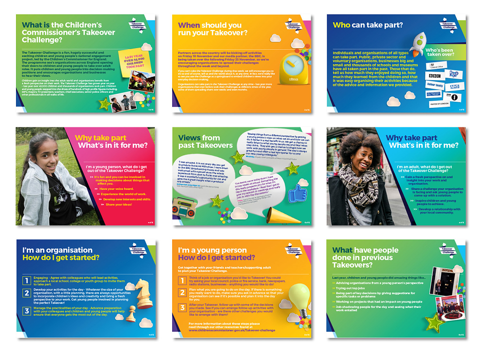
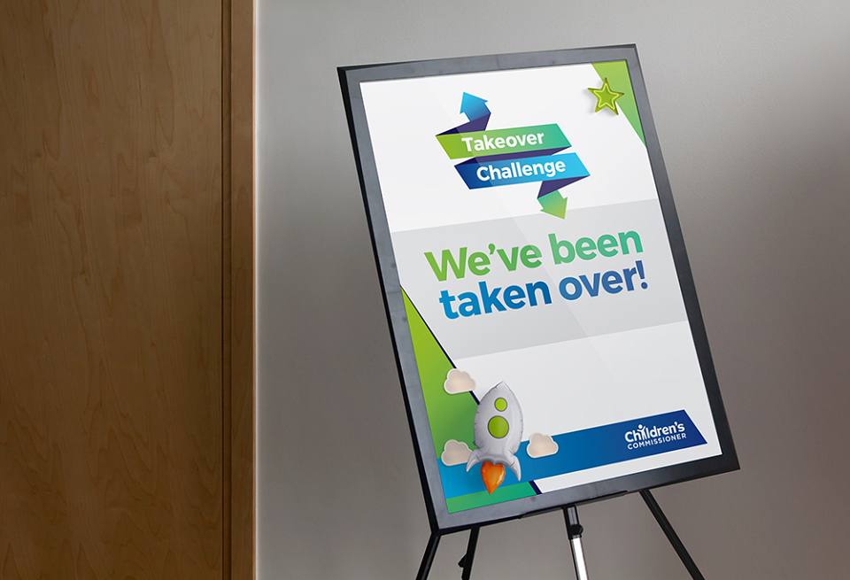
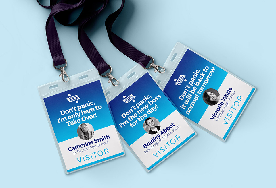
The look and feel of the overall campaign uses direct and engaging language, strong angled shapes and gradients to ensure all visuals are eye-catching and dynamic. The 3D graphic assets from the Children's Commissioner brand toolkit are also used to add depth and interest and drive as much interest and appeal to the campaign as possible.
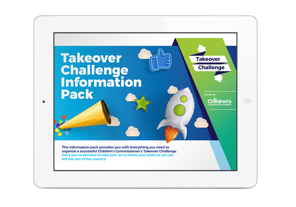
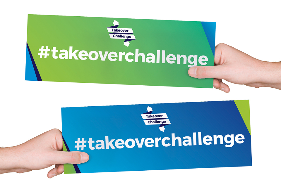
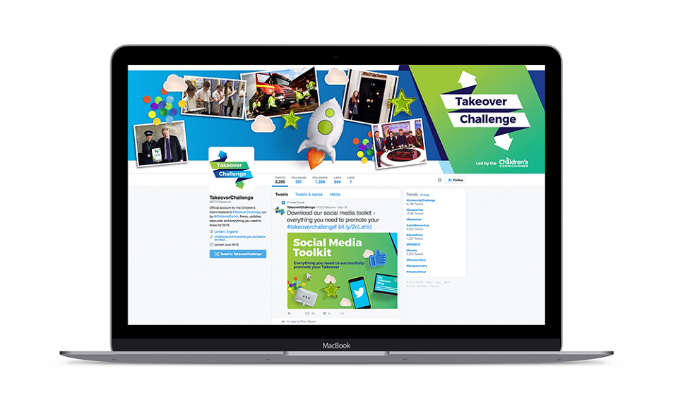
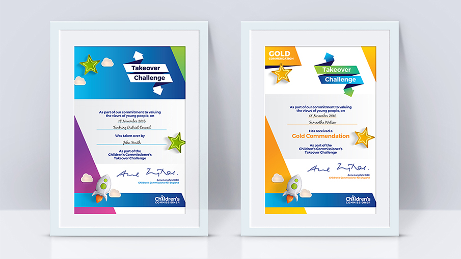
A series of key applications were designed to be downloaded from an online resource centre - these included an information pack, social media toolkit, a series of editable certificates and a placard to hold up in images to share online.
The initial results of the rebrand are very positive with an increase in participants from the previous years campaign. The client was very happy with the outcome and now has a campaign identity to mach the corporate identity of the Children's Commissioner to be used for years to come.