Lee
Freelance Design Director
ABOUT
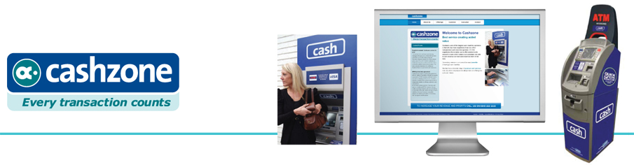
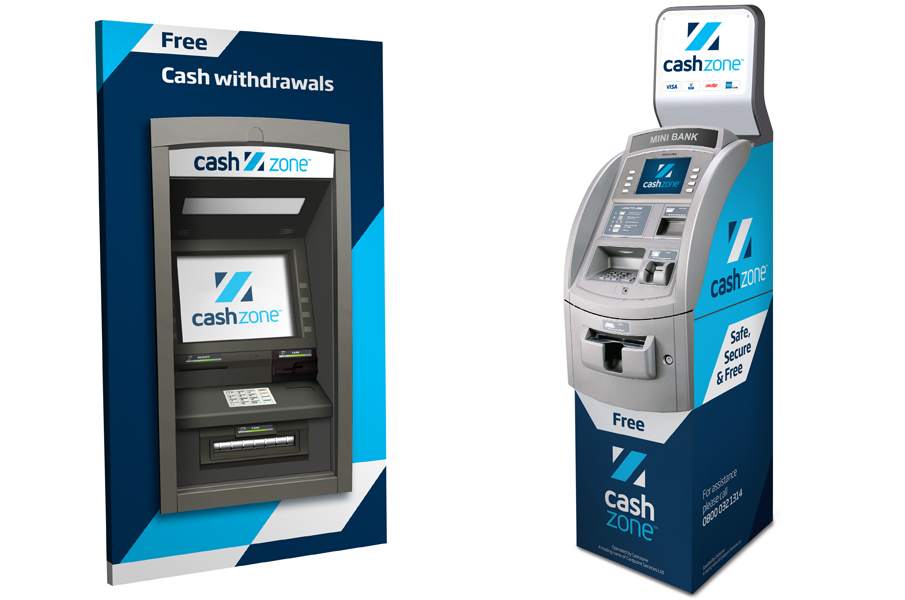
Cashzone, one of the largest cash machine operators in the UK, has more cash machines that any of the high street banks. However, over its recent history it has as a brand been organically bought and sold and therefore has lost its equity along the way. After its most recent acquisition there was a need for a new and unique high street brand which not only severed perception from the past, but also paved the way for a new dynamic and respected entity. The ultimate aim of this project was to create a strong and consistent ATM brand that had real stand out on the street - after a three way creative pitch Firedog was presented with this task. The outgoing brand had very little going for it. As a part of the Omnicash group it used the OC symbol set alongside a conventional sans serif wordmark. The ATMs themselves didn't carry the Cashzone logo or name - simply the word 'cash' in a lozenge device - therefore there was not the opportunity to build brand recognition or brand loyalty.
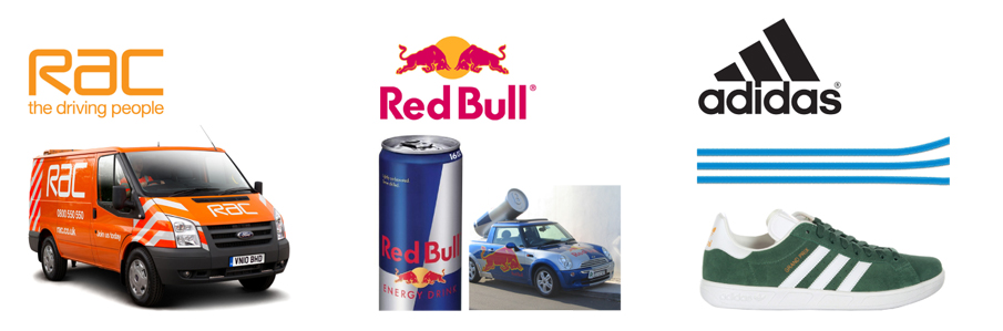
The key to creating a distinctive brand in this sector is to ensure high visibility of the branded assets. The use of a strong, simple graphic device will ensure the brand quickly gains standout. Examples of brands that have been successful with this approach include RAC, Red Bull and sports brand Adidas. Each has taken a simple graphic device and used to to create distinctive visual identities.
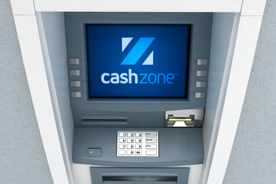
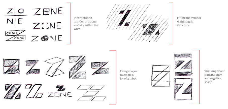
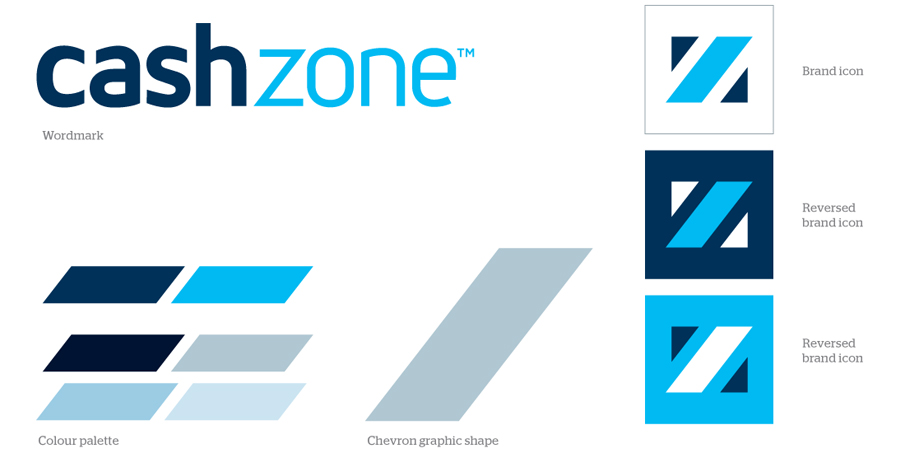
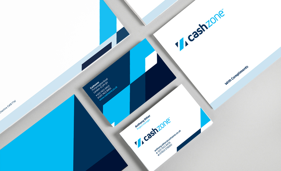
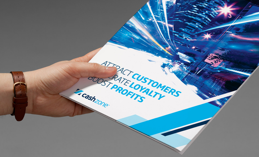
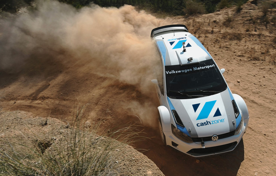
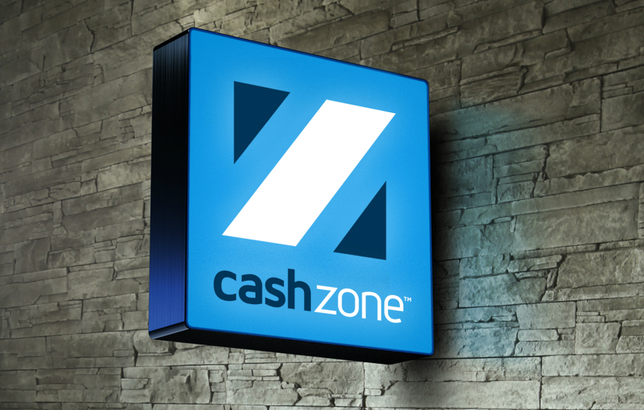
The final logo features a distinctive Z symbol which is both a graphic representation of a ‘z’ and also a clear demarcation of an area or zone formed out of a chevron pattern. The logo also features a custom drawn typographic wordmark - friendly, approachable and open. The logo is fully flexible, and has been designed to work in a series of configurations to fit onto different applications whilst maintaining its high visibility and clarity at all times.
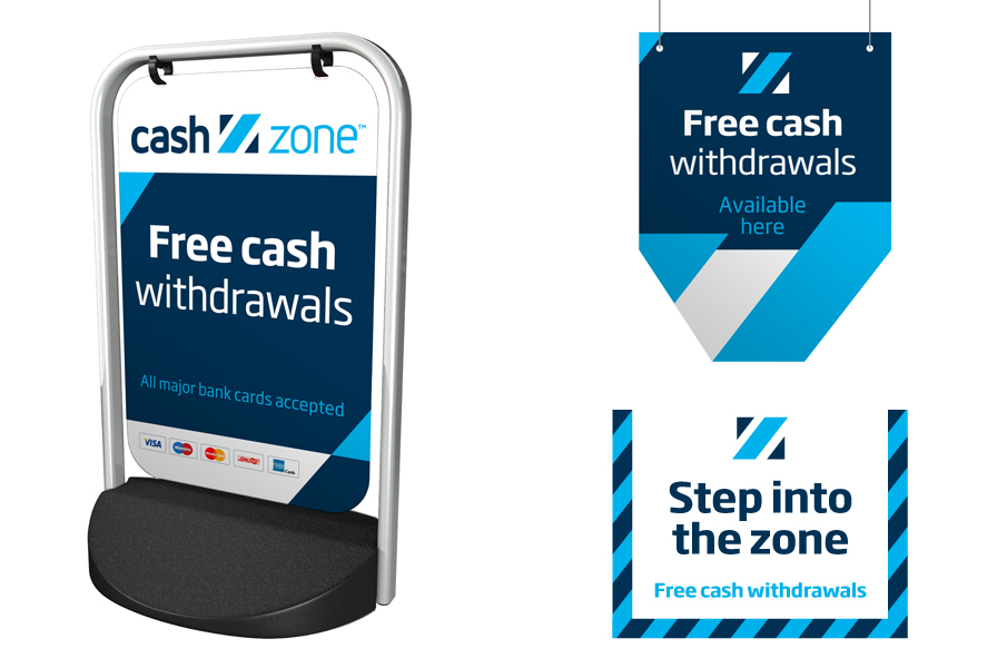
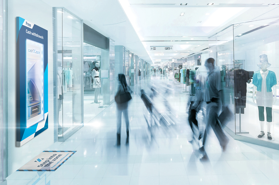
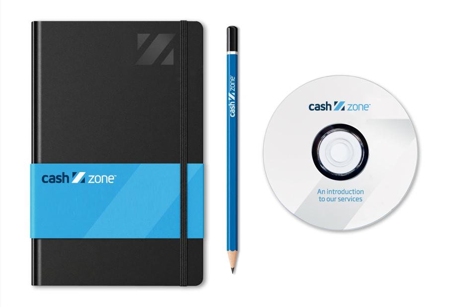
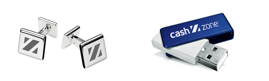
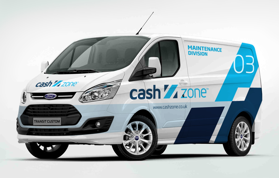
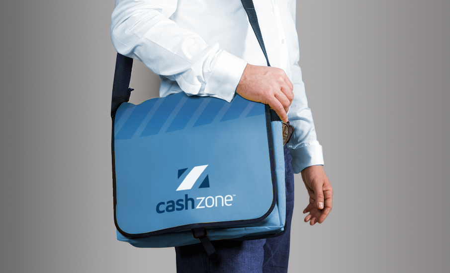
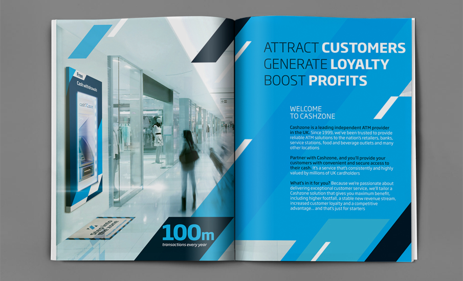
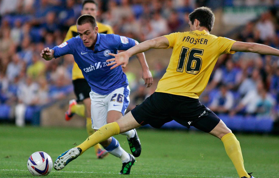
The supporting visual language of the brand uses the chevron device found within the symbol to form distinctive and eye catching patterns and graphic layouts that ensure the brand has a unique and highly visible brand look and feel. The brand language was subsequently applied across a broad range of branded applications with great success.
The result - Newly branded machines have seen a 42% increase in use over the previous designed machines.