Lee
Freelance Design Director
ABOUT
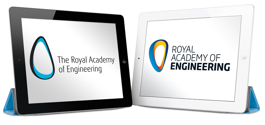
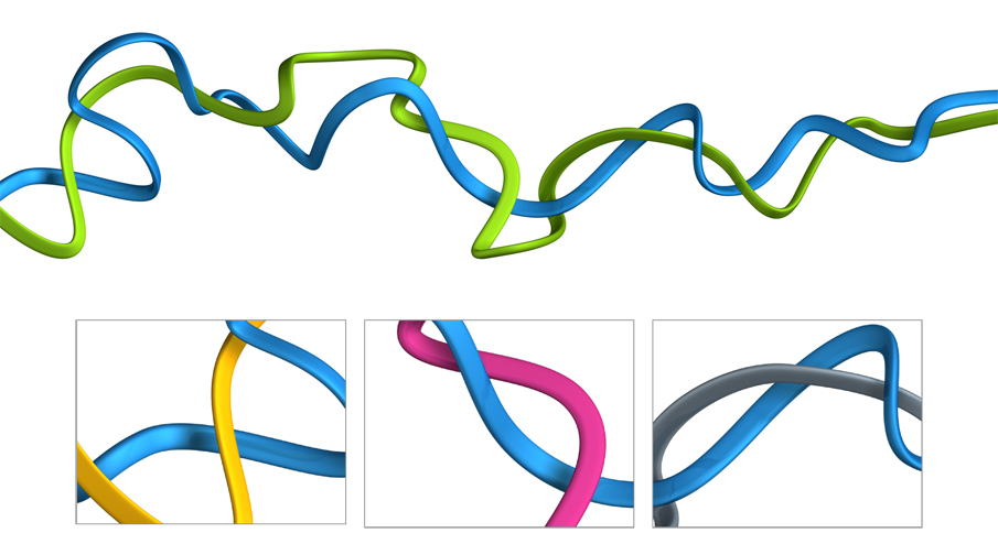
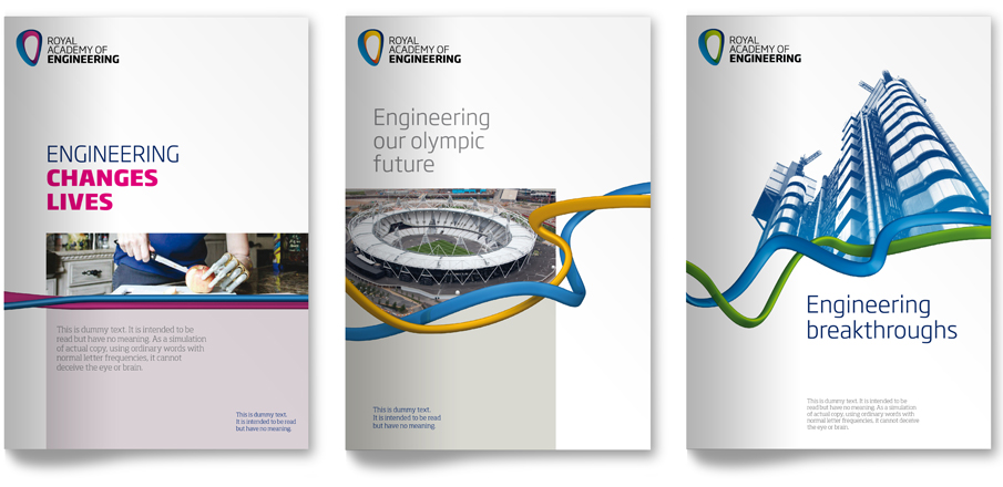
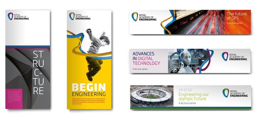
The Royal Academy of Engineering are the voice of engineering and innovation in the UK - they bring together the most successful and talented engineers from across the engineering sectors for a shared purpose: to advance and promote excellence in engineering. They approached Firedog with an identity issue. Their brand was struggling in the digital age and was not strong or compact enough when used in small spaces and alongside other partner brands. They were also in need of a much more flexible and creative visual identity system that would allow they to effectively communicate to their wide audience span as the existing visual identity was seen to be too limiting and expected.
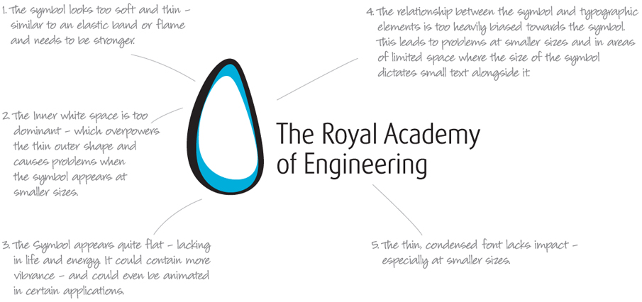
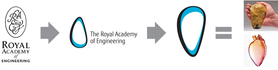
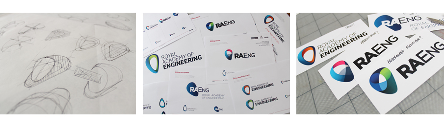
The key driver behind this project was evolution not revolution. We discovered that the symbol had been designed to represent a flint axe, the first tools invented by humans in order to progress, however the translation of this idea had become somewhat lost. Our brief was to retain the overall concept, yet create a logo and brand that was much stronger and more dynamic in application. We started the process by taking a closer look at the existing identity to discover where the main issues lie and to inform future decisions moving forward.
Our first step was to look into orientation of the shape and discovered that by simply rotating the symbol you can transform how it is perceived. The rotated symbol now has a much closer association to the hand axe from where it draws its inspiration. Interestingly, this shape then had a subtle reference towards a heart - making a strong link back to the academy’s overall strategic vision of being at the heart of society. Graphically, the symbol appears to be much more dynamic and forward thinking. This discovery was fed into our creative developments.
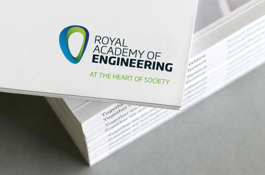
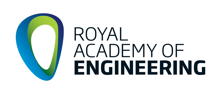
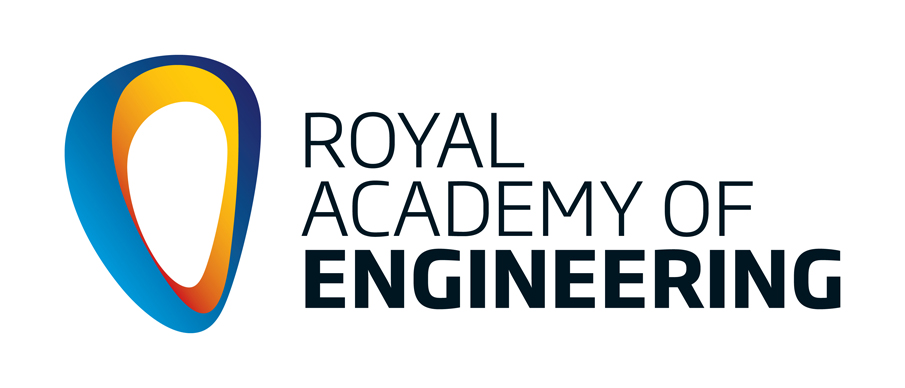
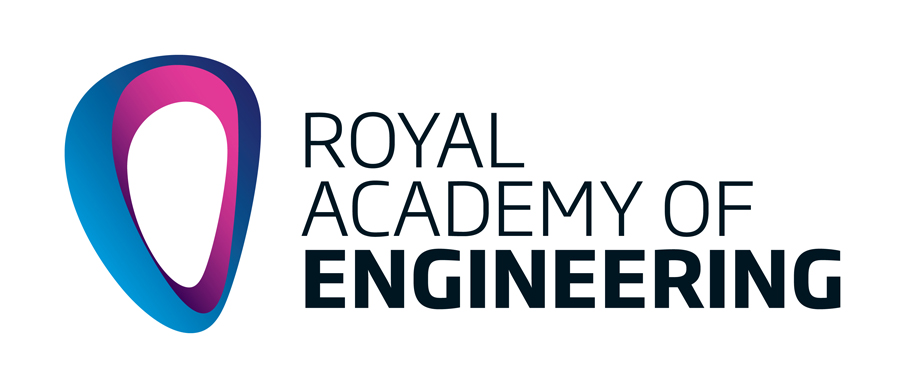
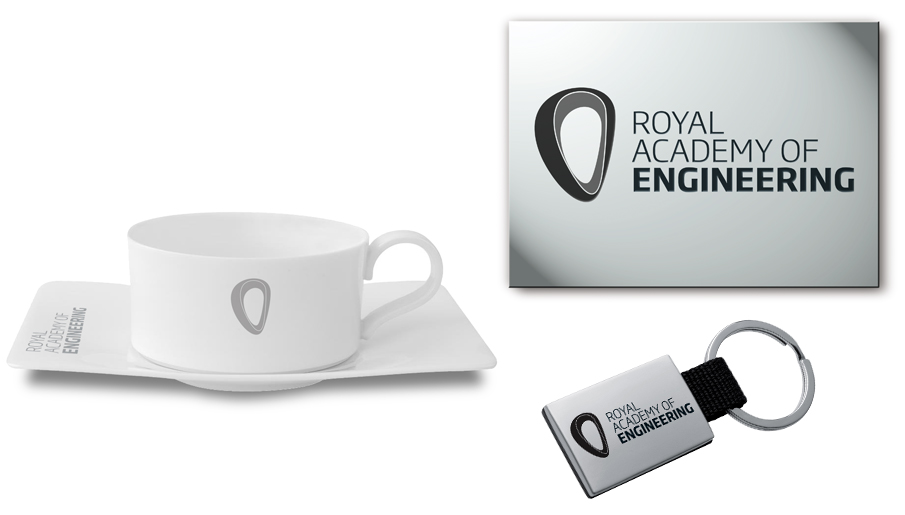
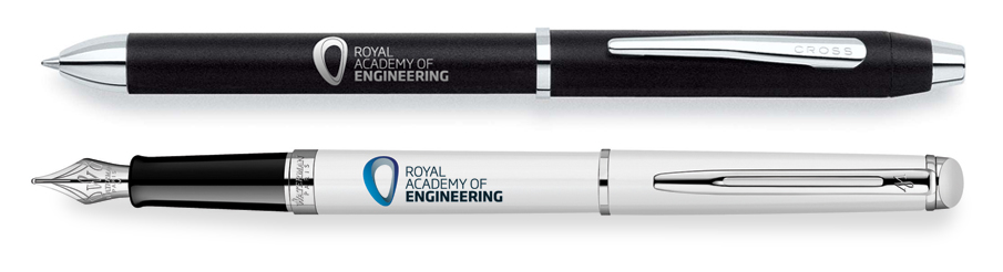
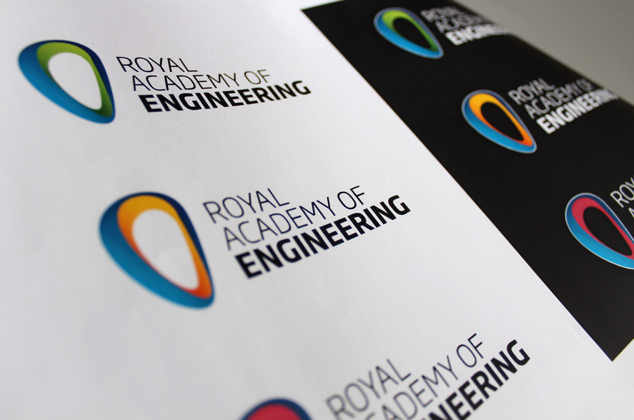
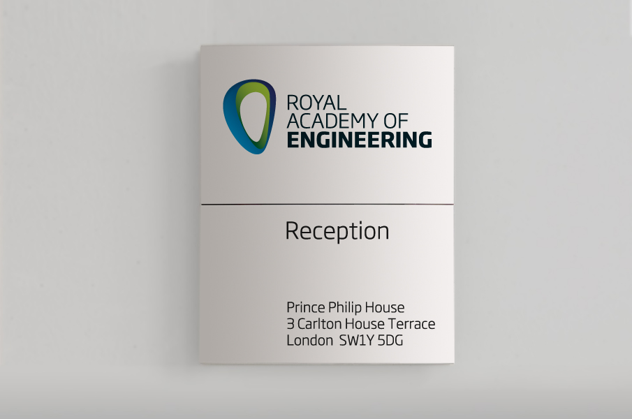
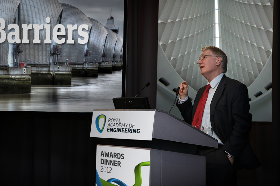
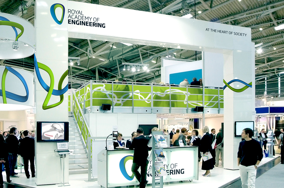
After a series of extensive brand research sessions, brainstorming and discussions made it clear that the visual aspects of the Royal Academy brand was lagging behind its visons and strategy for the future - they needed a brand that is confident, dynamic, modern and distinctive. After presenting a range of creative options, we arrived at our final chosen direction. The final logo features a stronger, thicker symbol with significantly increased visual impact. Within the symbol coloured gradients were added which work in opposing directions, deceiving the eye and giving it a much more 3 dimensional feel, alluding to looking inside at the core, the heart. Typography has also been further developed using uppercase letters which enables the name element to be set much tighter as a block, again to increased visual impact.