Lee Jones
Creative Director
ABOUT
10 Clement Street is the second and current development of property developers, Asquith Homes.
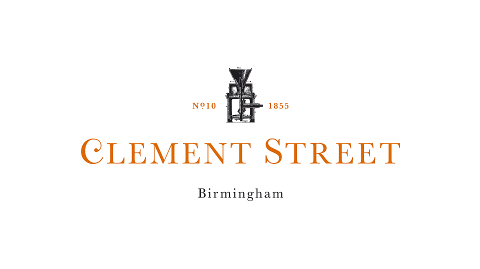
The logo uses a similar brand styling as Asquith
homes with the ornate initial letter and serif font,
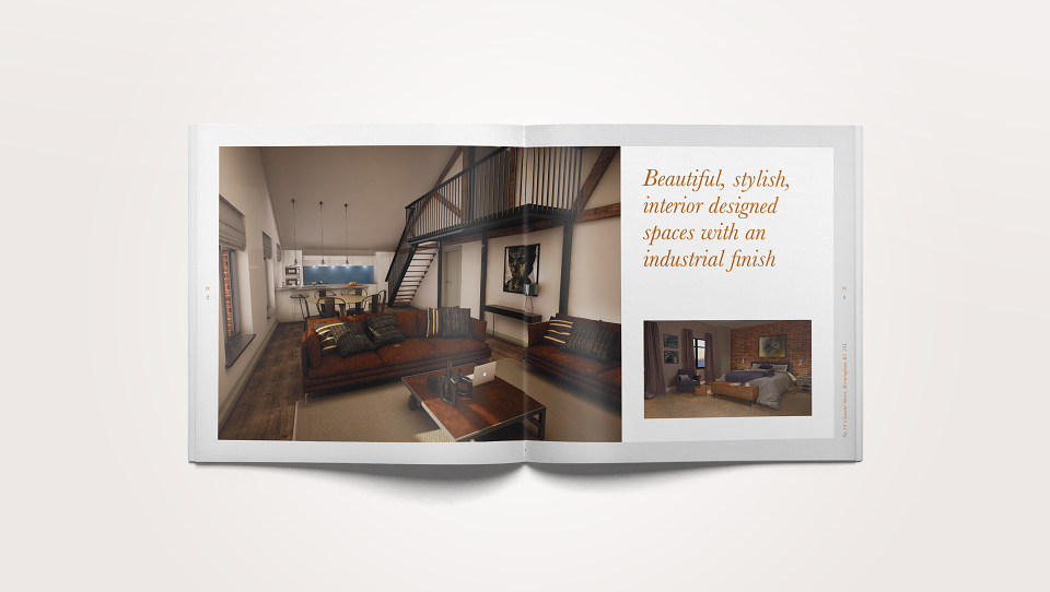
but this property will have an industrial finish to suit
the character of the building so the colours and icon have been introduced to reflect this.
The building was originally used for producing confectioneries, so to get this across I have incorporated a confectionery machine which was taken from an advert by the original company that owned the building in 1855.
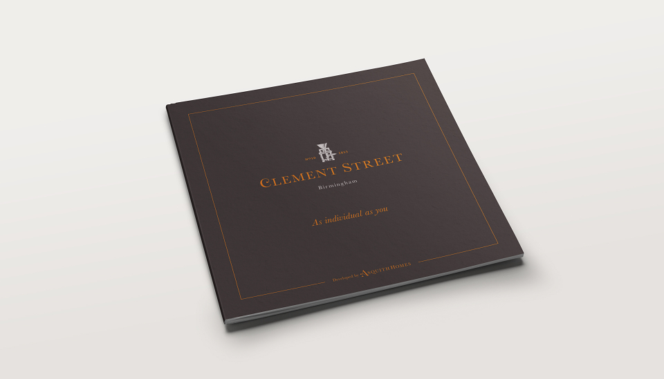
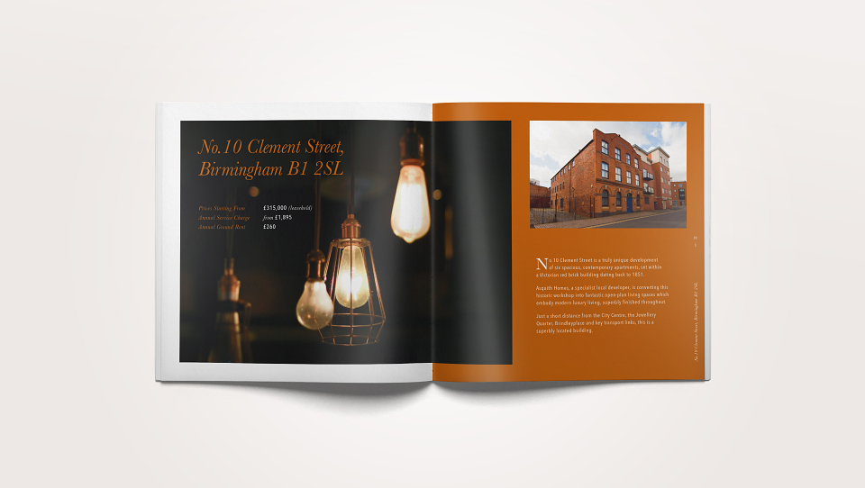
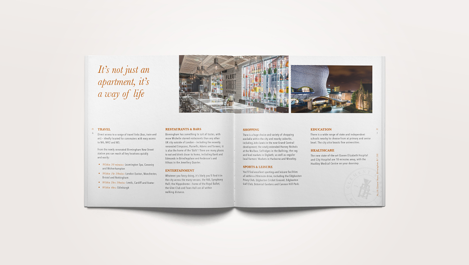
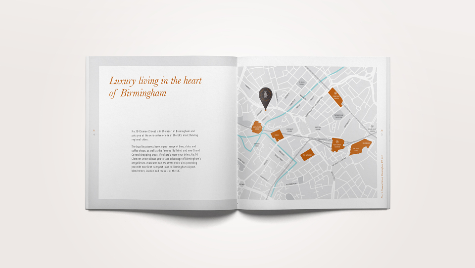
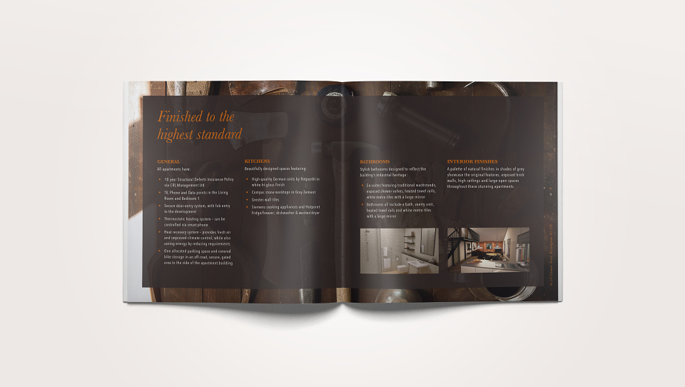
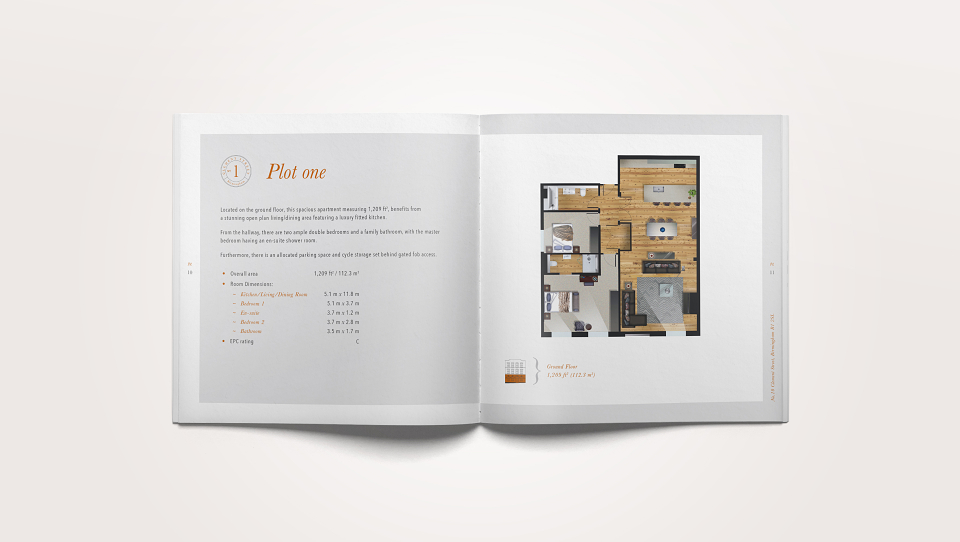
To maintain a consistent feel with the previous development, Asquith House, the brochure is square and the same dimensions as the inserts and sleeve. As this property will only have 6, 2 bed apartments I designed a more traditional brochure. I selected colours to compliment the interior and the orange was printed as a metallic Pantone to give the appearance of copper.