Lazy snail Design
Copenhagen
ABOUT
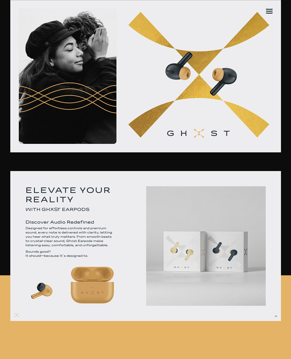
GHXST (pronounced “ghost”) approached us with a name and the bold ambition: to become a premium audio lifestyle brand for ages 15 to 50. As India’s market focused on major e-commerce platforms, the brand aimed to expand into flagship store–event spaces.
We uncovered a powerful link: in music, “ghost notes” are subtle, expressive elements that bring richness and depth. The “X” in GHXST became a metaphor for this nuance—transforming the name into a refined nod to sound itself.
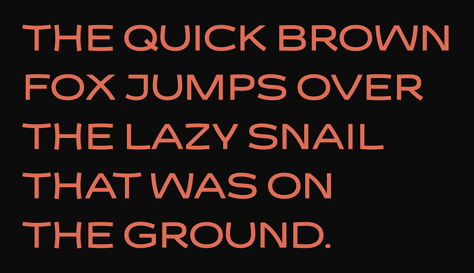
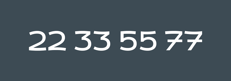
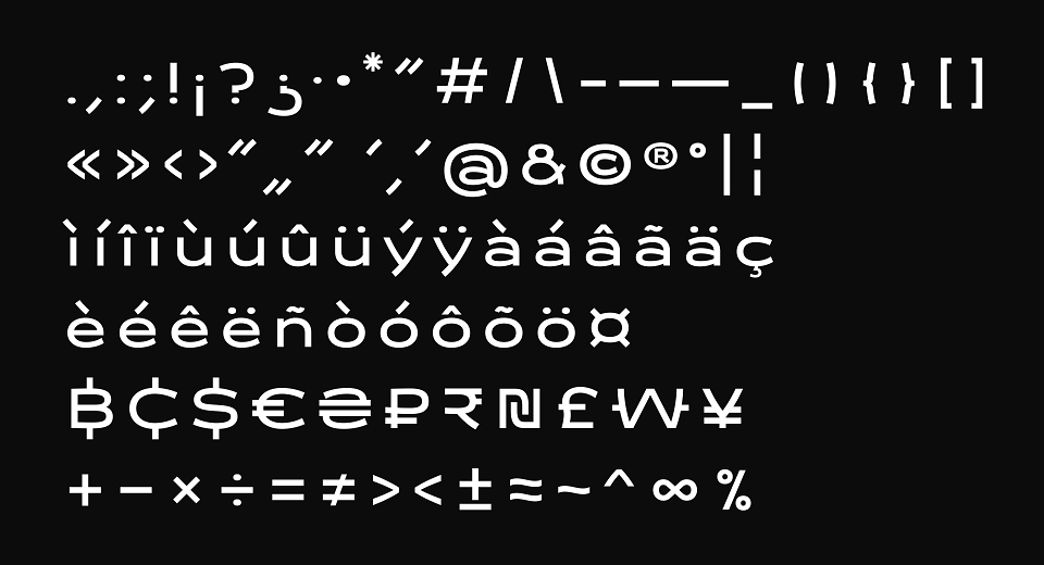
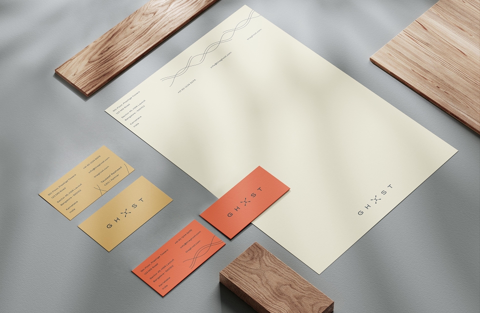
We created a logo that mirrors the richness of ghost notes—elegant, dimensional, and precise. A diamond-shaped “X” anchors the design, with custom typography reflecting echo and clarity across a wide sound spectrum.
GHXST’s visual world is anchored in geometry, minimalism, and sonic metaphors. The bold “X” motif recurs throughout the system, supported by a refined color palette and accented with gold to underscore luxury.
Fine lines reference sound frequencies and pentagram structures, grounding the brand visually in the world of music. Across packaging, digital interfaces, and touchpoints, GHXST presents as a premium, immersive experience—where every detail speaks to the artistry of sound.
As product development progressed simultaneously with our creative development, we relied on product mock-ups as a stand-in while we made the creative concept come alive. While GHXST has not entered the market, the brand work remains a bold entry to a concentrated field in consumer-driven personal tech.