Lawson
Public Affairs Culture & Tourism Officer/ Designer
ABOUT
The Challenge
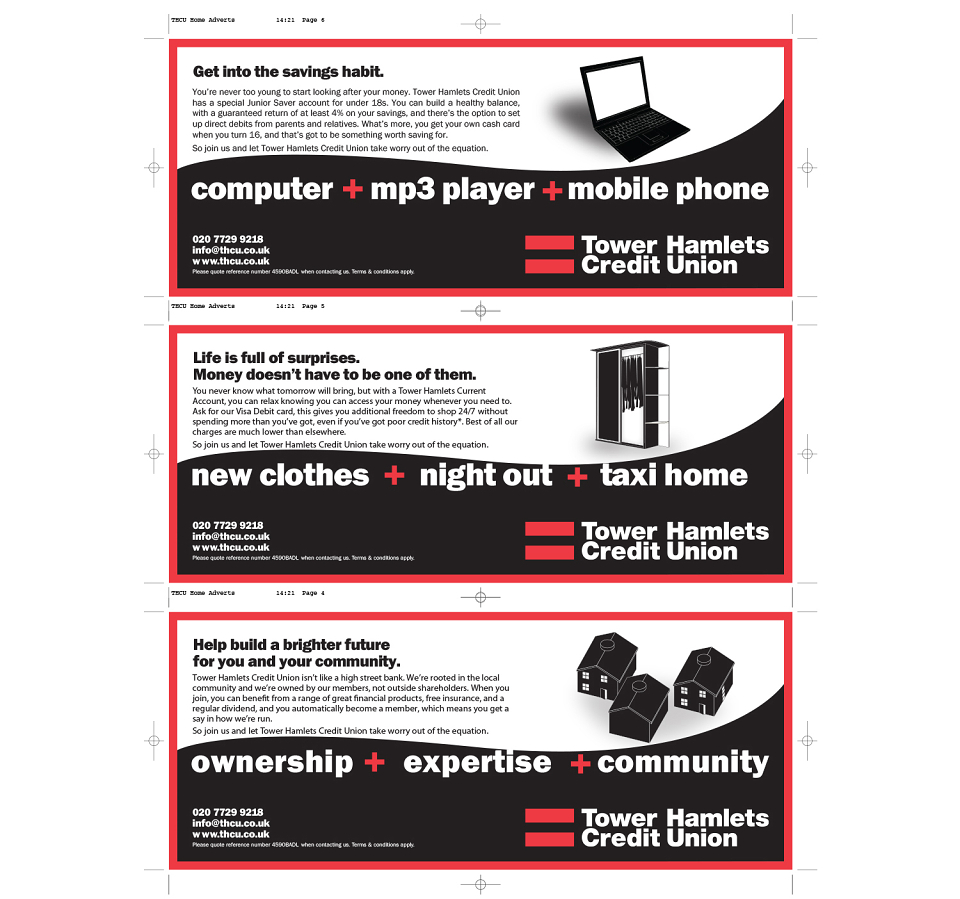
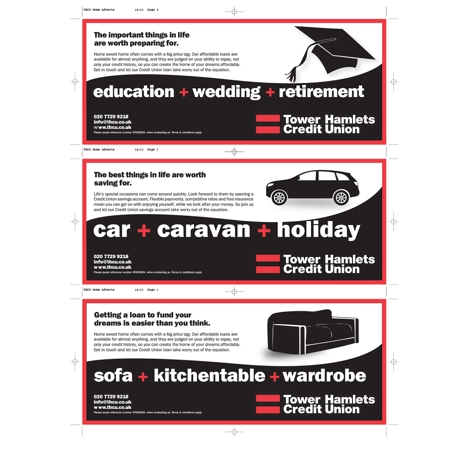
Tower Hamlets Credit Union (THCU) required a clean, professional advertisement for display in local newspapers across East London. The key challenge was to create an effective and visually appealing design while adhering to a strict budget. The client requested the use of only three colours—red, white, and black—which required careful consideration to ensure the design remained impactful yet cost-effective.
The Strategy
The strategy was to design a simple, bold advertisement that would capture attention in a busy newspaper layout while maintaining a professional look. By focusing on the use of red, white, and black, I aimed to create a striking contrast that ensured the key message stood out. The advertisement would be clean and easy to read, reinforcing the credibility of THCU and inviting potential members to learn more.
The Execution
I designed the advertisement using a minimalistic approach, utilising red, white, and black to create visual hierarchy and emphasis on THCU’s core message. I ensured the design was professional and legible, with clear typography and strategically placed imagery to support the message without overwhelming the viewer. The layout was optimised for newspaper print, ensuring the advertisement would be effective even at a smaller scale.
The Outcome
The advertisement successfully communicated THCU’s message in a visually clean and professional manner, staying within budget while delivering the desired impact. The bold use of red, white, and black ensured that the advertisement was eye-catching and memorable. The design was well-received, helping to raise awareness of the credit union in East London and potentially attracting new members.