Lauren Connor
Design Director
ABOUT
Brief in brief:
Create a new positioning for Norway's leading chocolate brand Freia that could be reflected through a masterbrand identity. Following this, create a new brand architecture to unify the complex and disparate cross category product portfolio of 250 plus variants.
Our thinking and doing:
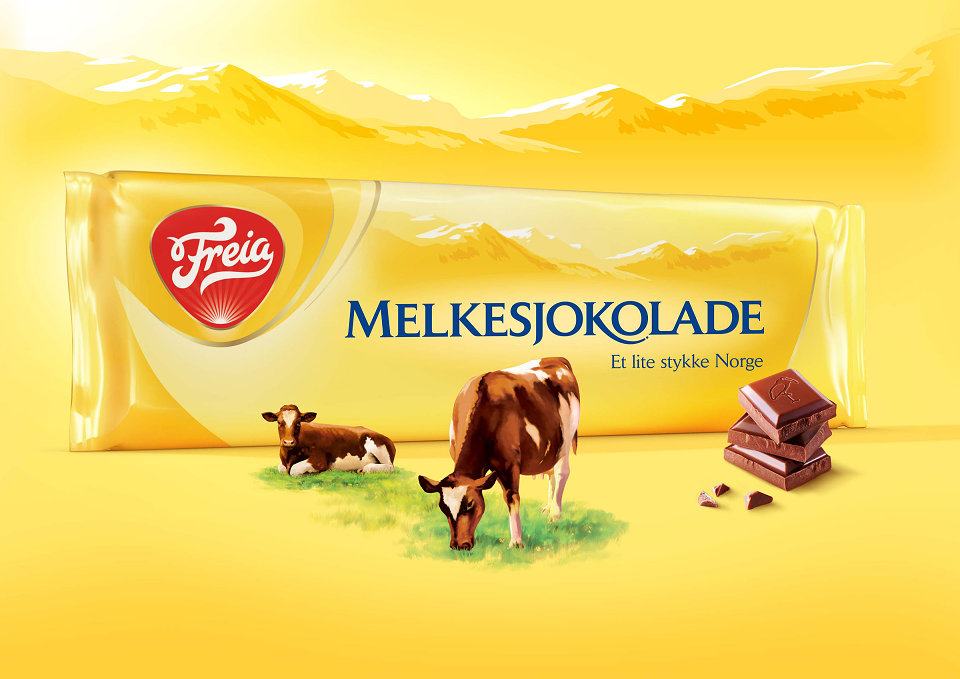
Freia holds a special place within the hearts and minds of Norwegians; it’s an integral part of their heritage and culture. We wanted to build on this and make that emotional connection even stronger. This is how we landed on the idea of building ‘Kos’ - a special Norwegian word that translates as ‘coziness’ - into the very heart of the brand. During our initial meetings with the team, we were taken to see the Freia clock in Oslo, a landmark of great emotional significance for Norwegians. We immediately felt there was a strong idea there just waiting to be unearthed. Inspired by the Freia clock, the new masterbrand identity features light fractals emanating to radiate warmth and ‘Kos’ across the pack, the idea being that everything is literally ‘touched’ by Freia.
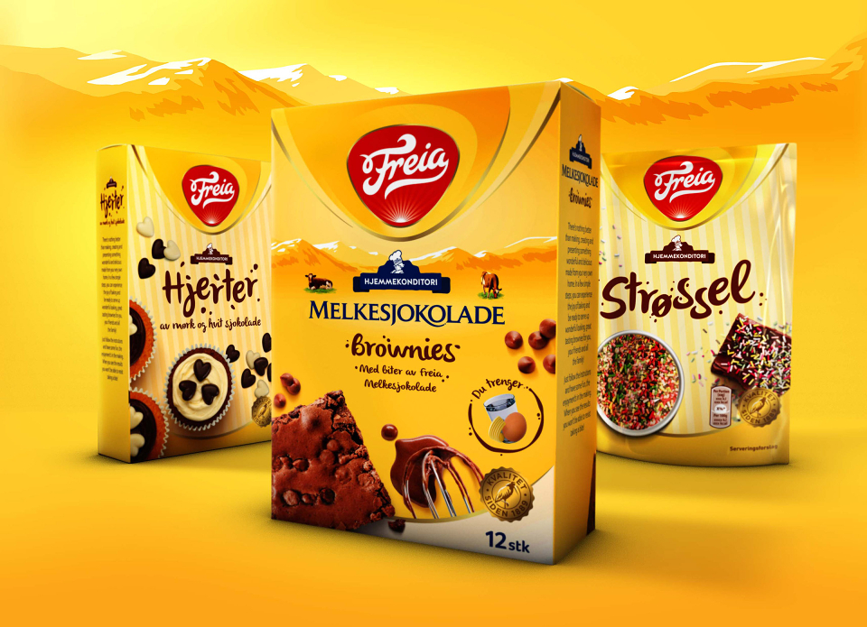
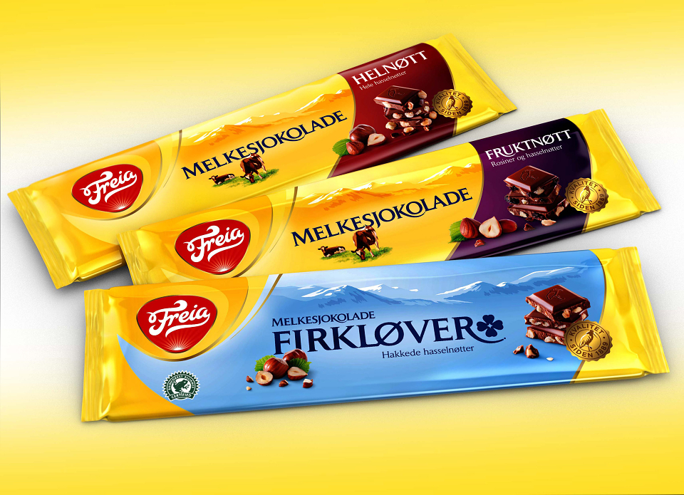
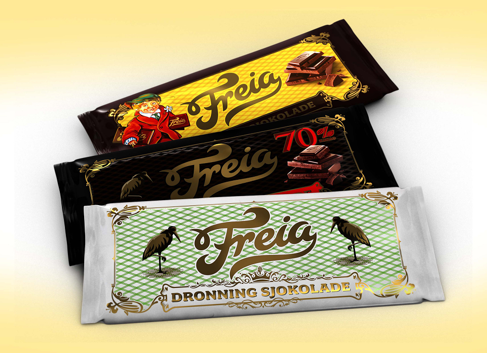
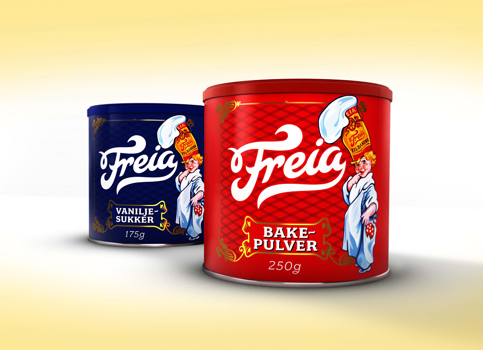
Once the masterbrand idea was landed, the small task of harmonising this hugely diverse and varied product portfolio began. This was achieved through a distinctive brand architecture and approach, which allowed the different category codes and sub-brand personalities to shine through, while simultaneously ensuring visibility and standout at fixture.