Lauren Connor
Design Director
ABOUT
Brief in brief:
Create a new brand identity and packaging design for the UK's favourite pickled veg brand, Haywards that will engage a younger demographic without alienating the brand's existing, older consumers.
Our thinking and doing:
We wanted to invigorate an old fashioned and traditional category dominated by private label by pushing boundaries and positioning the Haywards brand as the ‘Masters of Pickle’. Haywards pickled veg has a loyal fan base of older consumers, who have grown up eating it, however research showed that consumers didn’t understand the flavour profiles and strengths of the various products in the range. Our challenge was to create a bold and flavour-centric design to entice younger consumers to trial the products – all without alienating existing consumers.
As part of our strategic process, we developed the ‘Tongue-tastic’ creative platform to capture the sharp, cheek-sucking, eye-popping flavour sensations of a Haywards’ pickled vegetable – ‘the veg with edge.’ From this, the creation of a bold design would emerge – a visual interpretation of a ‘flavour punch’ that is striking, impactful and promises to smack taste buds squarely in the face.
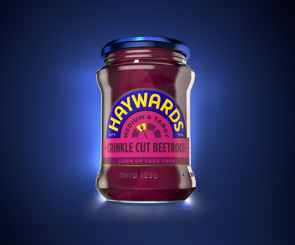
We needed to push the boundaries with a new look that amplified this perception of big lively flavours, while capturing culinary imagination and eliciting a curiosity for flavour experimentation. Haywards pickled vegetables’ had a vast product offering, which was both wondrous and confusing. Therefore part of the design job was to create a simple, approachable visual language that helped consumers understand the different products, flavours and usage occasions, demystifying the pickled veg category and educating consumers in a fun and engaging way. Central to the design is the Haywards’ ‘Tang-o-meter’. Defined by colour and a gauge, we used this device as a means of illustrating the various flavour intensities of the products. Consumers could, as it were, ‘dial up the tang’, from ‘sweet and mild’ to ‘hot and spicy’. The lighter shades of the Tang-o-meter represent milder flavours with the colours deepening in richness as the product flavour becomes more intense.
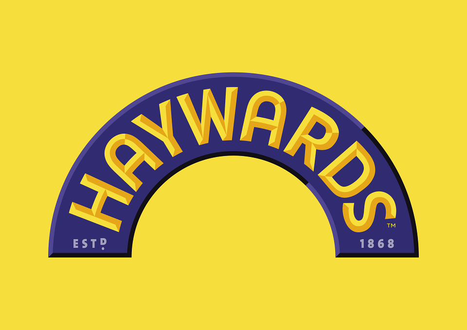
Next was the brand identity. Keeping the existing Haywards yellow-on-blue colour scheme, we created a contemporary hand drawn brand mark inspired by the vibrant, vintage-style typography of Latino art. Emboldened by contrasting 3D detailing, the identity frames the 'Tang-o-meter' giving it real punch. Beneath the flavour dial, the product is labelled accordingly with bold typography using a colour scheme that is in line with the flavour. The brand’s strapline “Liven Up Your Food” sits at the base of the label – a nod to the positioning that Haywards pickled veg is the ultimate foundation for a vibrant and punchy plate of food.