Lauren Brecher
Graphic Designer
ABOUT
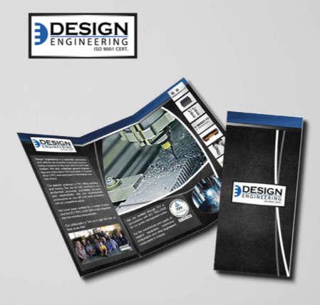
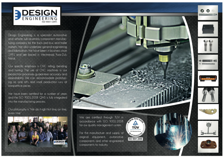
A engineering firm hired me to revamp their Corporate ID and to create a brochure of their products. The logo I created used their existing colour scheme of blue, black and white. They liked my idea of creating the logo looking like a cog/machined part in the shape of a D and E. The brochure also required me to photoshop a lot of their products as they were very dirty or did not actually have reference photographs. The client was very pleased with the end result.