Laura Hemphill
Creative Designer
ABOUT
The beauty of designing wine labels is having a sophisticated brand to elevate. Exploration of typography, colour, illustration, paper textures and speciality printing techniques were used in these instances to drive the creation of beautifully crafted wine labels.
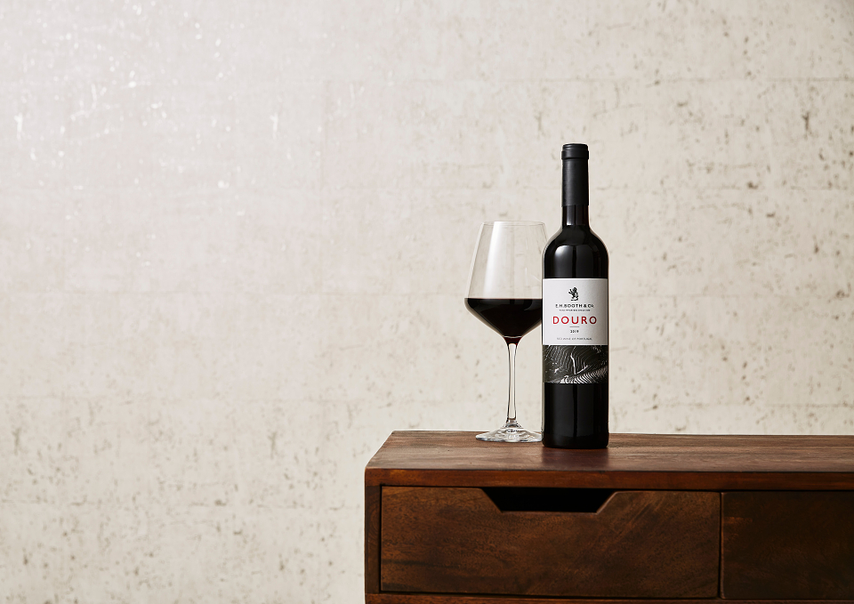
Inspired by the Douro region from where the wine originates. Simply one of the most glorious spots on earth. One of the world’s oldest demarcated wine regions (since 1756), the Douro Valley showcases steep terrace vineyards carved into mountains, which simply had to be the dominating feature on this label design!
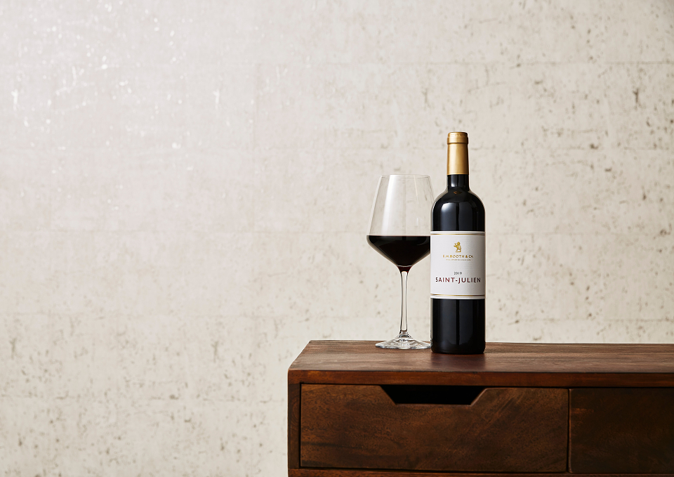
This wine reflected an elegant and gracious French wine and so, it felt necessary to reflect the sophistication of this wine via a beautifully paired back label design, finished with luxurious textures and print finishes.
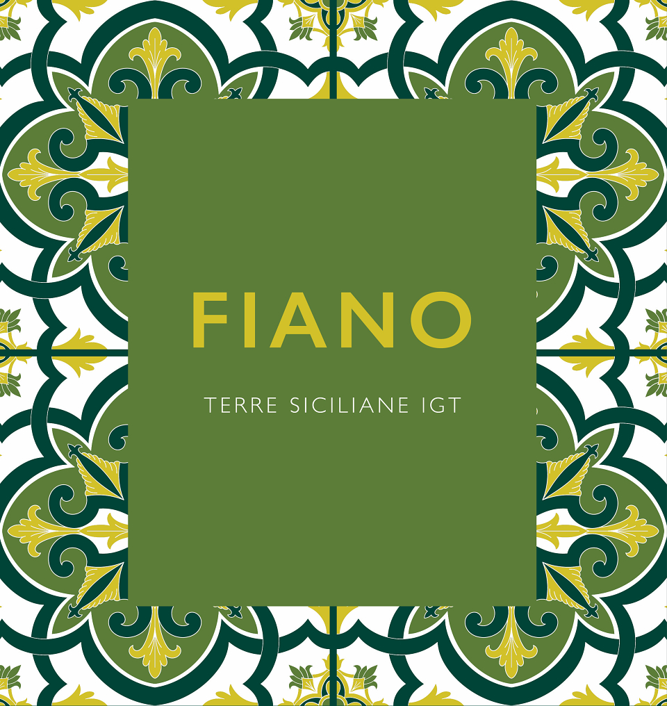
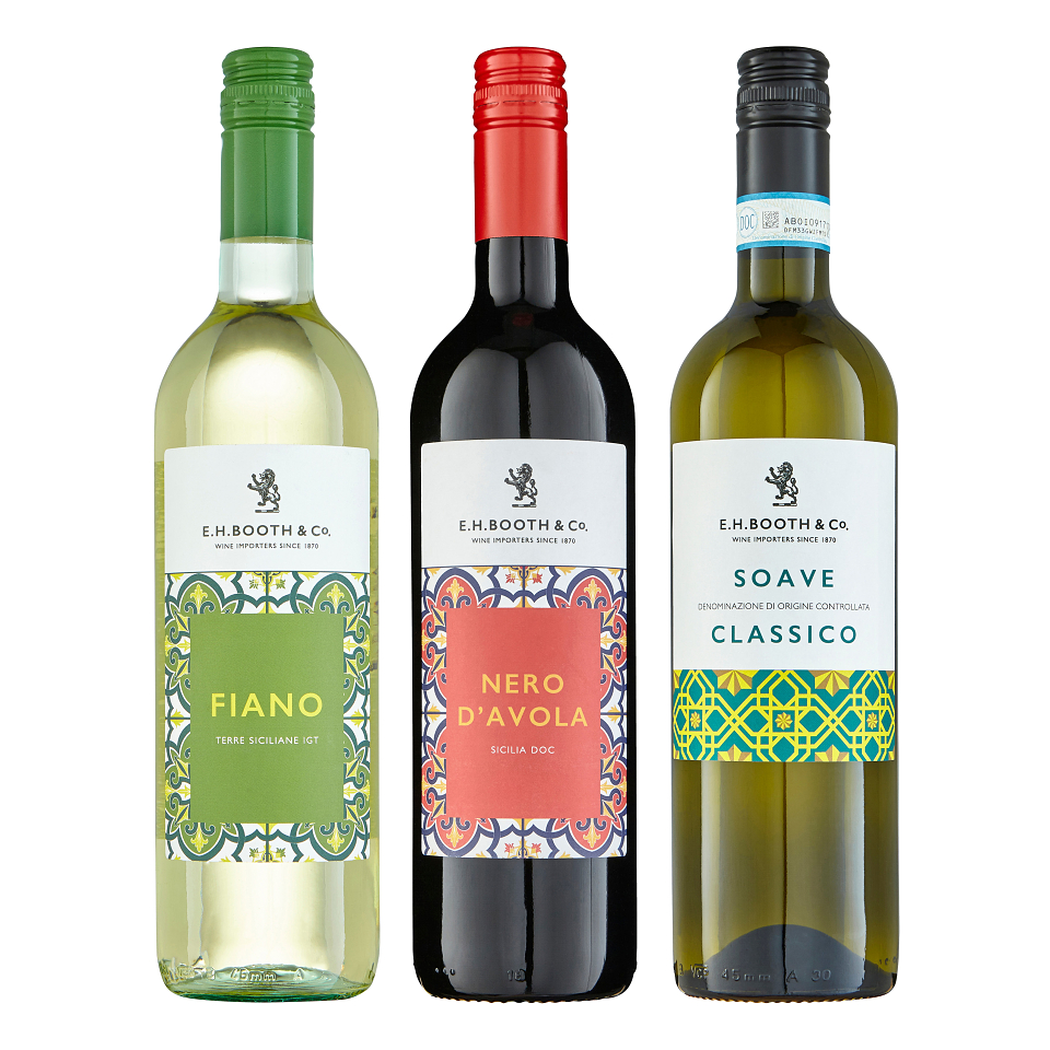
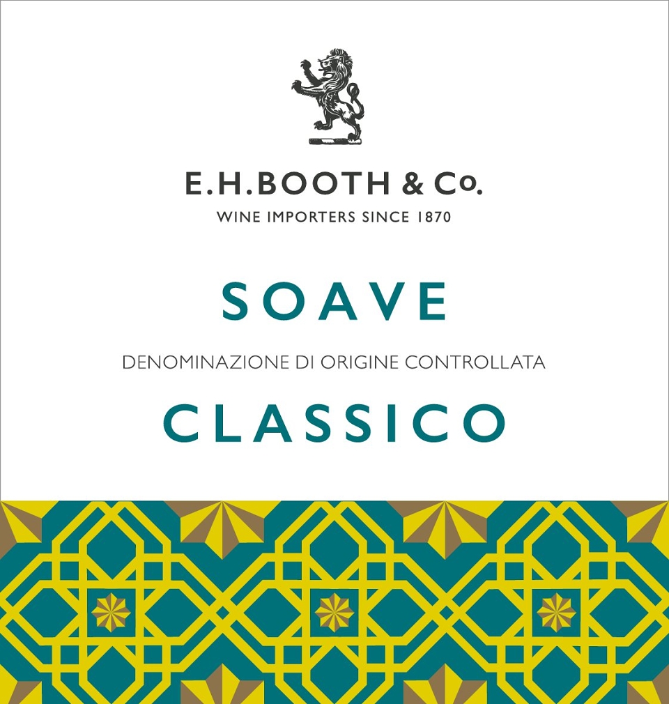
This range of wine is a mid tier level and the brief was to inject a little character into the design by taking inspiration from their origin. Originating from the vibrant Sicily, the design broadly took inspiration from the illustrative patterns displayed on tiles. The vector illustrations were drawn up and colourways chosen associated with the wine varieties. The use of traditional style patterns meets a modern look, with bold contrasting colours and elegant typographic styling.
MADEIT CREDITS
-

Laura HemphillLead Creative Designer