ABOUT
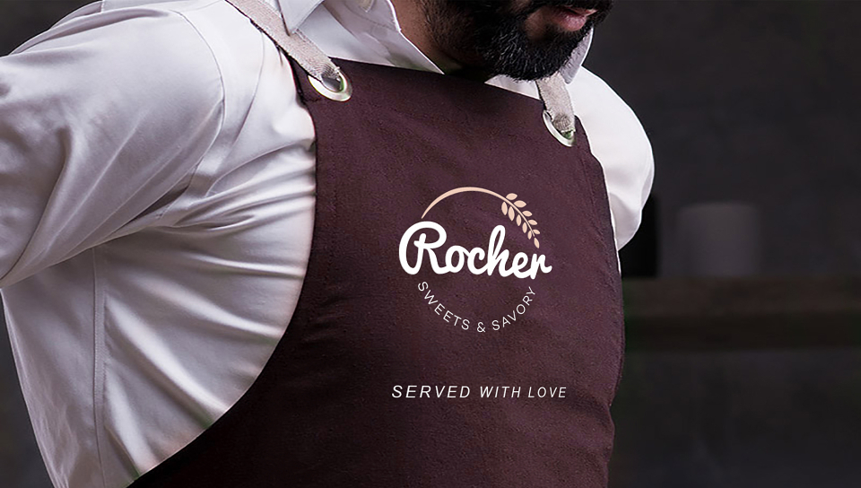
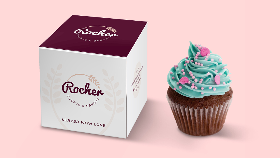
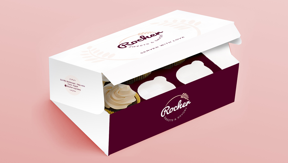
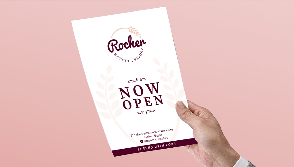
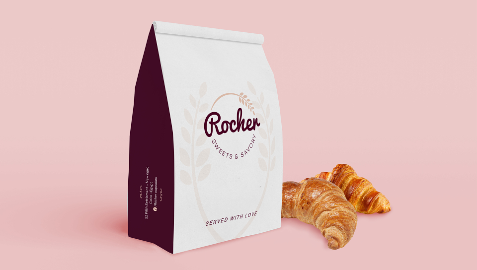
Rocher sweets & savory is our latest branding & packaging design in sweet industry.
LASHEEN create the concept of the logo based on using wheat's spike icon, which refers to the freshness and quality of the product, as its produced fresh day by day .
The colors and fonts selected to reflect the elegant category of the shop and their target clients .