


For more than 50 years, the National Children’s Bureau has worked to champion the rights of children and young people in the UK. Years of austerity have seen funding for children’s services and education cut by local authorities and central government while the demand for support has increased. In this climate, the charity – and its six supporting sub-brands – wanted to refocus how it articulates its impact. Lantern was appointed to redefine its strategy and identity, helping to better tell the organisation’s story with clarity and conviction.
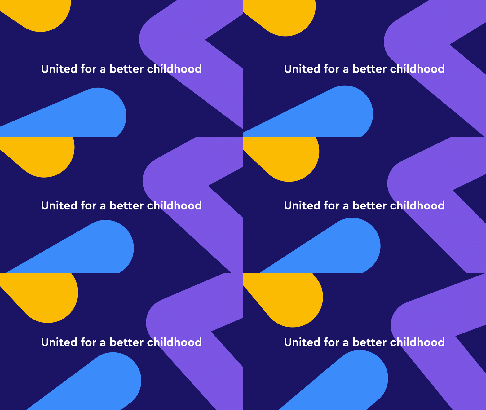
Following a series of stakeholder workshops, we developed a new strategy to better articulate the charity’s point of difference. The first step was to reframe the sense of unity within the organisation. Previously, ‘United for a better childhood’ meant being united internally, which wasn’t a compelling story for fundraising. Our research revealed NCB did far more than this – uniting central and local government, charities, schools, the media, and society as a whole. This meant they weren’t just impacting on the lives of individual children, but the lives of an entire nation.
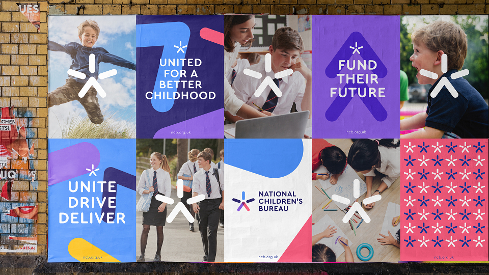
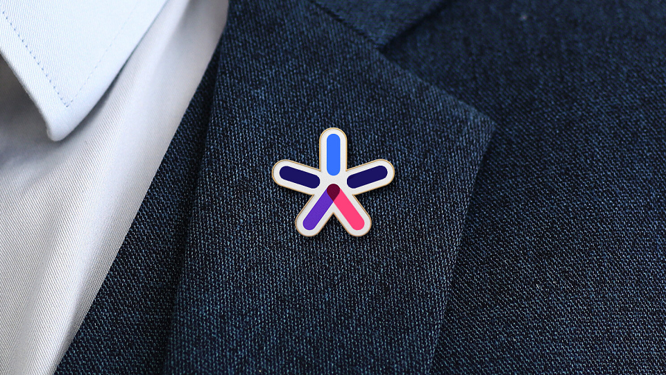
The new brand is flexible enough to appear playful and engaging, whilst also being able to communicate to government officials and policy makers. As well as flexing for different audiences, the brand system is designed to work for both print and digital applications. The logo captures the very essence of ‘United for a better childhood’. A star, a jumping figure, an upwards arrow – the symbol provides a refreshed energy and sense of optimism.
A bespoke, illustrated typeface builds on the concept of many elements uniting, whilst the illustration style provides the opportunity to communicate complex issues in a simple and intelligent way.
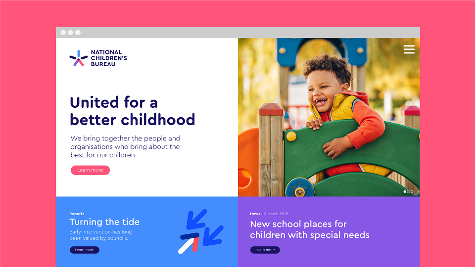
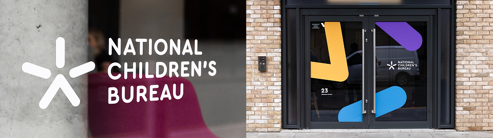
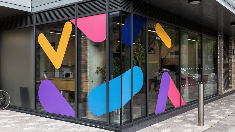
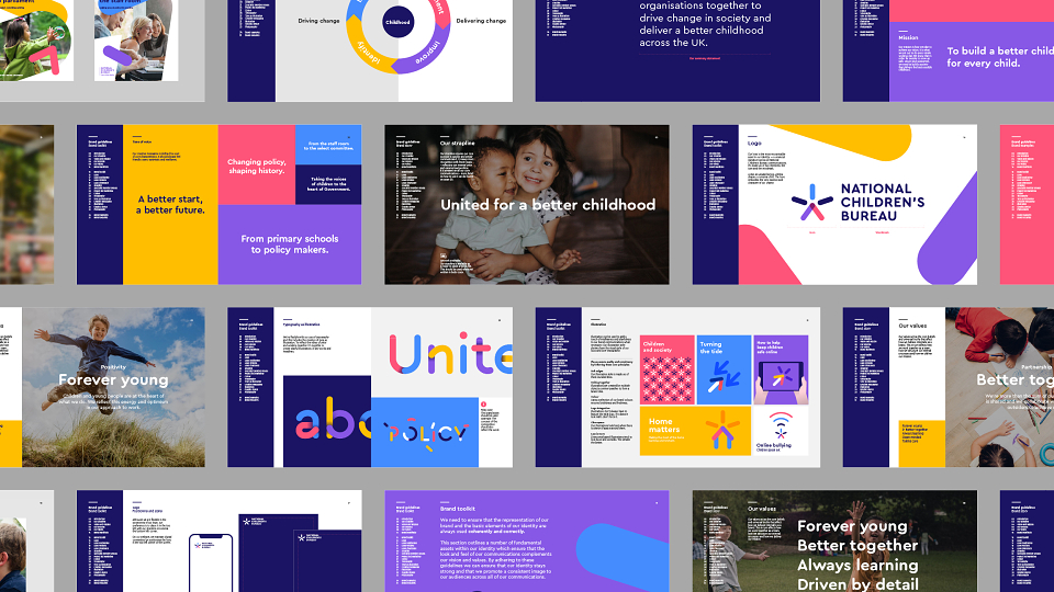
We worked closely with the charity's internal marketing team to help launch the identity across applications including brand guidelines, animation and a new website. To coincide with the rebrand, NCB also took residence at their new offices. Our design team worked on wayfinding, signage, window graphics and wall murals throughout the building.
The new identity system unites six sub-brands with the parent, through a shared visual and verbal style, delivering a clear and compelling vision for the future. Following the launch, the re-brand was awarded silver for ‘Best Creative Strategy’ at the Transform Awards Europe.
Transform Award