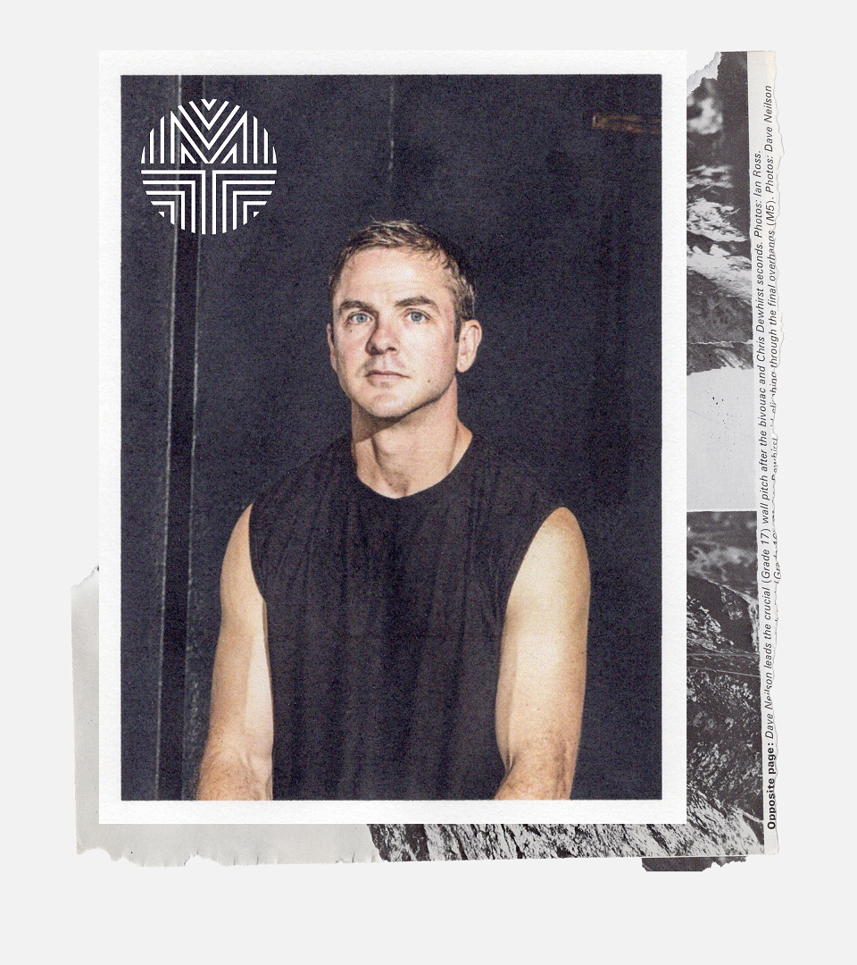
Kyle Eertmoed
Founder & Designer
ABOUT
Concept
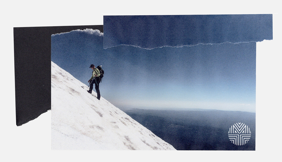
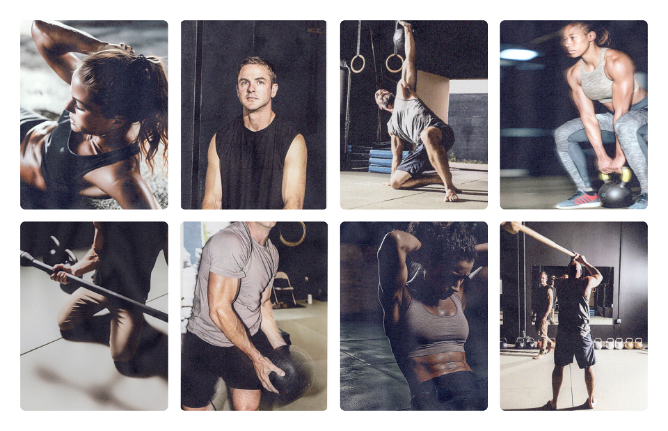
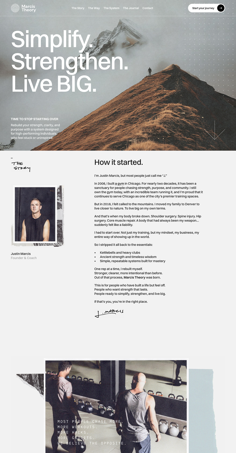
Marcis Theory is a strength coaching practice built on ancient training methods: heavy clubs, kettlebells, and intentional bodyweight movement for high-performing men in midlife. The challenge wasn't just creating a brand from scratch. It was replacing one that had stopped working. The previous identity, Meridian Theory, had stagnated. It didn't represent the founder, his methods, or where he was heading. The brief was to uproot everything and build something that could carry the weight of a genuinely different philosophy in a crowded, trend-driven category.
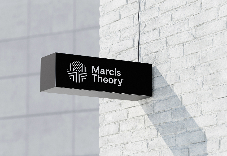
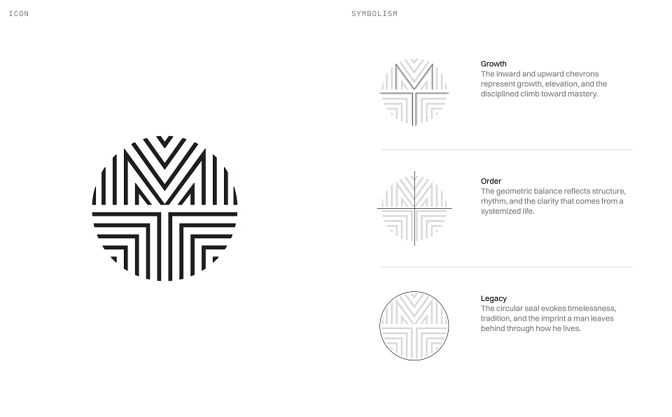
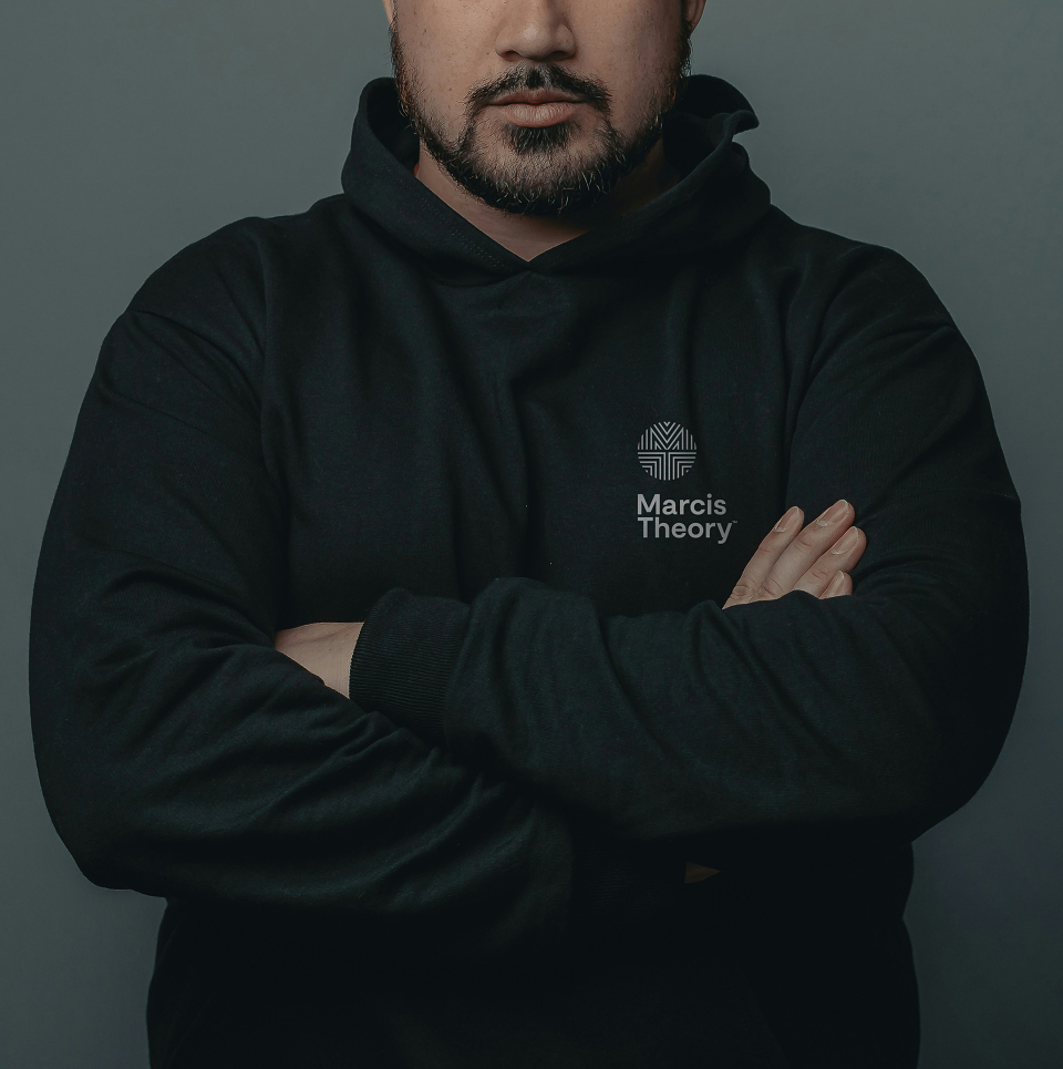
The concept centers on timelessness over trend. Drawing from ancient seals, warrior markings, and architectural geometry, the identity was designed to feel primal and modern at once. A badge rather than a logo. Something earned.
Execution
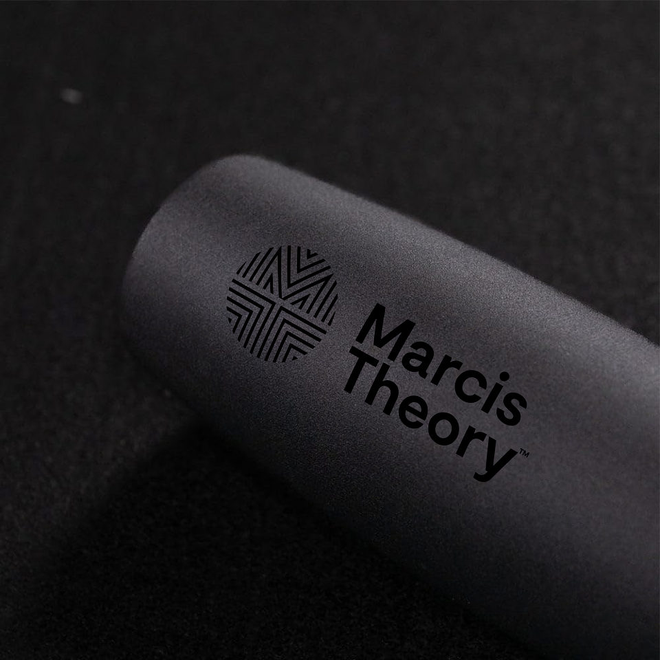
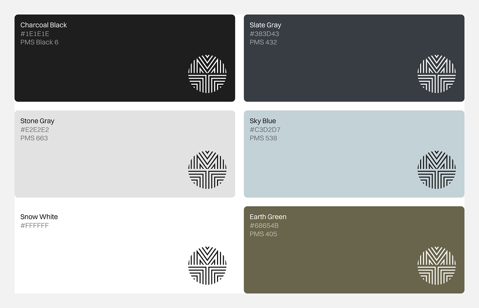
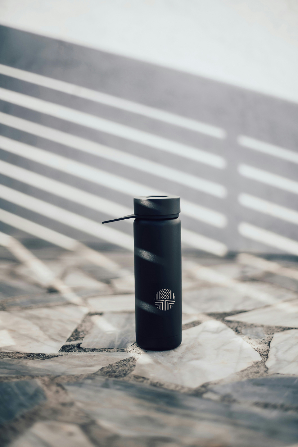
The wordmark pairs with a monogram that fuses M and T into a circular seal. Inward and upward chevrons signal growth, discipline, and ascent without stating it. The palette draws from the natural landscape: charcoal, slate, earth green, sky blue, and snow white. Elemental and muted, with nothing borrowed from fitness industry conventions.
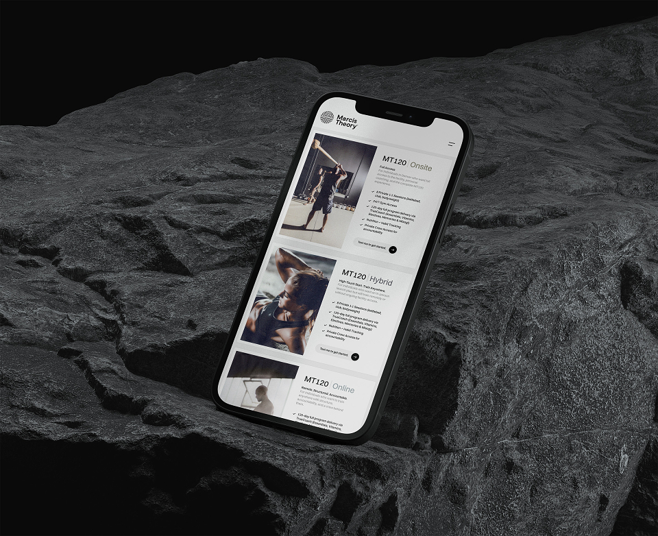
Switzer anchors the typography, clean and commanding at scale. A handwritten secondary voice adds a human, tactile quality that keeps the brand from feeling cold. The same tension between precision and humanity carries through to the website, built in Framer for pixel-level design control and seamless performance across devices.
Results
The rebrand gave the founder something the previous identity never did: confidence. For the first time, sharing the practice felt aligned with what it actually was. The athlete roster has grown. The methodology has found its audience. A brand built on integrity turned out to be the most practical business decision of all.
Credits
Kyle Eertmoed
Creative Director & Designer
Chris Fairchild
Monogram Designer
Brandon Lopez
Photographer
MADEIT CREDITS


Annual 2026 ShortlistMarcis Theory Brand IdentityBranding