Uyen Thao Nguyen
Graphic Designer
ABOUT
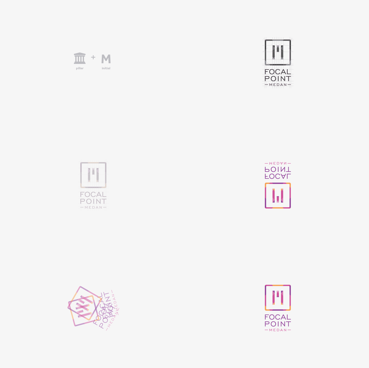
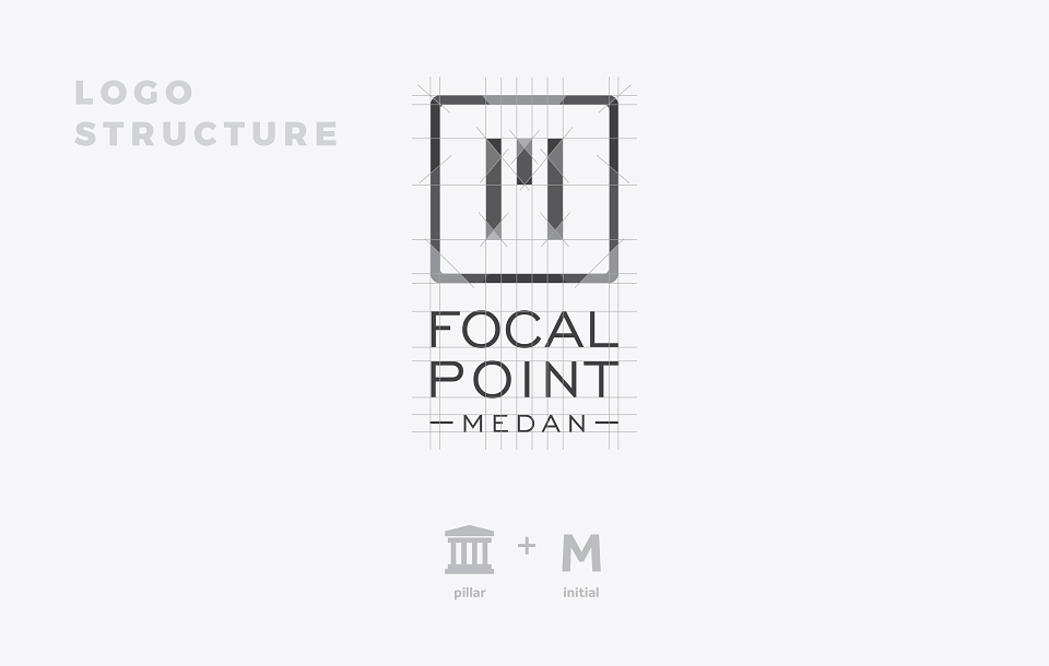
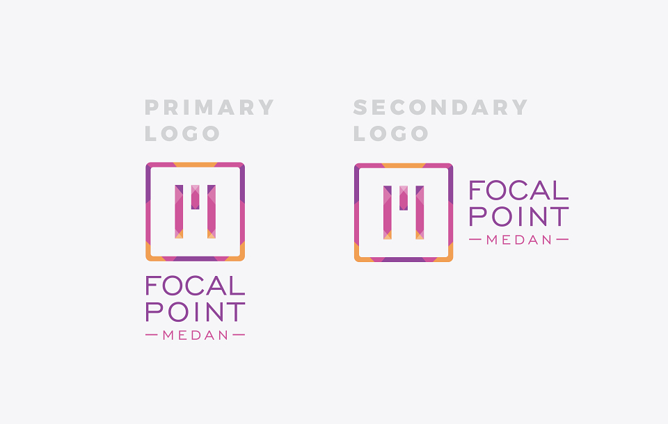
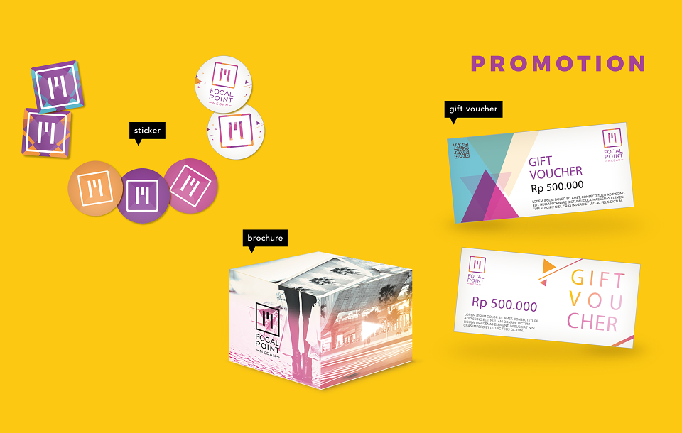
The logotype of M for Medan.
When heard of ‘Medan’, people will directly think about the Focal Point; the three bars represent the supporting pillar; small pillar in the middle meaning the position of the mall always in the top, as the best in Medan.
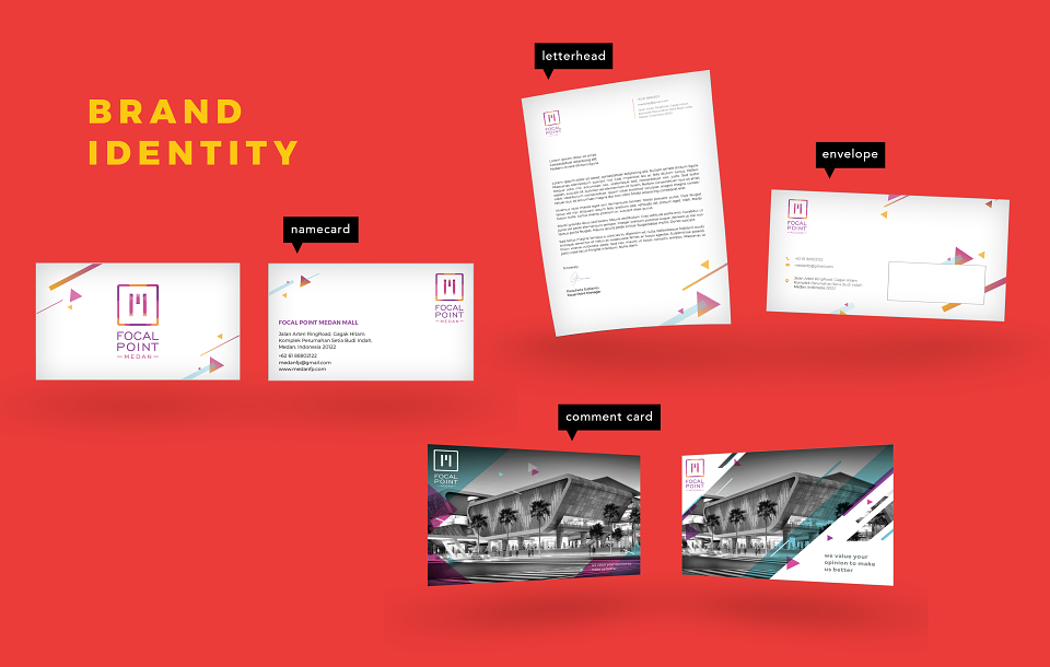
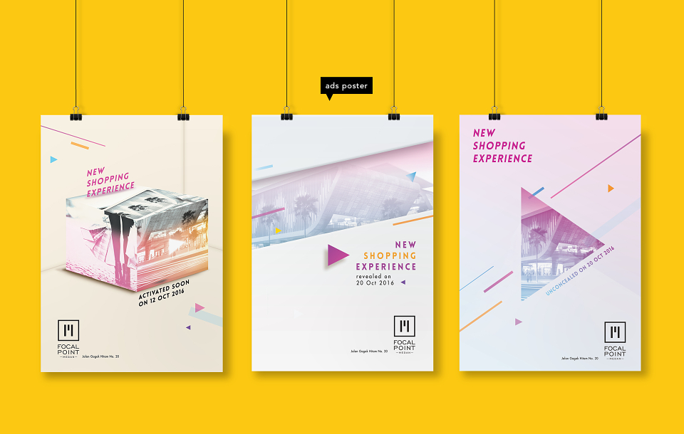
Geometric Pattern
Represent the regularity suggests organization and efficiency.
Rectangle: suggest conformity, peacefulness, solidity, security and equality (foundation of buildings)
Triangle: represent dynamic tension, action and aggression
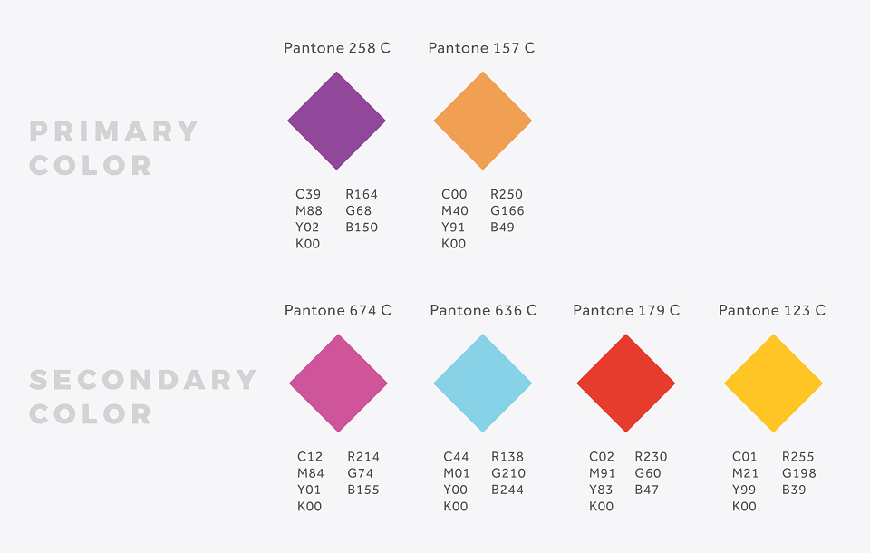
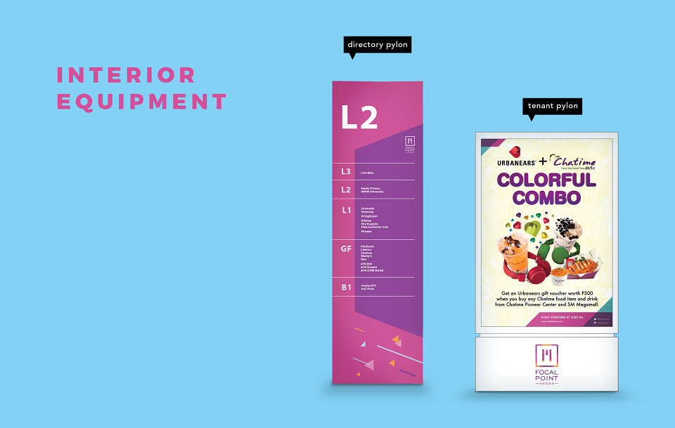
Orange and purple colours brings the physical energy and cheerfulness, optimistic and uplifting; also represents creativity idealism, charisma and alluring energy
MADEIT CREDITS
-

Uyen Thao NguyenGraphic Designer