Iggy Kos
Creative Director
ABOUT
Concept
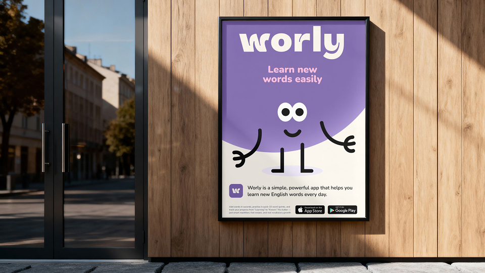
Worly is a language learning app designed around one core idea: learning words should feel simple, structured, and actually stick. Instead of overwhelming users with content, the product focuses on small learning sprints and clear progress states — turning vocabulary into a daily habit.
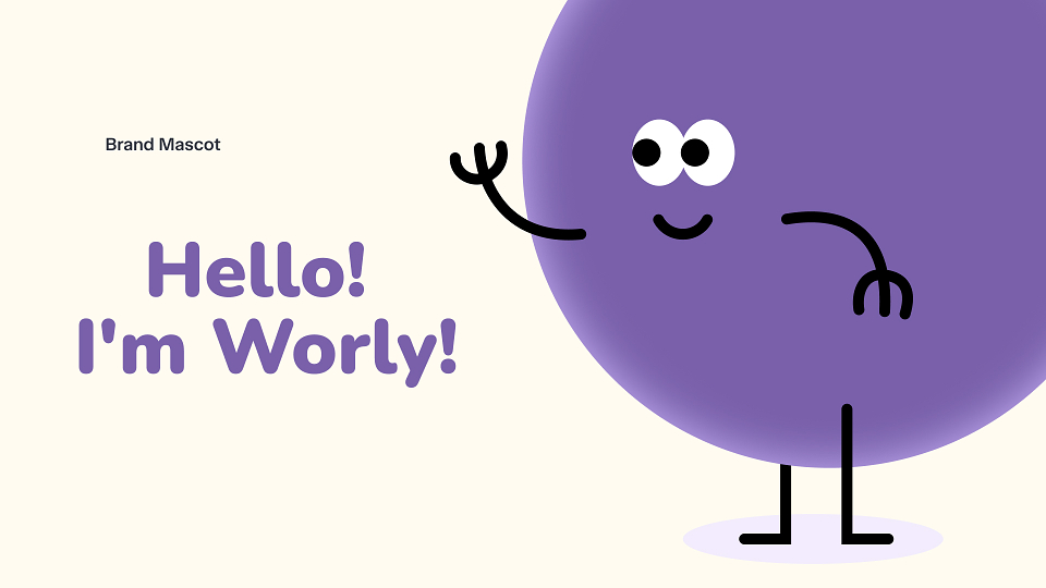
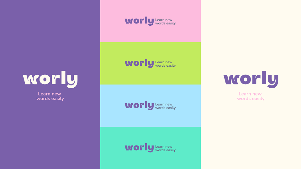
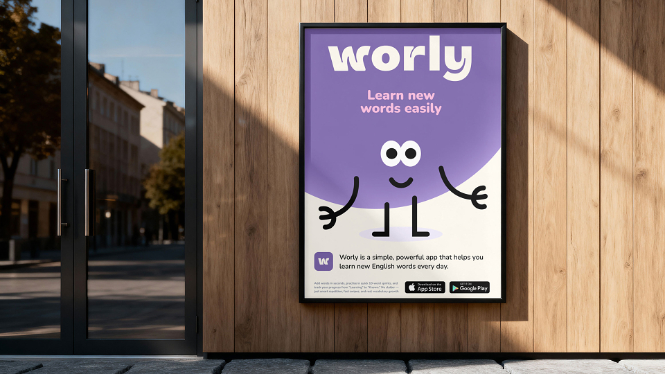
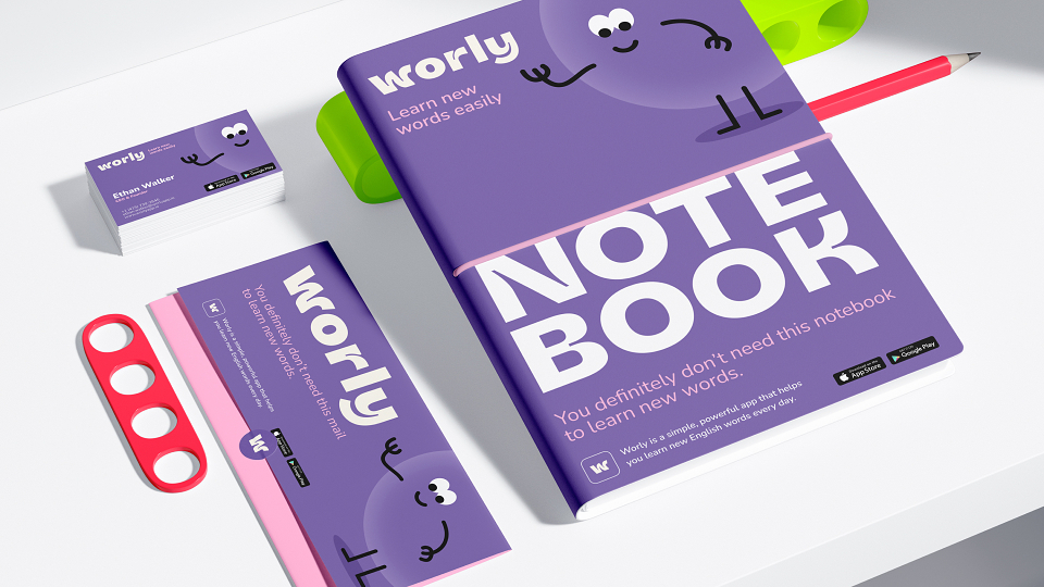
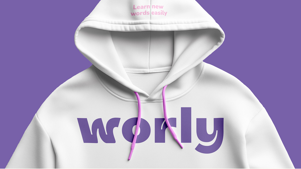
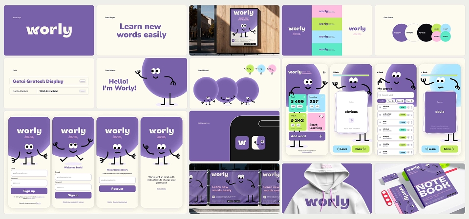
The brand identity reflects this philosophy. Soft shapes, playful motion, and a character-driven system make the experience feel friendly and low-pressure, removing the intimidation often associated with language learning.
Execution
I developed the project end-to-end — from naming and positioning to visual identity and product design.
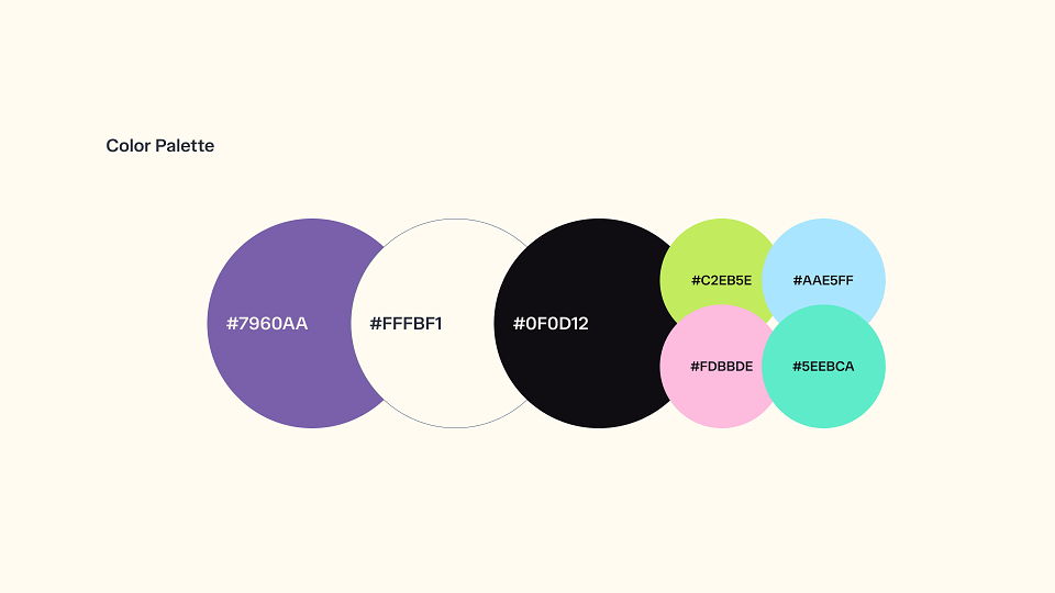
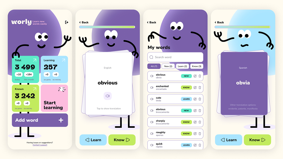
The system is built around three key learning states: new, learning, know, which directly shape both the UX and visual language. The interface reinforces this structure through clear color coding, simple interactions, and minimal cognitive load.
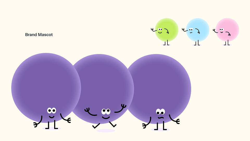
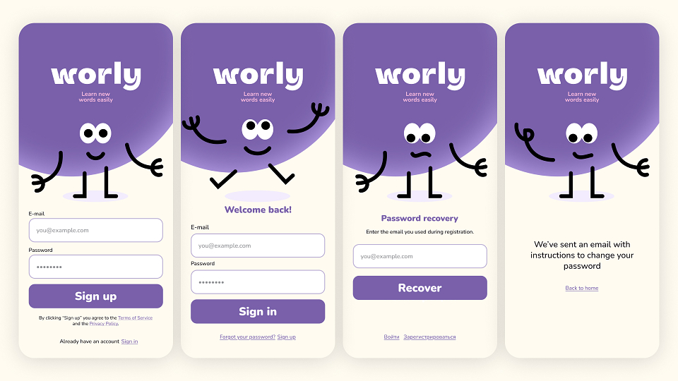
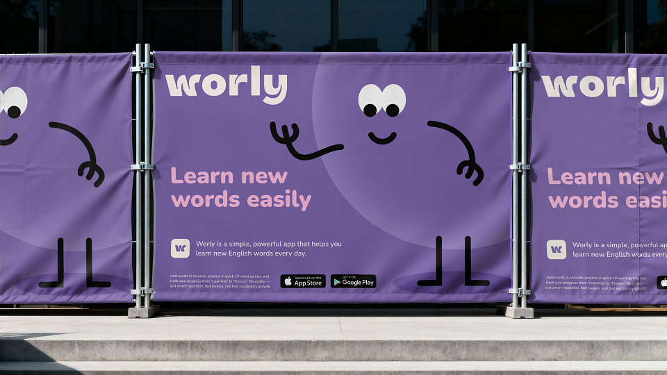
The mascot becomes a central storytelling element — a visual metaphor for knowledge growth — used across onboarding, learning flows, and communication touchpoints.
The UI is designed to support fast interactions: quick word input, swipe-based learning, and distraction-free sessions aligned with habit-building mechanics.
Results
The result is a cohesive product experience that combines branding and UX into a single system. Worly stands out from typical language apps by focusing not on content volume, but on clarity, consistency, and behavioral design.
The project demonstrates how a strong concept can unify product logic, visual identity, and user experience into a scalable system.