Iggy Kos
Creative Director
ABOUT
Task
To develop a professional and cohesive brand identity for MKSP, a Russian company specializing in the design of infrastructure projects and urban environments. The identity needed to reflect the company’s technological precision, systematic approach, and expertise in complex design solutions.
Solution
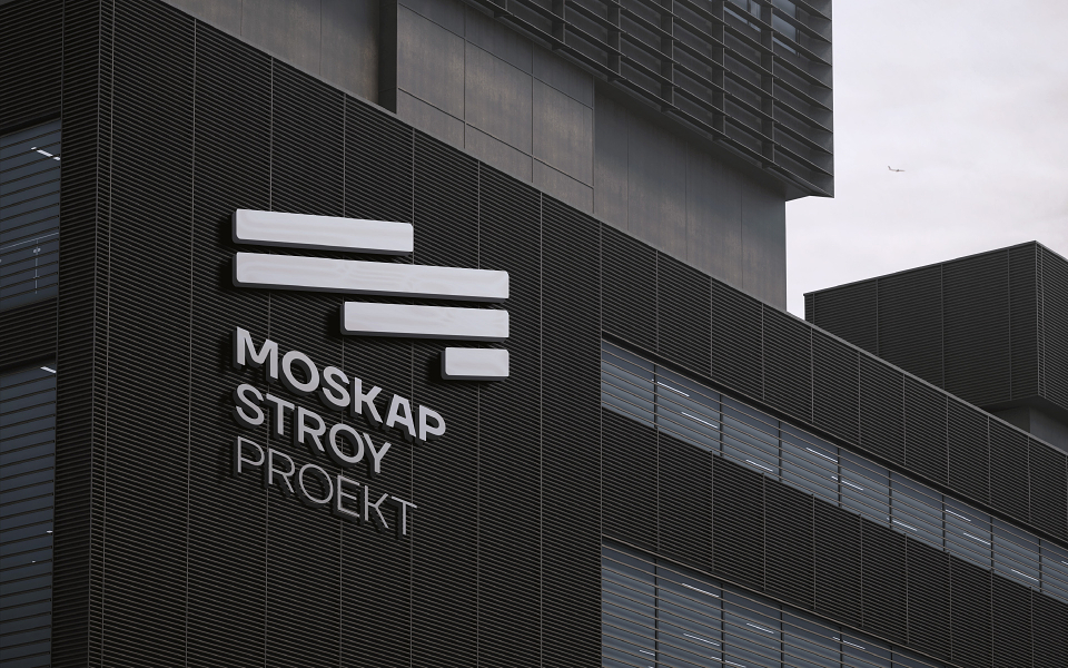
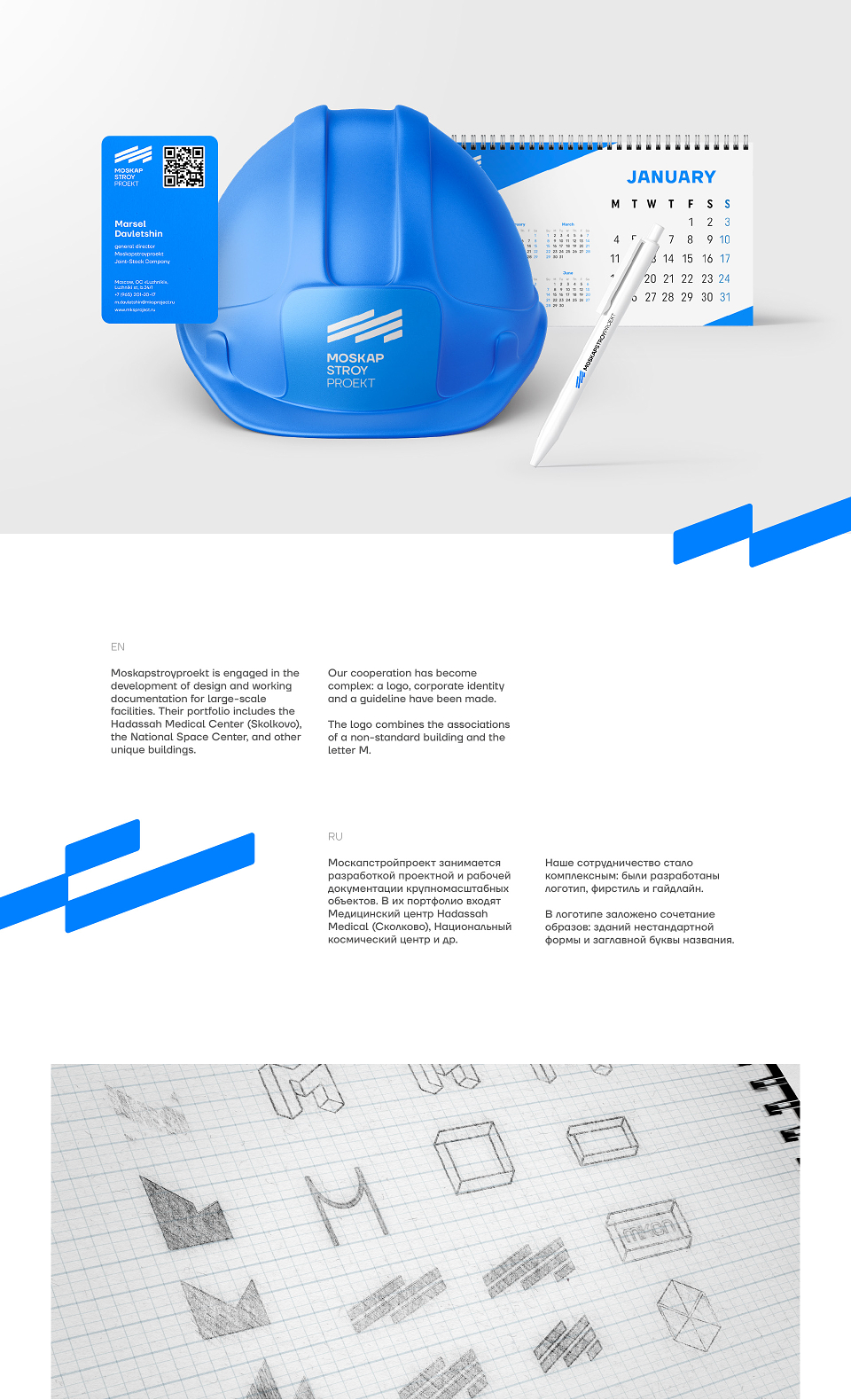
The design concept was grounded in the principles of engineering precision, structure, and modularity. The logo was created using architectural grids and project blueprints, symbolizing the company’s meticulous planning and systematic approach.
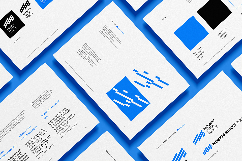
The color palette features soft blue tones, representing clarity, transparency, and high technological standards, which are central to MKSP’s work. This color choice also conveys a sense of intellectual expertise and professionalism.
The typography was selected for its clean, geometric design, reinforcing the company’s technical nature. The overall visual system incorporates thin lines, modular structures, and balanced proportions, drawing direct references to architectural blueprints and urban planning.
Result
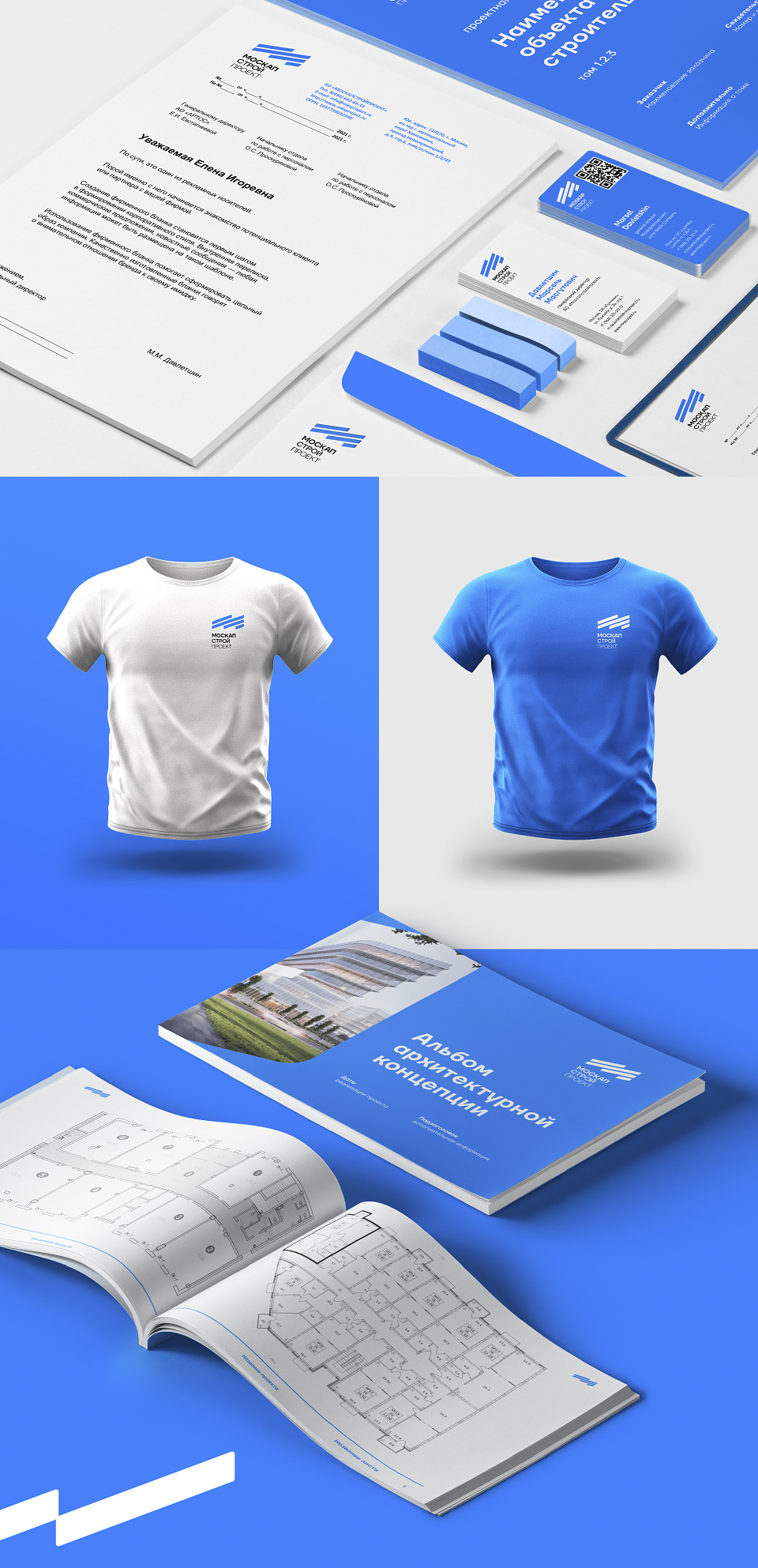
The resulting brand identity reinforces MKSP’s position as an authority in the design of infrastructure and urban projects. The identity successfully communicates the company’s commitment to precision and reliability while enhancing brand recognition and trust with partners and clients.