Caroline Ellis
Head of Marketing
ABOUT
The ask: Translating values and strategy into an engaging, understandable and cohesive LIMA Services identity. Taking into account a recent business strategy day which had identified short-term goals with long-term objectives. While keeping core brand elements such as shapes, colour, tone of voice, imagery, graphics, iconography and style.
The existing brand style was heavy and dark. Execution of the original styling had not been consistent or measured against changes in business strategy.
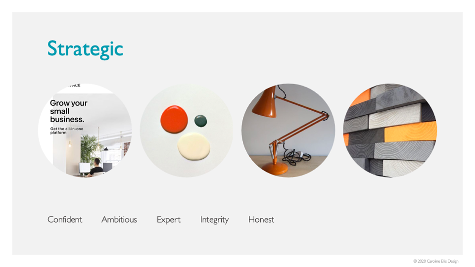
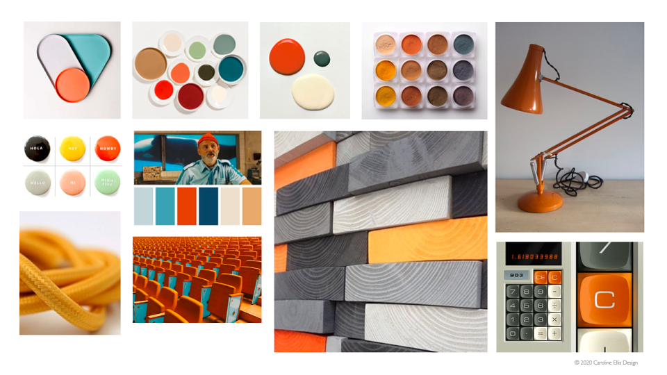
The CEO didn't like the original secondary colour palette and there was confusion in how to use them in context. I took a look at the use of tone to convey the business outcomes from a recent strategy day. Orange is a hard colour to balance when using a bright secondary palette. If there isn't a real need for lots of colours then simple use shades and tones can be utilised in a strategic way to bring life, clarity and direction to an identity.
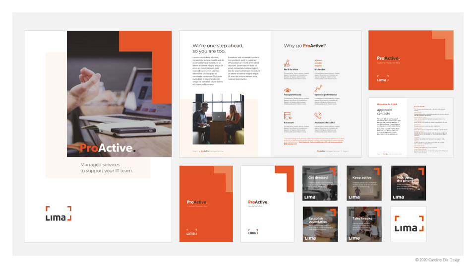
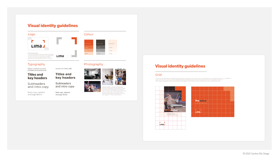
I proposed a more mature, muted palette, using clear alignment and grids for placing core brand assets.
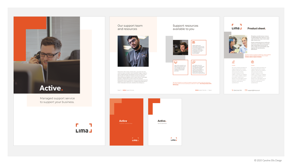
I demonstrated how the four corner device could be used more strategically and focus the brand identity back to the basics of the logo. The use of the core brand orange as a key highlight but not dominate. I gave the client ideas in how this refresh could be used across media and platforms, but stay true to the basics, how this direction could elevate their collateral to align with the new business strategy. Conclusion of the project included the production of a two-page brand reference guide in how to execute consistency and clarity with the brand basics.