Kiran Ghattaura
Graphic Designer and Branding Consultant
ABOUT
Early Years Training Enterprise was an organisation that worked with educational facilities, providing training to teachers.
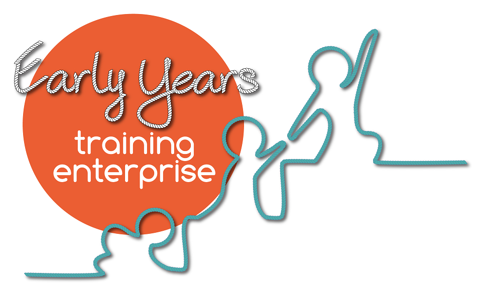
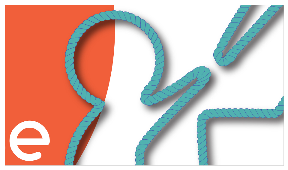
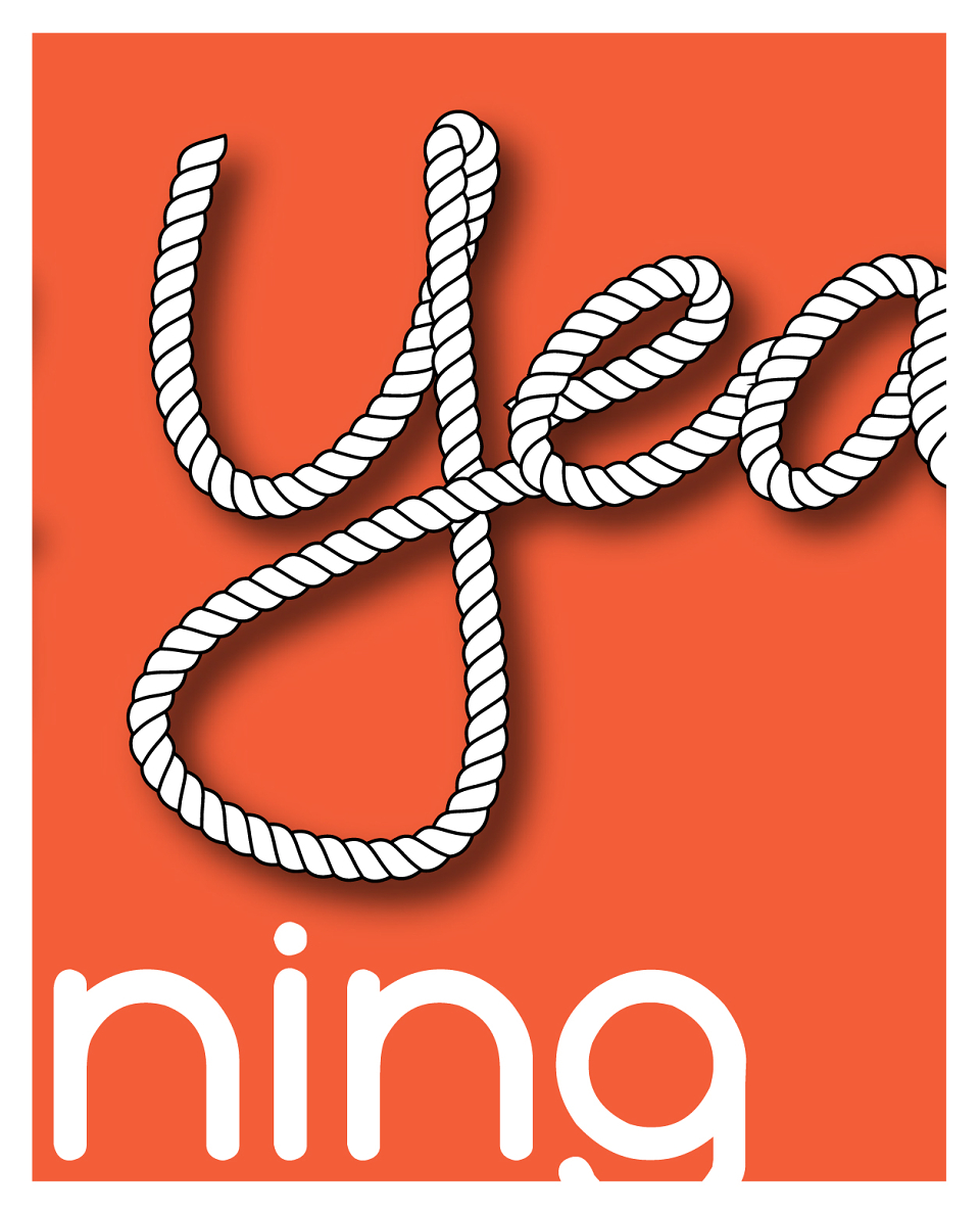
Brief: To revamp existing logo into something bolder, fresh and iconic, while maintaining the outlined shape of children from their original logo. Client request: make it look as though the image was made out of a piece of rope.
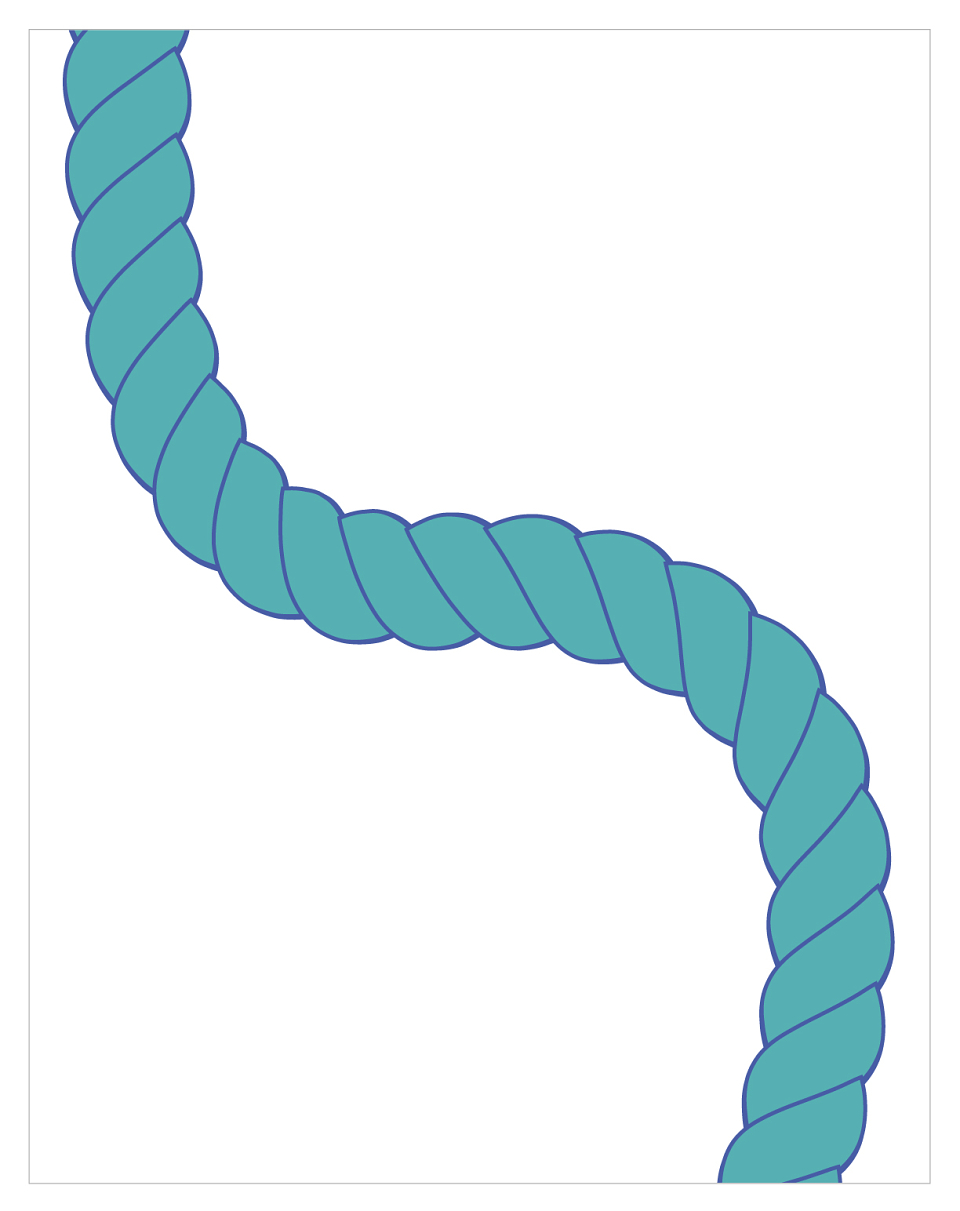
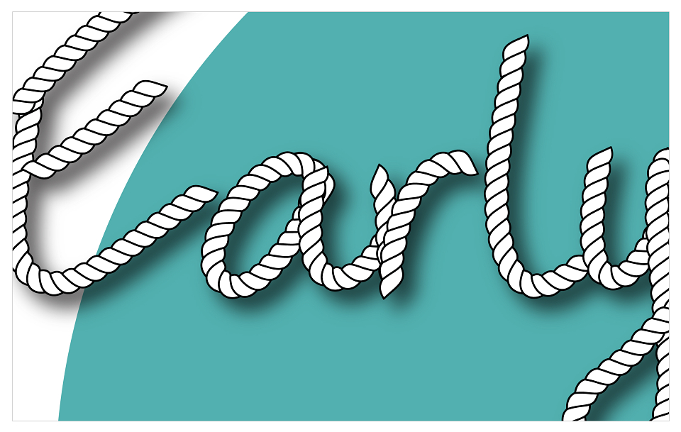
Result: Having developed the rope pattern, I redesigned the logo with a more flowing result. In order to maintain continuity throughout the brand identity, I developed a free-flowing font based on my own handwriting using the rope effect for the “Early Years” portion of the logo and then paired with a complimentary font for the “training enterprise” segment.
MADEIT CREDITS
-

Early Years Training EnterpriseClient
-

Kiran GhattauraFreelance Designer & Branding Creative