Kiran Moorkath
Graphic Designer
ABOUT
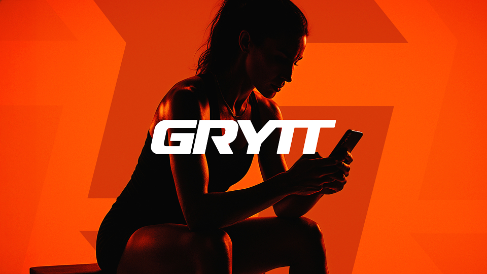
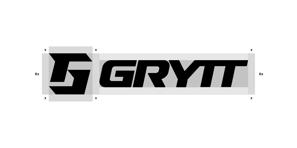
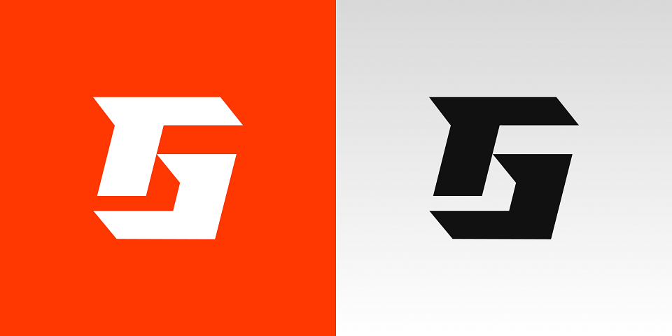
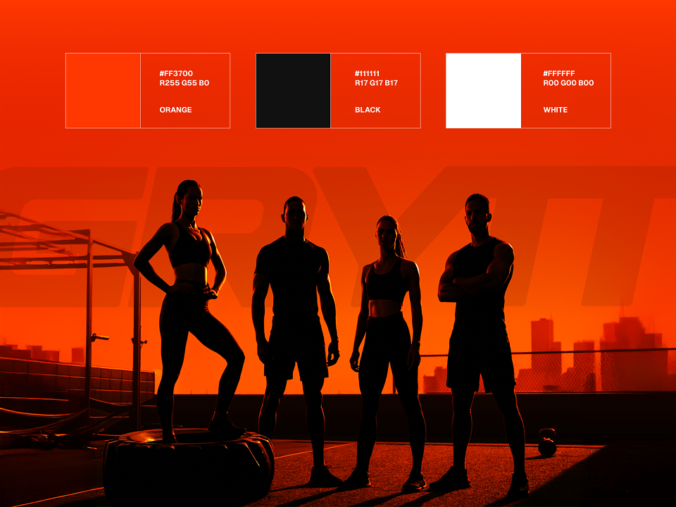
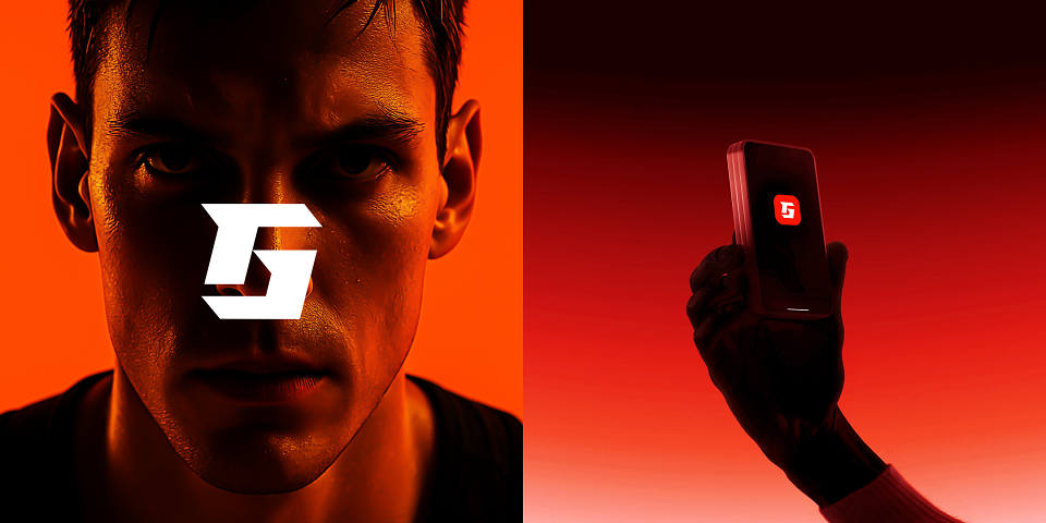
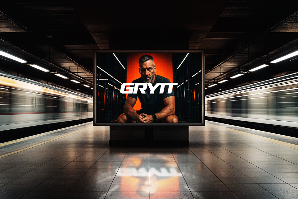
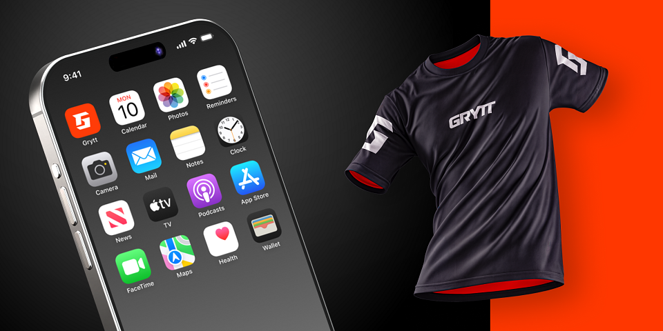
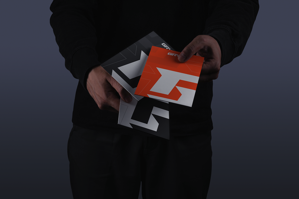
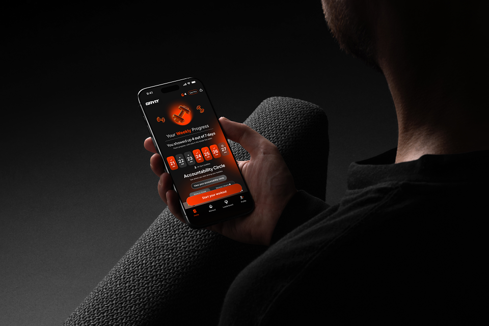
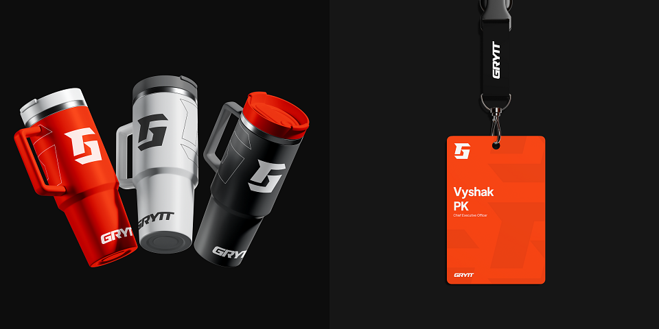
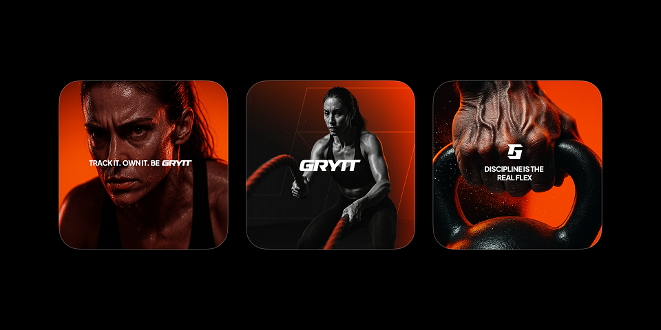
At the core of Grytt’s identity is a bold monogram crafted for maximum impact, rooted in angular geometry and symmetry. Built with the Cornero typeface, the logotype captures strength, resilience, and precision. The "G" icon mirrors the grit and determination of those on a fitness journey sharp, focused, and always in motion. The vibrant orange symbolises energy, urgency, and progress, echoing the inner fire of self-discipline and daily effort. The stark white logomark punches through with clarity and confidence, creating instant recognition and high contrast across all platforms. This unified visual language reflects Grytt’s mission: to empower individuals to log their progress, stay consistent, and conquer every challenge, one rep at a time. The identity speaks to a mindset, not just a brand; where consistency becomes power, and effort turns into growth.