Kieran Salaria
Graphic Designer/Marketing
ABOUT
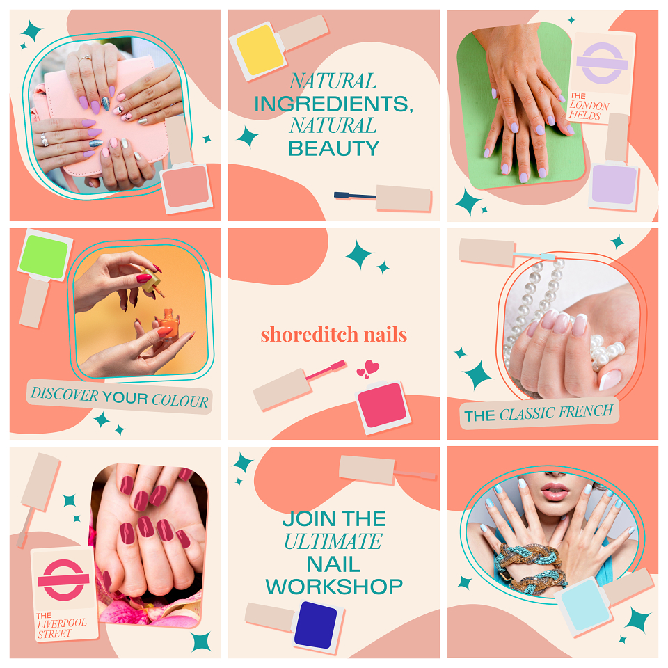
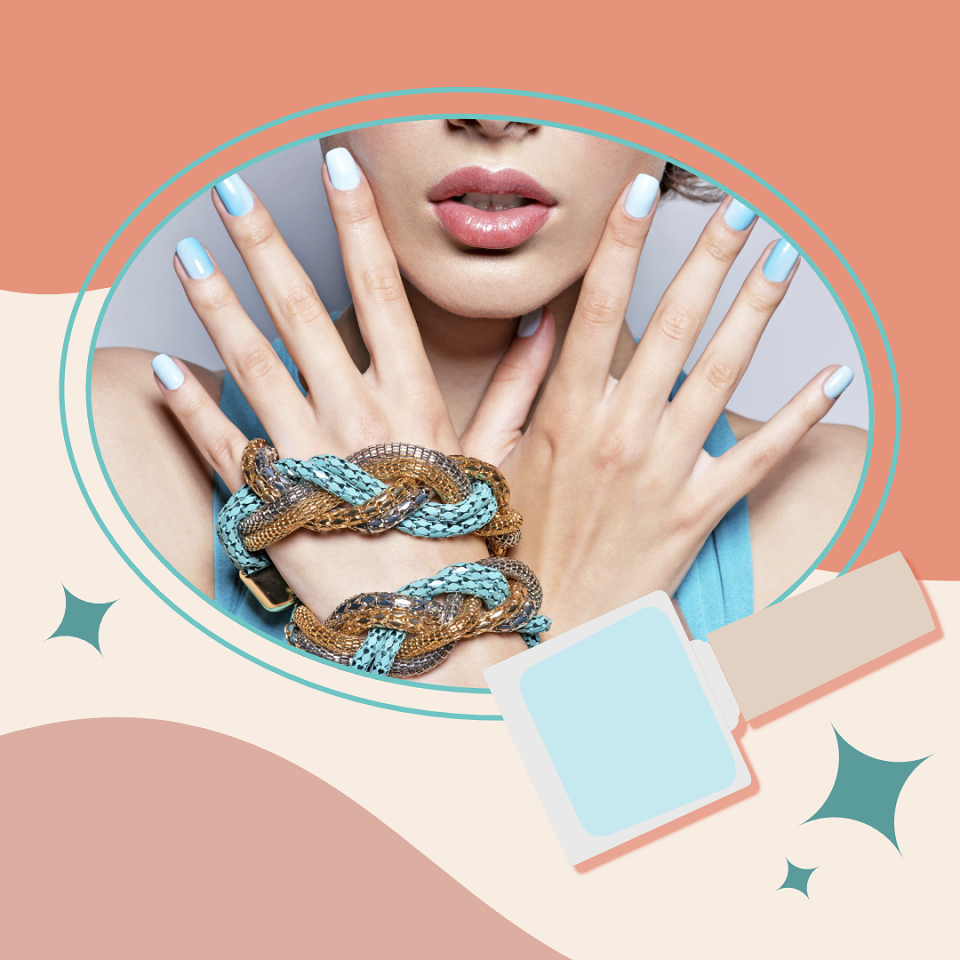
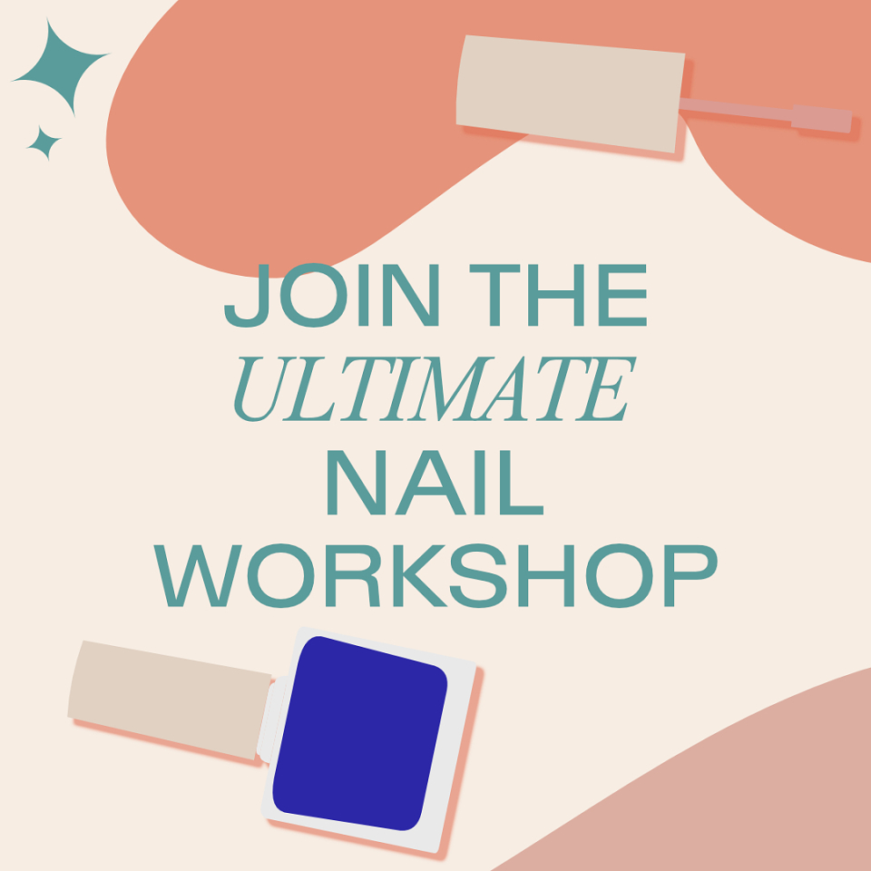
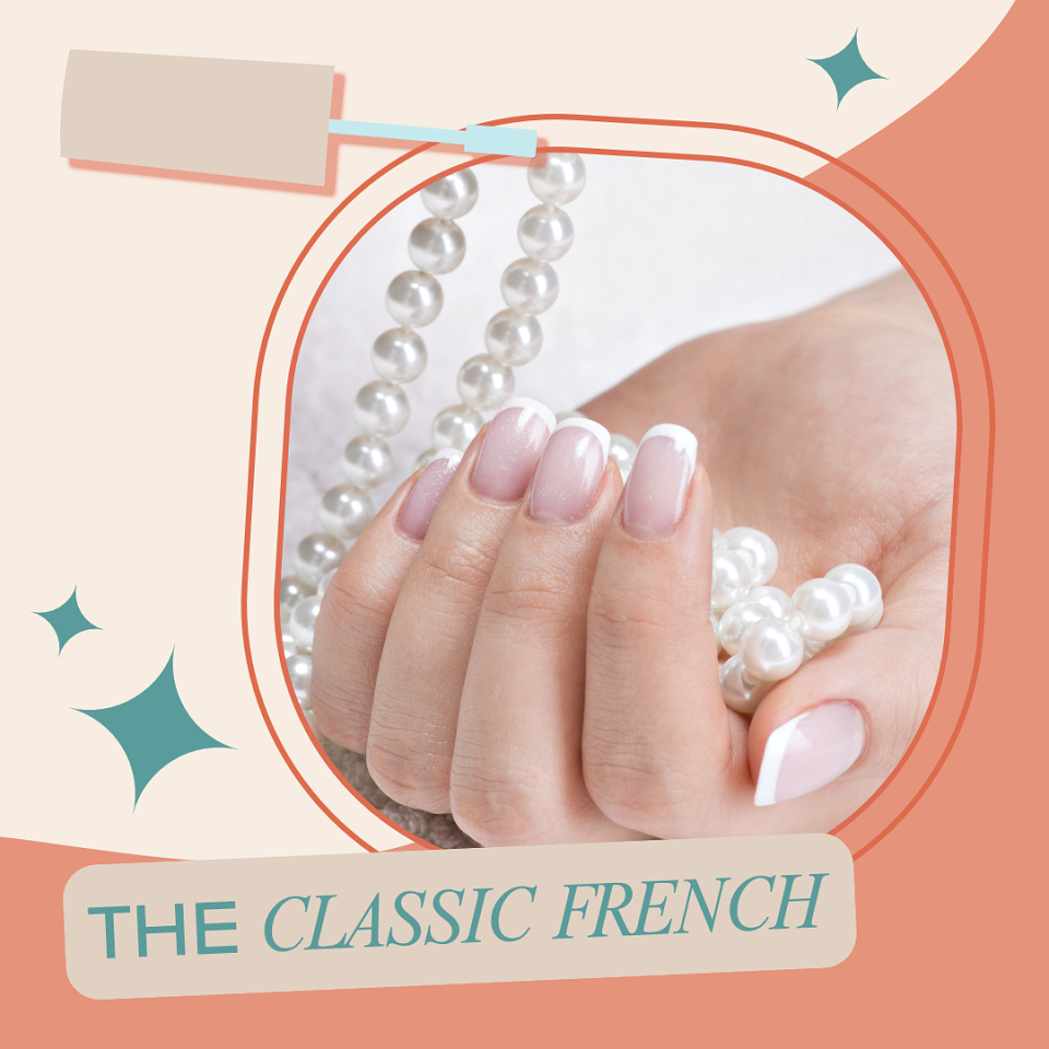
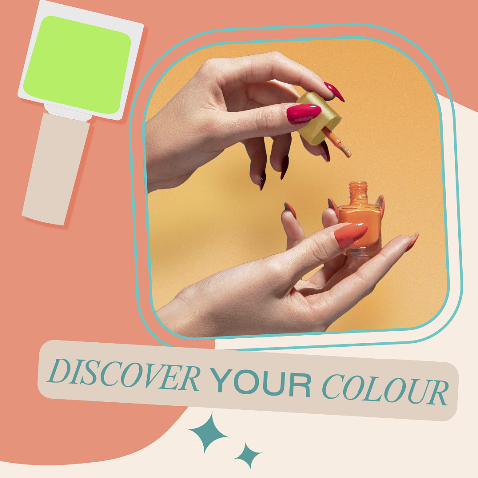
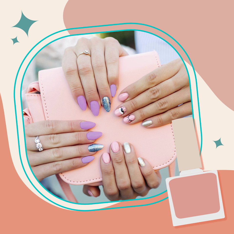
I had been given a preliminary task to redesign Shoreditch Nails' Instagram feed in the form of a 3x3 mock-up, with the goal of making it more "aesthetically pleasing".
For this approach I had first done some initial research on the company's three Instagram accounts, in order to garner some idea as to what kind of imagery was used by the brand, as well as some inspiration regarding the direction I wished to take with the posts.
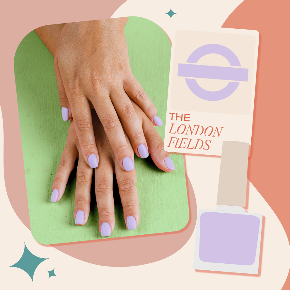
I came to the decision to design a puzzle post mockup, as I would be able to explore a fun, vibrant design that would appear across multiple posts. Colour-wise, I decided to stick with their use of orange as I was quite fond of their branding colours, and paired it with a complimentary teal font.
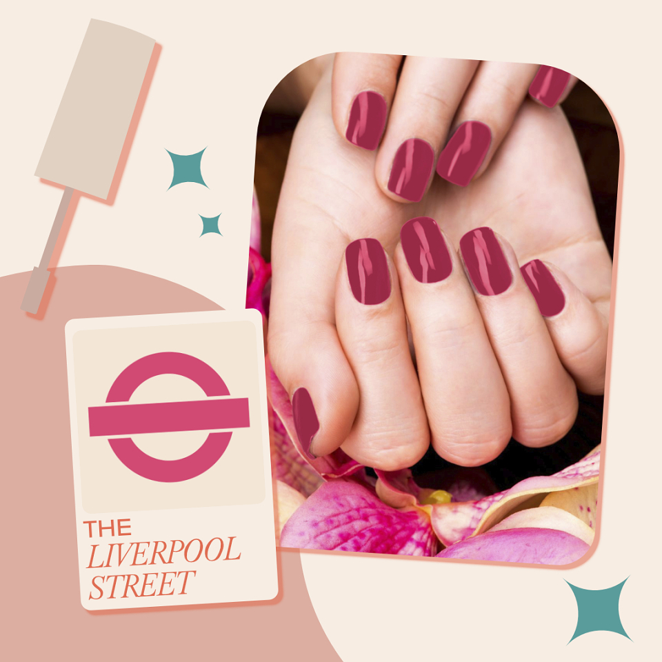
I decided to use roundel-shaped swatches on two of the posts, aimed to be highlighted nail polish colours. This was due to the fact that the brand is very strongly proud of its London-based origins, to the extent where its shades are named after well-known locations in the city.
In conclusion, I had managed to excel in this task to procure an interview with the founder of the company.