KentLyons
London
ABOUT
We were commissioned by Film London to create a brand identity for the Jarman awards in 2009. Derek Jarman was admired as one of British cinema’s greatest, and most controversial, artistic film-makers and The Jarman Awards was launched in 2008 to recognise artists working with moving image whose work, like Jarman's, resists conventional definition, encompassing innovation and excellence. Any emerging artist film-maker, whose work embraces the spirit and legacy of Jarman's highly experimental and risk-taking approach, can be put forward for this annual prize.
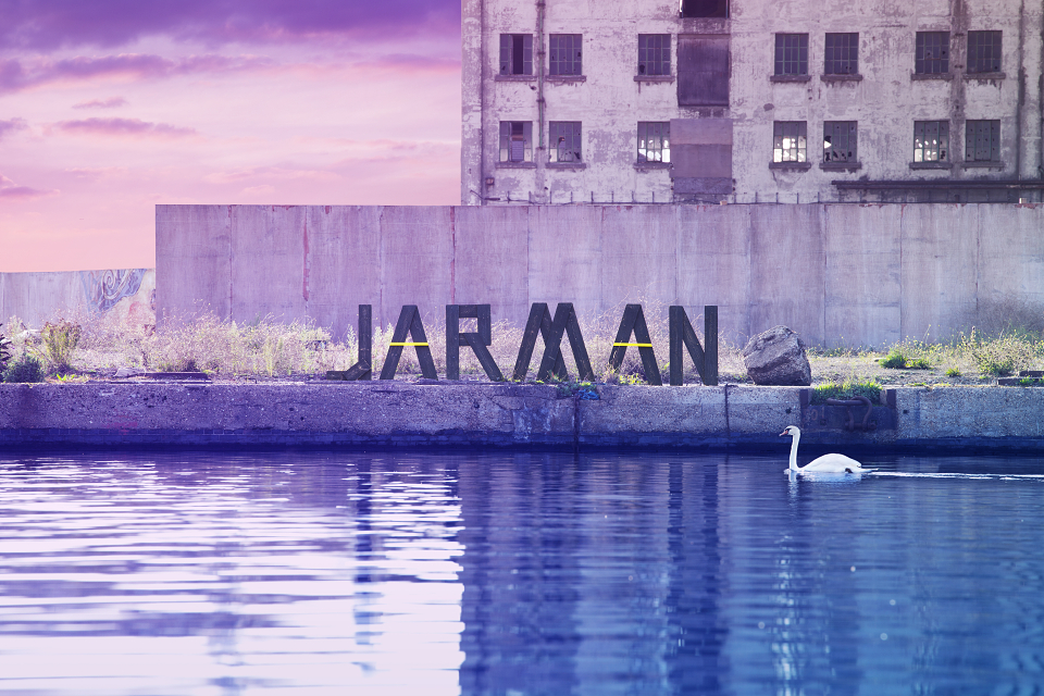
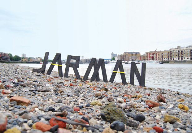
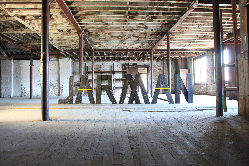
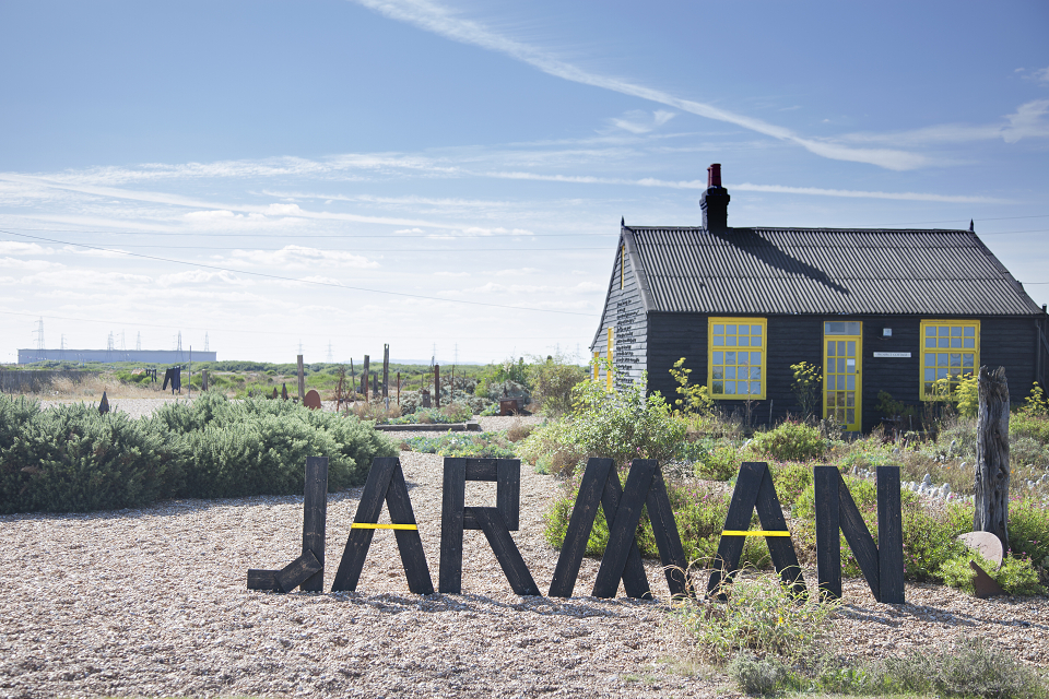
We focused on creating a visual icon that would become a strong feature of the awards’ identity. We felt that it had to be something that was clearly associated with Jarman, something that embodied the spirit of his work and him as a person. For the last decade of Derek Jarman’s life he lived in a black and yellow house on the beach in Dungeness, Kent, England in the vicinity of a nuclear power station. We created a logotype inspired by this iconic wooden structure and built the word JARMAN in meter-high letters from cladding board. This was then painted black and yellow and the physical logotype was then situated on London's beaches – the banks of the Thames at low tide – and then photographed. We used the black cladding for the main stroke width of the type and the yellow beading for the horizontal bars of the A’s. The letters form a physical identity that only lives as a 3D, tactile device. We installed the letters in the Whitechapel Gallery on the night of the awards ceremony to form the key signage for the event. Since 2009 the identity has travelled to a variety of locations, but the real key to the success of the brand is that it is awkward. It only exists in it's singular wooden form - there is no eps file, no jpeg. And it's massive - over a meter high and five meters wide. It lives for most of the year in our studio, taking pride of place on our walls, but comes out once a year to promote the awards.