Keighley Dyson
Graphic Designer
ABOUT
MURDER MOST UNLADYLIKE, 2025
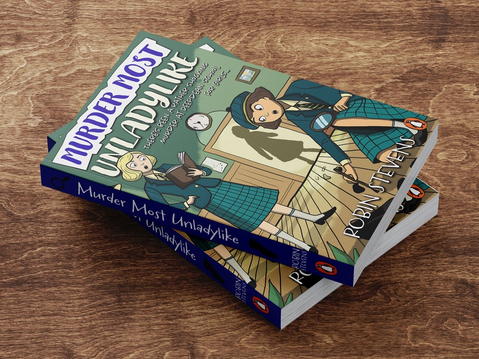
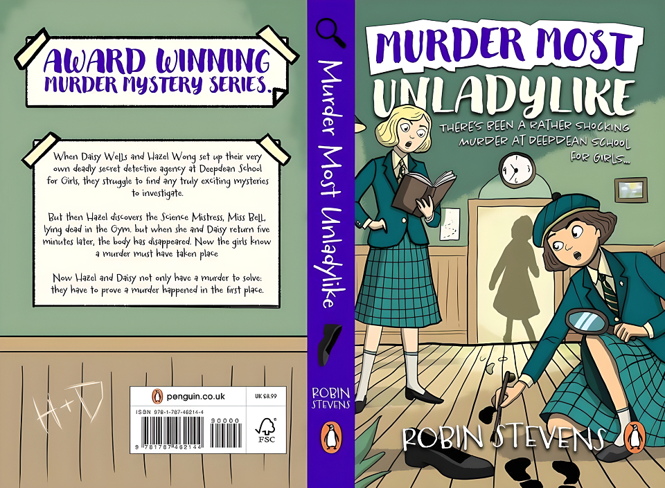
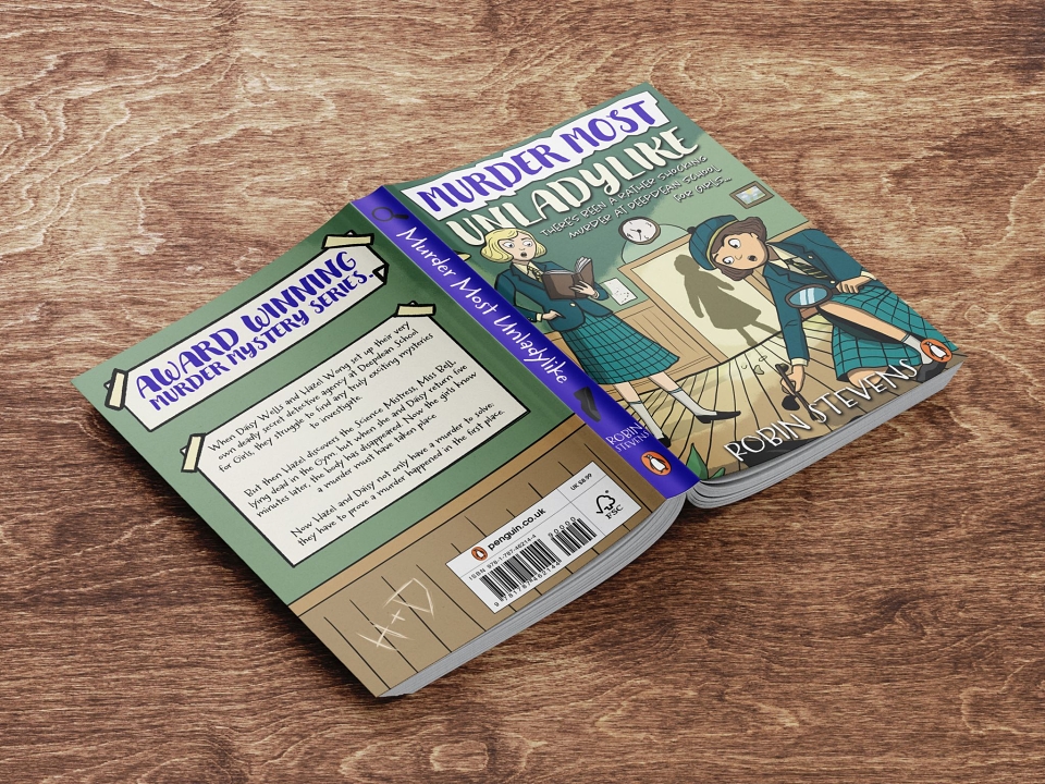
I redesigned the front cover, spine, and back cover for Murder Most Unladylike as part of the Penguin Publishing Book Cover Design competition, creating a fully illustrated wraparound cover and supporting mock ups. The concept aimed to visually reinterpret the novel’s mystery and youthful tone through hand-drawn illustration, composition, and typography while remaining appropriate for its target audience and genre.
Role: Book cover design, illustration, layout design
Deliverables: Front cover, back cover, spine design, two presentation mock ups
BRIEF & ASSETS
Murder Most Unladylike was a redesign brief focused on creating a compelling book cover that communicates mystery, intrigue, and youthful curiosity through illustration, typography, and layout.
The visual direction draws on classic detective themes and mid-century school-story aesthetics, combining hand-drawn illustration, playful yet suspenseful composition, and clear typographic hierarchy to create a cover that feels engaging, character-led, and appropriate for its middle-grade audience.
RESEARCH & CONCEPT
My initial design thinking began by looking at Harry Potter as a reference point, due to its status as one of the most recognisable and successful children’s book series of all time. I analysed how its covers balance mystery with approachability, using illustrative storytelling, considered colour palettes, and strong central imagery to immediately signal genre and audience.
Drawing from this, I aimed to create a cover that felt intriguing and suspenseful without becoming overly dark, ensuring the visual language remained accessible to younger readers while still communicating a sense of adventure, investigation, and narrative depth.
PROCESS
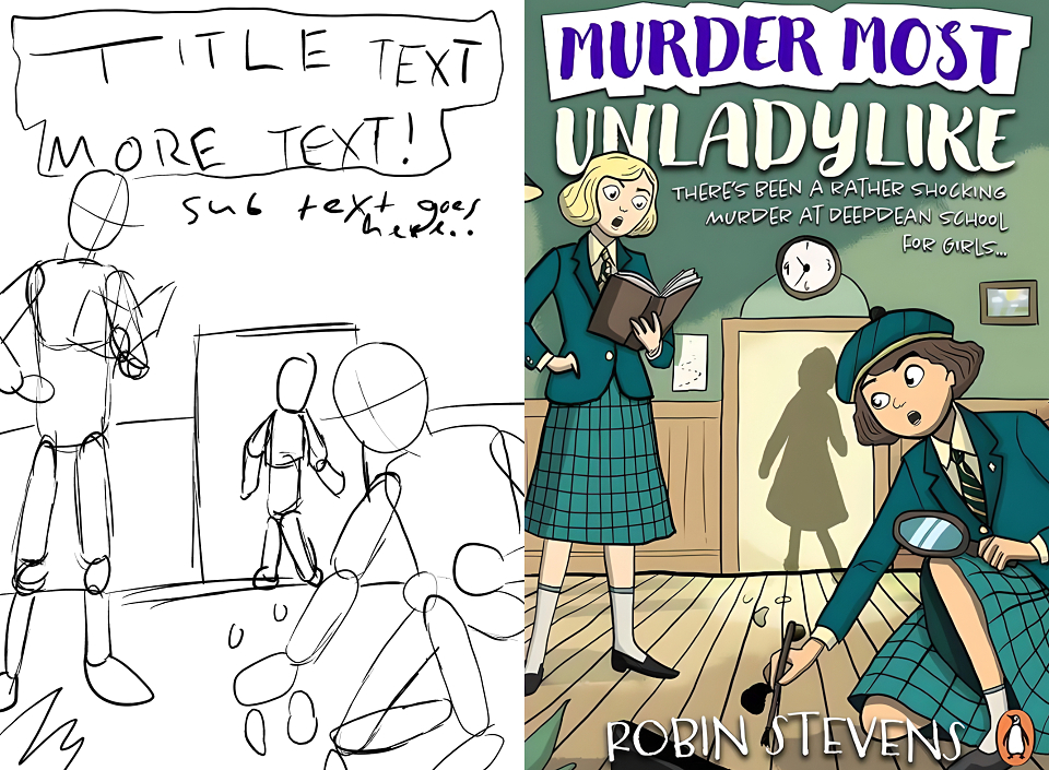
The front cover design evolved from loose sketches focused on hierarchy, storytelling, and audience appeal. Drawing inspiration from children’s classics like Harry Potter, I used hand-drawn illustration, expressive typography, and a balanced colour palette to communicate intrigue while remaining approachable.
The aim was to immediately communicate the genre and mood, using the protagonists in the midst of investigation to spark curiosity and suggest an active, unfolding mystery.
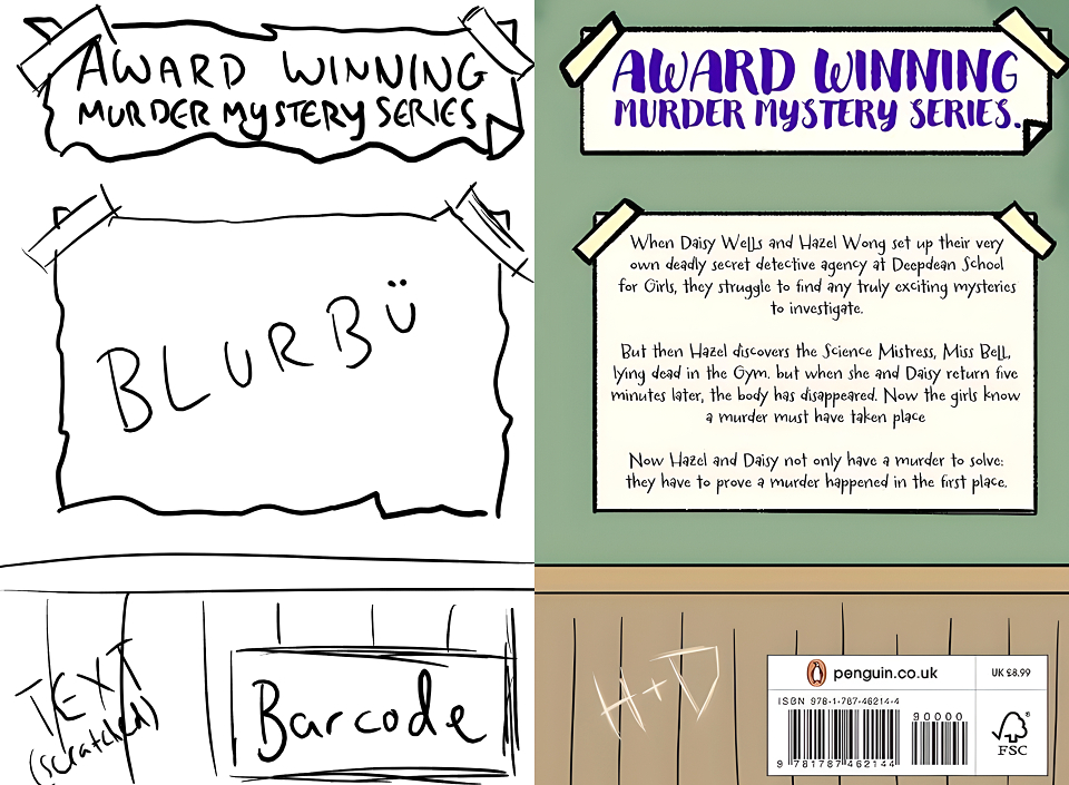
For the back cover, the design focused on clarity and cohesion, evolving from initial layout sketches into a structured, readable composition. Clear hierarchy and spacing were used to guide the reader through the blurb while maintaining consistency with the illustrated style of the front.
The inclusion of the “H + D” initials was an intentional symbolic detail, representing Hazel and Daisy’s friendship and partnership, and reinforcing that the heart of the mystery lies in their shared identity as detectives.
REFLECTION
Overall, This project focused on redesigning a book cover that clearly communicates genre, tone, and audience while remaining visually engaging for a younger readership. Through illustration, colour, and typographic choices, the final outcome aims to balance mystery and approachability, creating a cohesive wraparound design that feels character-led and narrative-driven.
What went well
The early sketching and research phase worked particularly well, allowing references from children’s mystery classics to inform the composition, illustration style, and colour palette. The hand-drawn approach and expressive typography helped establish personality and intrigue, while the front and back covers work together to create a consistent visual language that supports both storytelling and readability.
What I’d improve
With more time, I would explore additional typographic variations and test alternative layouts to further refine hierarchy across the full wrap. I would also experiment with more mockup contexts, such as in-store or digital environments, to better demonstrate how the cover performs across different formats.
MADEIT CREDITS
-

Keighley DysonGraphic Designer