Kaitlyn Chasarik
Graphic Designer
ABOUT
Classic books give a lot of opportunity for people to connect. Most people will have read at least one or two books from the variety that I created.
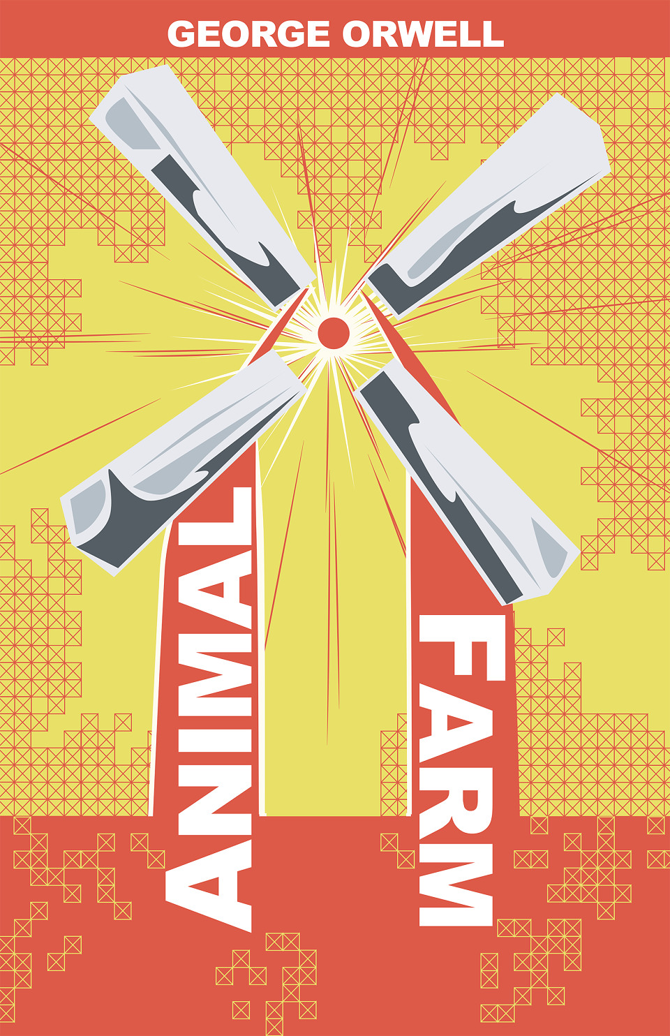
Animal Farm - One of the most important symbolic elements of George Orwell’s book is the windmill that the pigs force the animals to build and then blame it’s ultimate destruction on Snowball. Using the windmill as the main focal point of the cover, I wanted to invoke constructivist style of art in a post-modern way.
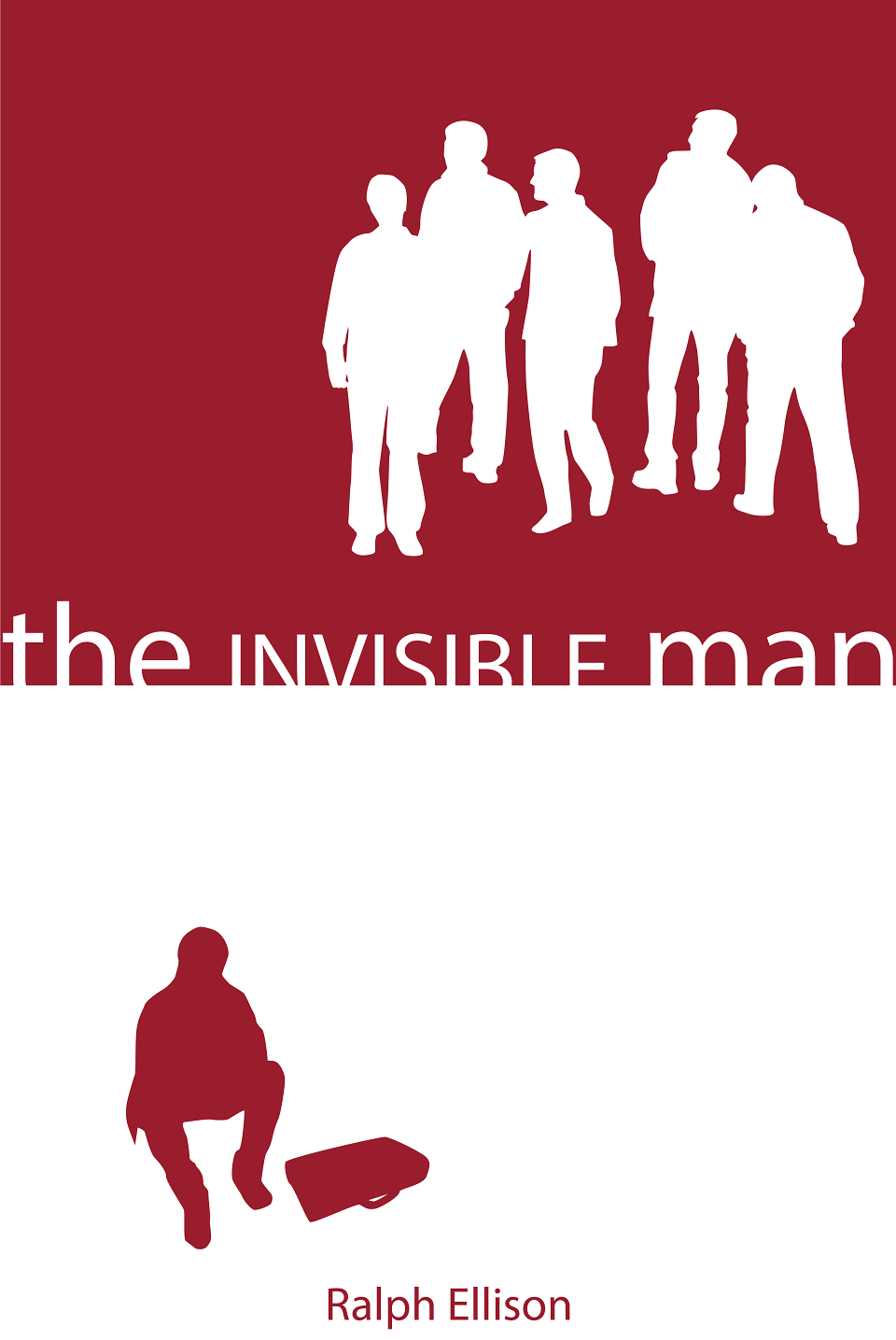
The Invisible Man - The cover is the last scene in the book. The narrator has fallen underground in the dark, but finds himself enlightened. I wanted to juxtapose the enlightenment of the narrator with the continued ignorance of those above ground.
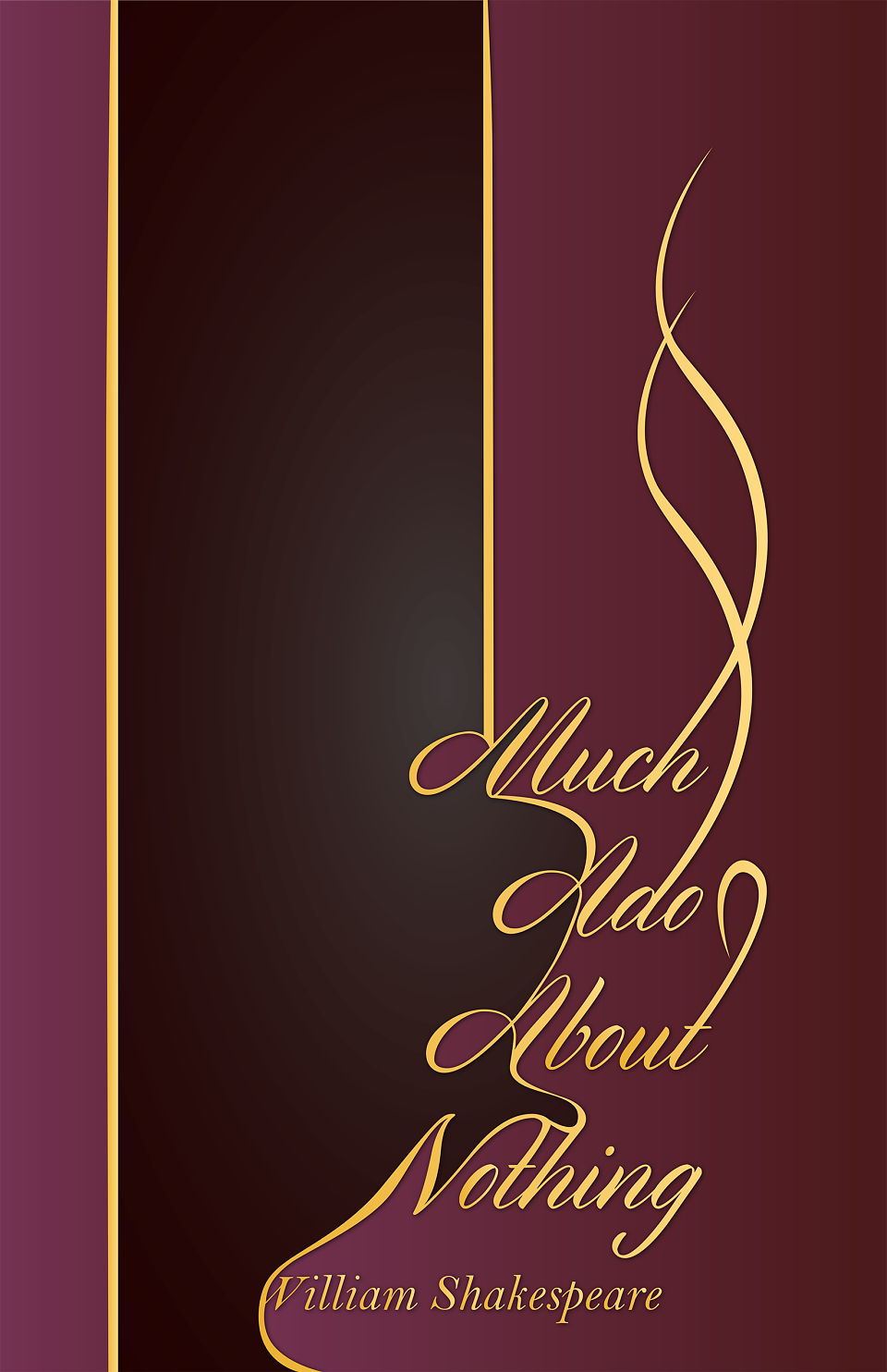
Much Ado About Nothing - Much Ado About Nothing is what I consider to be one of Shakespeare’s best comedies. A lot of the play has to do with mix-ups do to disguises or other circumstances. A lot of the play is almost farcical. I wanted to create something that reminded me of a door to signify two separate planes while also playing on farce. I wanted to use royal colors to describe both the character’s statuses and the status of Shakespearean work in the 21st century. I also wanted to do something with typography that was both elegant and sharp to describe the humor. My goal was not to make this cover lighthearted, I wanted it to describe the deeper aspects of the play.
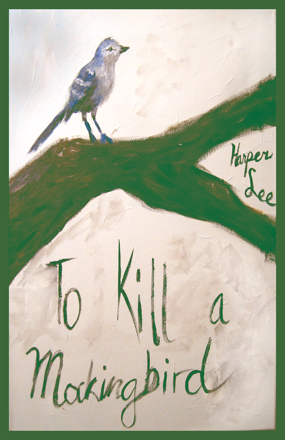
To Kill A Mockingbird - This is a book about children. But this book deals with very real struggles that children and adults face in the world. It’s about injustice as much as it’s about the good things in a child’s world. I wanted to do a cover that embraced the fact that this book is about children, but I also wanted to do a cover that was very real. Everything about this cover screams child, but whether it’s the specific green I used or the muted look to the poster something about it is very much so mature. While this book is not about mockingbirds, Harper Lee knew what she was doing with the title and I wanted to stay true to that aspect. The mockingbird is the only thing on the poster that is not significantly muted. It’s the only thing about the poster that’s “pure.”
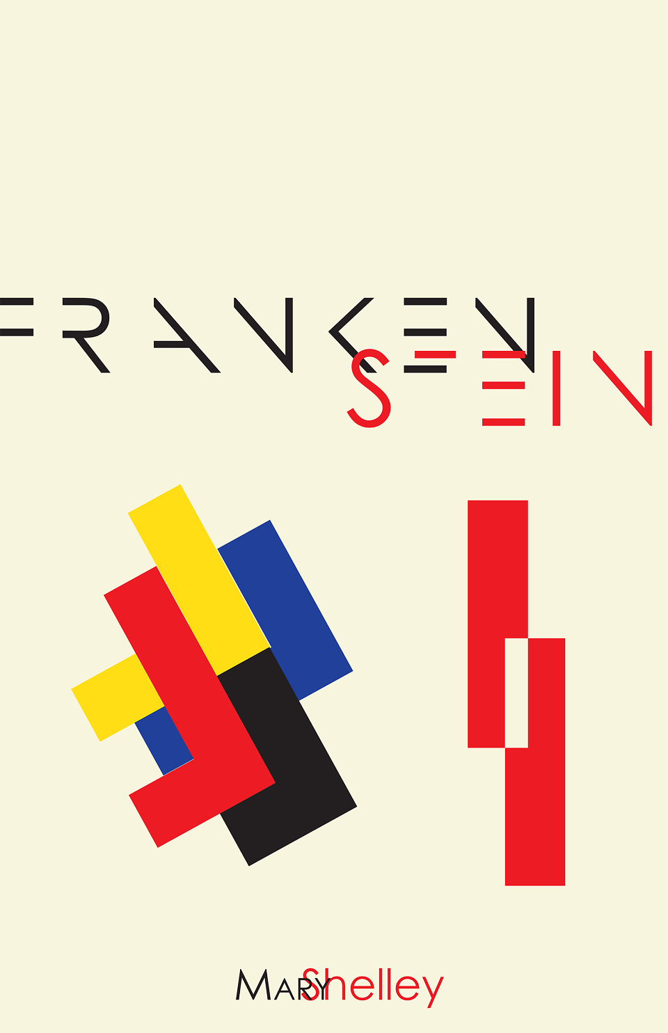
Frankenstein - This was the first poster I designed in the series. For this cover I wanted to use thematic elements of the story without using blatant symbolism. Frankenstein has a lot of false imagery associated with the story. The monster is not green, does not have bolts in its neck and is not unintelligent as most movie versions of the story would lead you to believe. The actual book is about the dangers of obsession. On the right of the poster I wanted to use something symbolizing a man chasing another man or perhaps a dream or other obsession. On the left I wanted to include something more from the actual story by creating a shape from a dogsled chasing another dogsled and editing it down for minimalism. It also invokes ice breaking apart, which is again an important detail from the book. With the minimalism I wanted to create a sensation of not quite knowing what you’re looking at, as though the details have been interpreted too far, just as the movie is interpreted too far from the book to something almost unrecognizable.
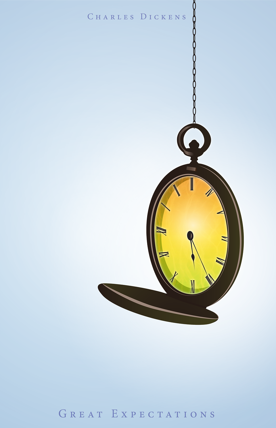
Great Expectations - Clocks and time play great importance in Great Expectations. The story of great expectations is about growth from believing in wealth and class to believing in affection, loyalty and conscience. With a stopped clock a person can never move on from a moment and can never find importance in their own life.
MADEIT CREDITS
-

Kaitlyn ChasarikGraphic Designer