Karen G. Burbano
Graphic Designer, Art Director & Brand Strategist
ABOUT
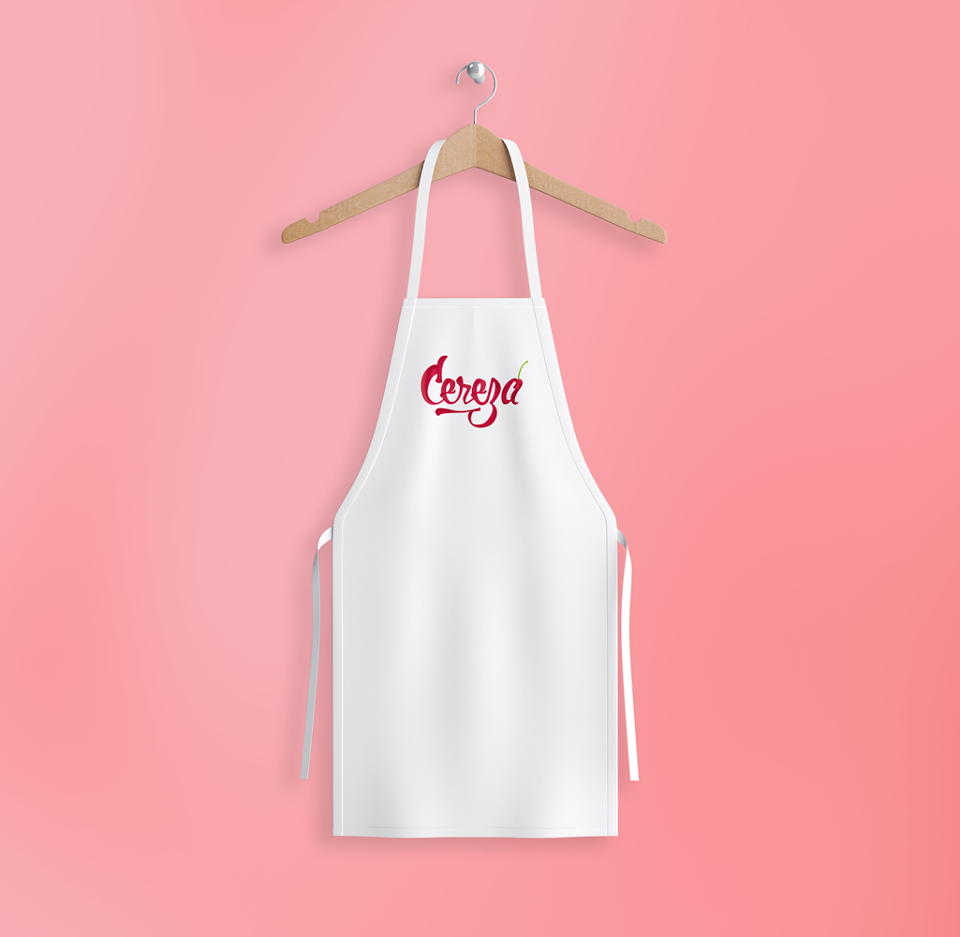
Visual identity, packaging and uniforms for a dessert shop
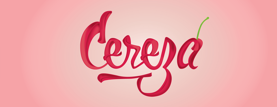
Cereza is a Colombia start-up which makes artisanal desserts with fruits.
For many months Cereza (Cherry) has delivered products at a local level, and now it is so popular that it wants to create a more solid visual identity.
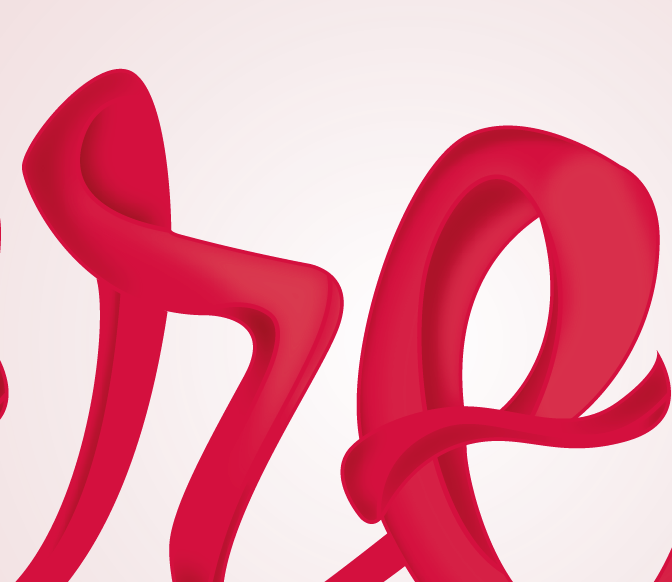
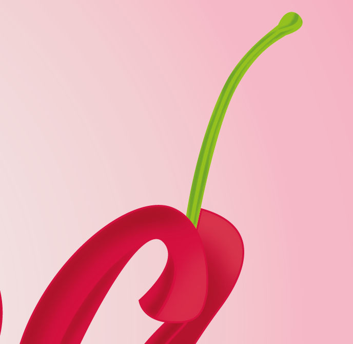
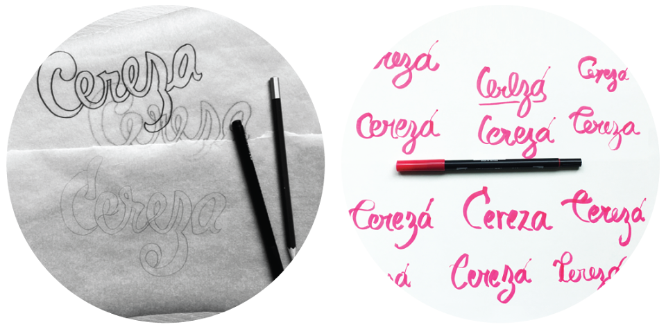
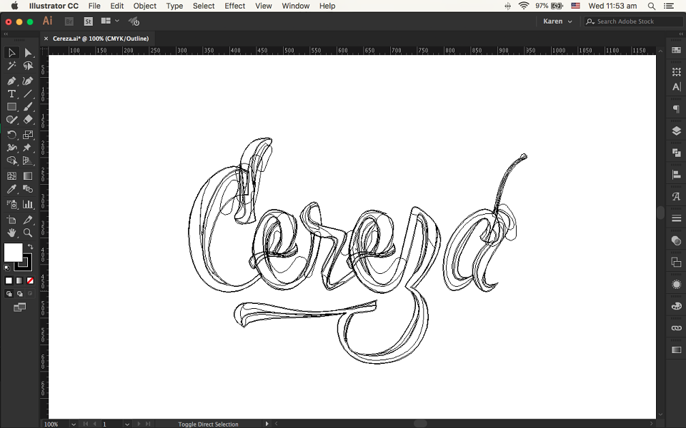
The study of the form through calligraphy was the main step to illustrate the brand. I represented the movement and softness of the cream using the cherry colour.
It is a happy and friendly brand that induces the desire to eat.
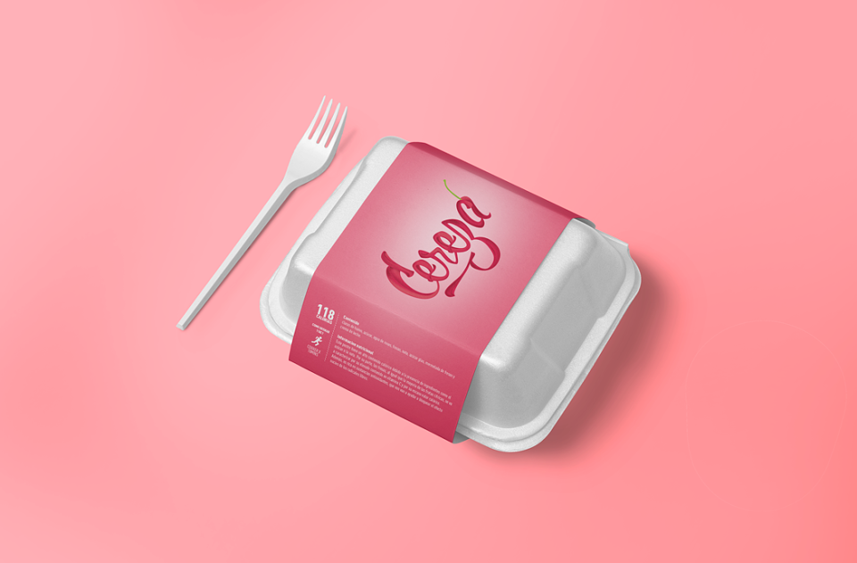
For the packaging, I needed to provide the number of calories that each dessert contains, but as a playful visual communicator I also provided the way in which the consumer can burn these calories. For example, this specific dessert contains 118 calories that a person can easily burn in a 10 minute jog.
MADEIT CREDITS
-

Karen G. BurbanoGraphic Designer and Art Director