Kayhan
Senior Art Director / Graphic Designer
ABOUT
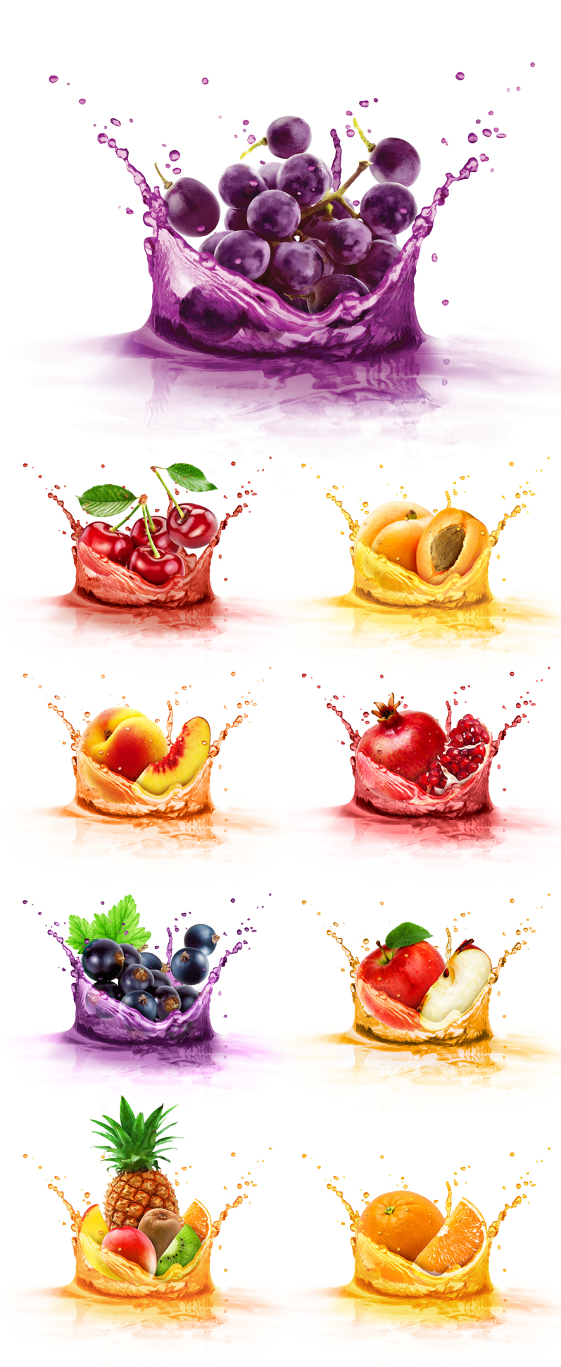
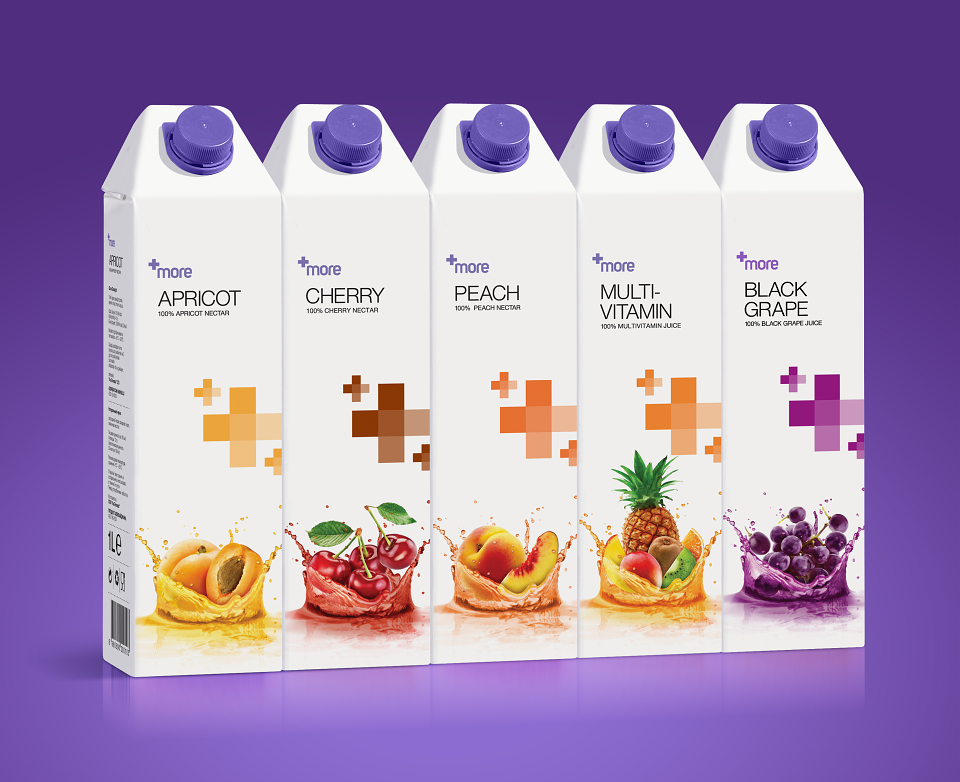
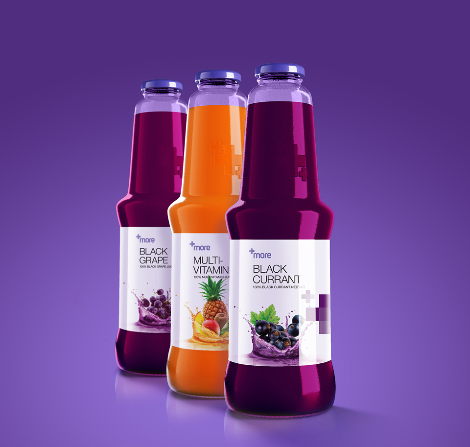
More is a premium fruit juice which contains high percentage of real fruit extracts, therefore the name “More” was selected for the brand. The plus (+) icon on the package is used as a symbol to indicate the rich fruit ingredient of More. The plus changes color according to the flavor. White is used all over the package. Plus and white emphasizes the health and triggers the perception of hygiene. White is also differentiating the package of More from the other fruit juices on the market shelves and putting it forward. The simplicity of the package is an advantage. Illustrations on the package are effective but not distorting the simplicity.
Best of Central Asia, Packaging Design, First Prize, 2012
Pentawards – Category Beverages, Silver Pentawards, 2013
Red Jolbors Fest, Packaging Design, Silver, 2013
AWARDS
PentAward - Silver