Kateryna SUPCHAN
Graphic Designer
ABOUT
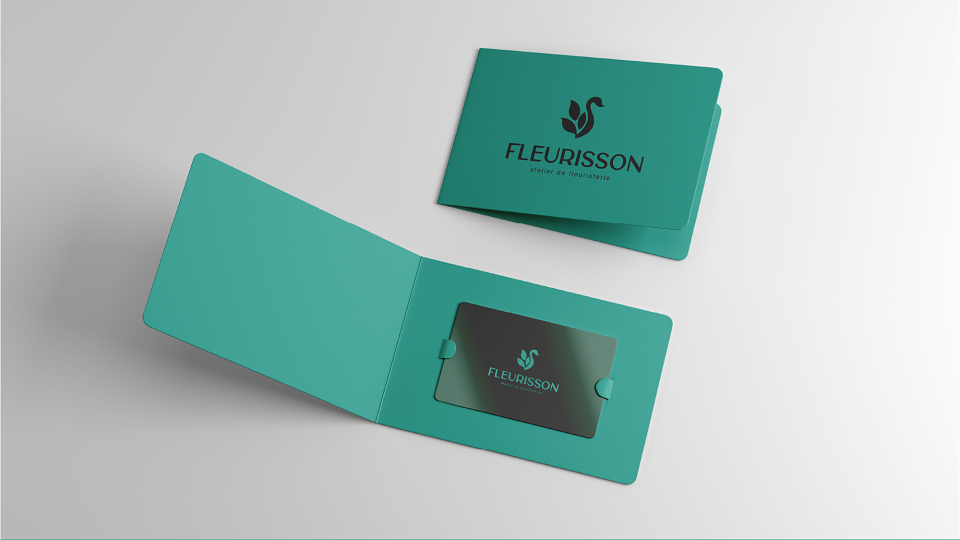
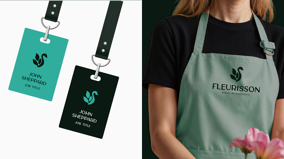
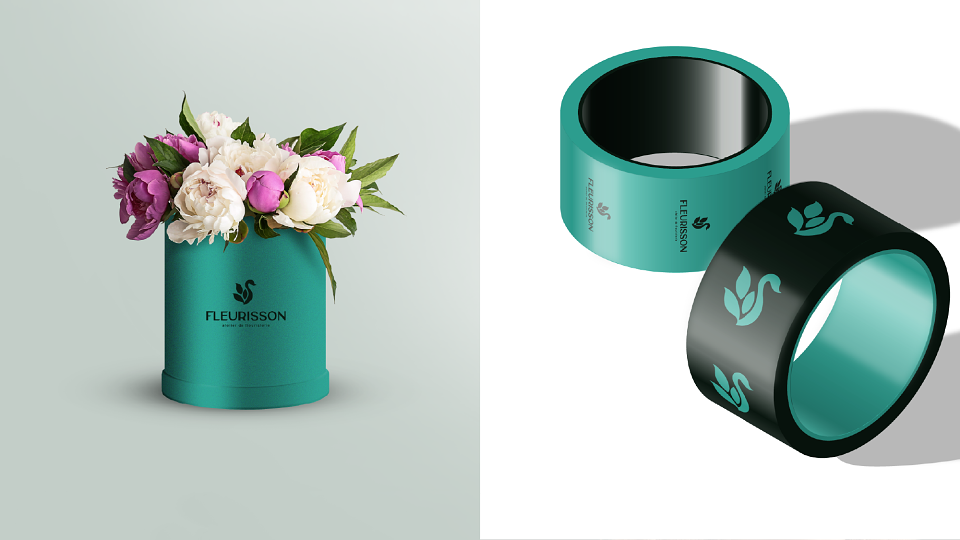
As a graphic designer, I was tasked with capturing the essence of Fleurisson — a floral studio built on French romance, elegance, and modern charm.
⠀
From the very first sketch, it was clear: this wouldn’t be just another logo for a flower shop. It needed to feel like a soft melody — visual, emotional, and atmospheric.
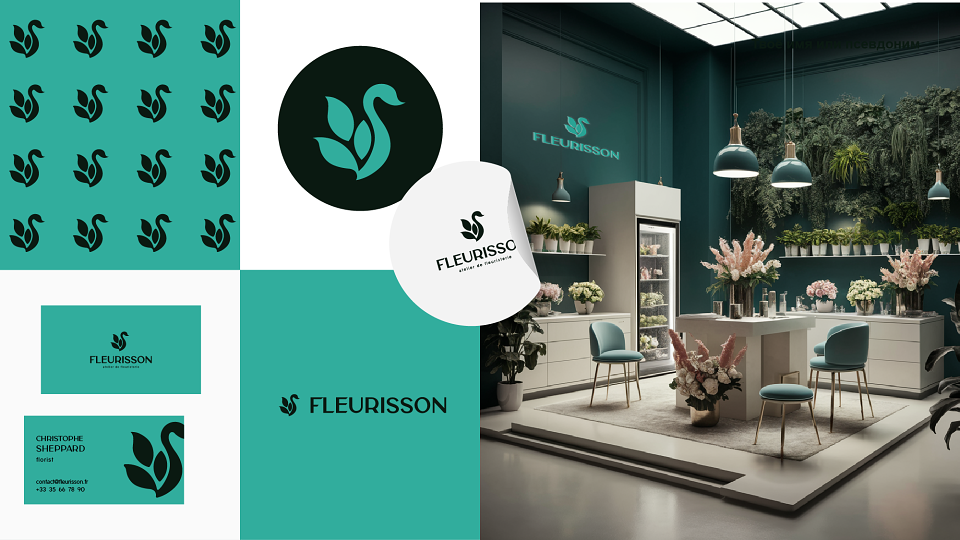
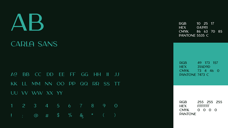
The color palette I chose was thoughtful and bold:
▪ Deep green — for sophistication, depth, and a strong connection to nature
▪ Vibrant turquoise — to bring freshness and life
▪ Pure white — to create breathing room and visual harmony
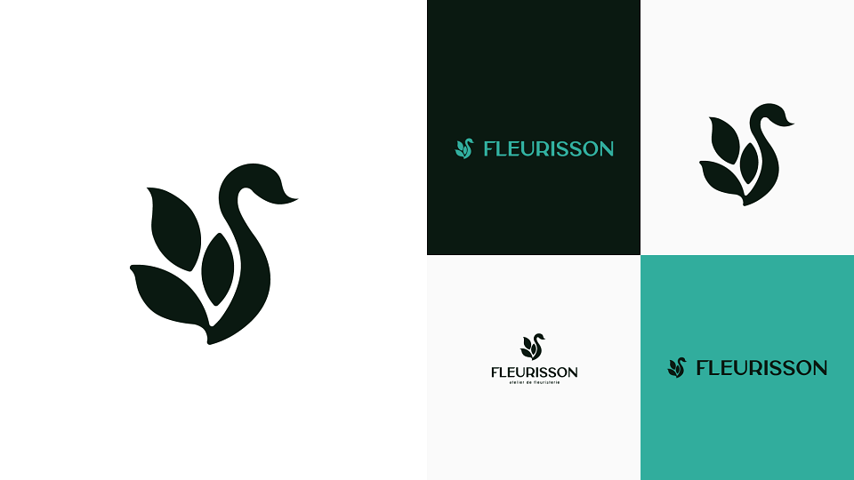
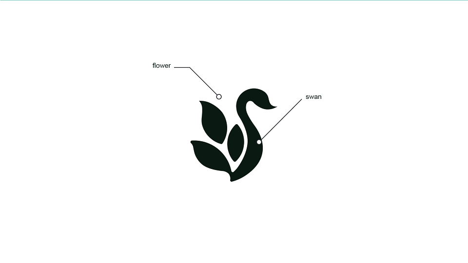
I designed an elegant yet distinctive logo, paired with a minimalist symbol that reflects the brand’s personality and premium positioning.
This logo doesn’t shout. It invites.
It speaks not only of flowers, but of feeling.
From concept to execution, I translated the soul of Fleurisson into a timeless visual identity.
MADEIT CREDITS
-

Kateryna SUPCHANGraphic Designer