Kate Mayhew
Senior Graphic Designer
ABOUT
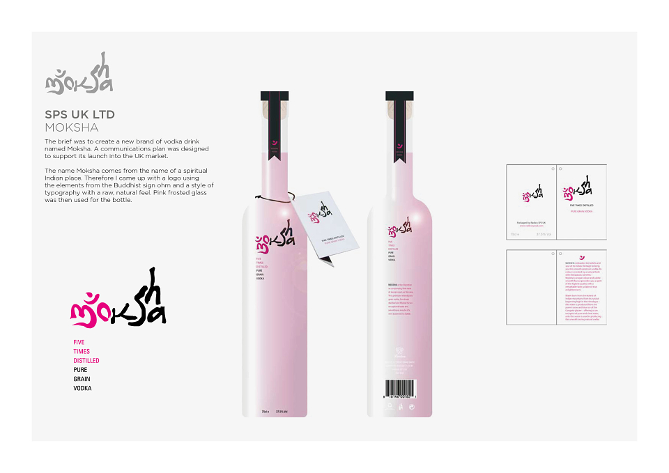
The brief was to create a new brand of vodka drink named Moksha. A communications plan was designed to support its launch into the UK market.
The name Moksha comes from the name of a spiritual Indian place. Therefore I came up with a logo using the elements from the Buddhist sign ohm and a style of typography with a raw, natural feel. Pink frosted glass was then used for the bottle.