Kate Harmsworth
Illustrator
ABOUT
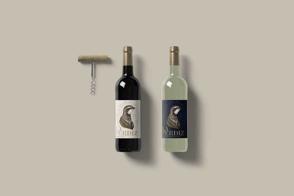
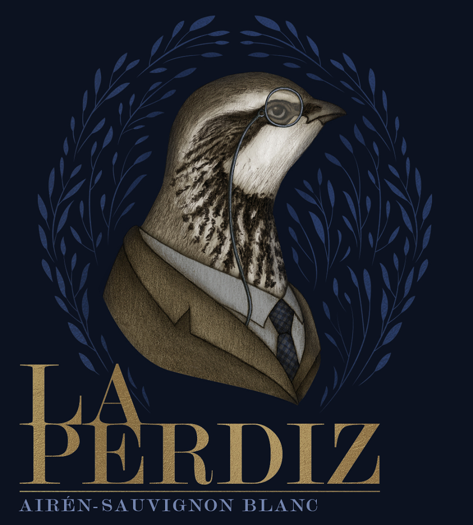
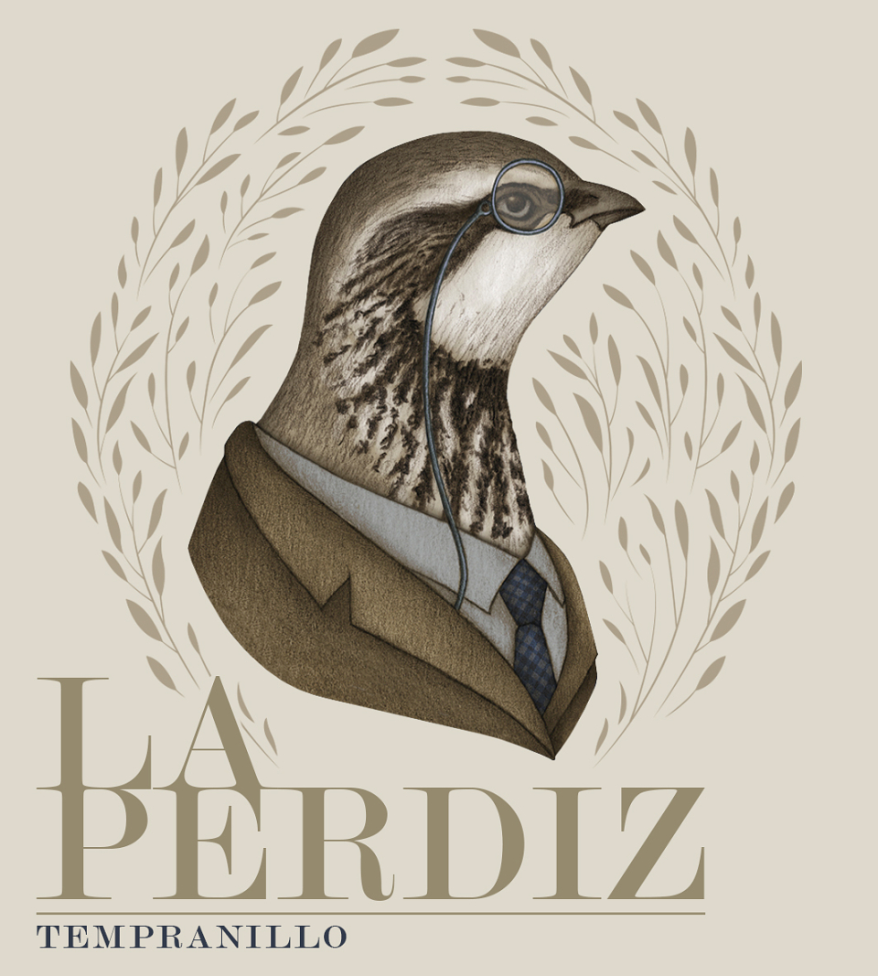
A wine label design I’ve created for a client:, for their new wine called ‘La Perdiz’. I’ve designed two cohesive labels for both the red and white versions of the wine. The client desired an illustration that was unique and had a surreal quality to it. The design I created is sophisticated with a contemporary feel to follow suit with the company’s branding and features a fun and quirky pencil illustration I’ve illustrated of a prestigious looking partridge wearing a suit and monocle. The illustration brings an element of English heritage to convey the main inspiration behind the wine, which is the company’s hometown, Partridge Green.
MADEIT CREDITS
-

Kate HarmsworthIllustrator